
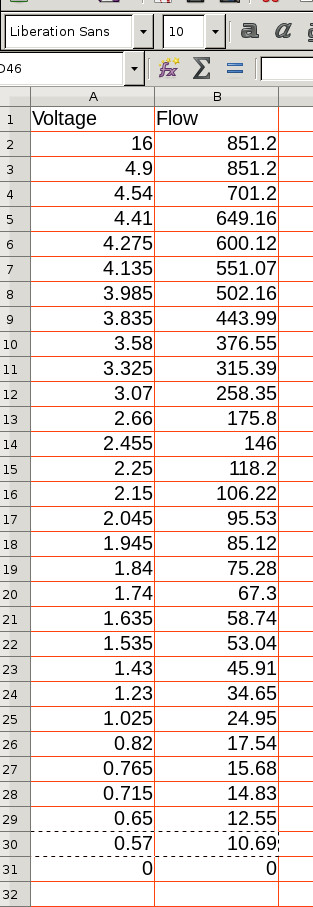
I have a data set that looks like:
I am attempting to create a chart from this data set. However once I have the data pasted into Calc and then try to insert a chart instead of create a x - y line chart using my two columns of data, it seems to want to create two line graphs with the index as X and each column as the Y data. So like this:
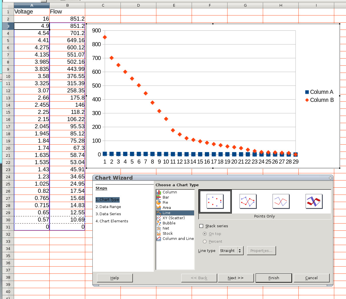
So there must be something simple I am doing wrong. Can anyone please explain my error?
Thanks in advance.
Sven