
I want to hide columns of data to make data entry easier but I want charts to be able to use the visually hidden data so I can still see averages, bar charts, and so on.
Thank you for looking at this. The data range of the hidden cells is included but the chart data disappears when the columns are hidden. I’d upload a picture but it says I need karma>3. I could email the jpg to you if that would help. Or I could setup an example spreadsheet and send that.
qubit throws some karma at @rcw
Okay… now you should have enough karma 
Please upload your files, then ping @rmfaile with a comment below the Answer.
Thanks!
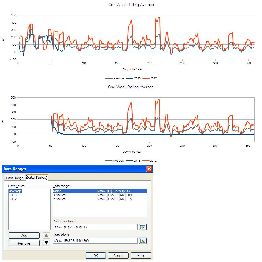
When creating your charts, unhide the columns you want to use in the chart data. Then select the data range (including the usually hidden columns) in the Chart Dialog. Once the chart is created, hide the columns again. If the chart is already created, go to Data Ranges in the Chart Dialog and include the hidden cells in the data range.
@rcw – Did @rmfaile’s Answer work for you? If so, please mark it as correct. If not, please post a follow-up describing why it didn’t work for you.
Added a jpg and an ods. The picture got there, I hope the spread sheet did.
@rcw – Image looks good, but the link to the ODS wasn’t showing up. I removed the “!” in front of the link to the ODS, and I think it’s working now.
@rmfaile – Tagging you back in
@qubit1 - Thanks.
@rcw - I was able to select column N, go to Window > Freeze. Then able to scroll back and forth horizontally and the chart was visible along with the last data cells. The chart used all the data. Does that solution work for your situation?
@rmfaile - I was already using freeze to keep row labels and column titles visible. The (previously unexpressed) idea was to use hide with scroll to make one week at a time visible for data entry while being able to see both the beginning of the row labels and the end of row summary data and look on another sheet for the averages. I hoped that the display of data and the use of data could be made separately controllable. Thank you and @qubit1 for your help
@rcw - Maybe the best option is to create a new sheet, link each cell in the new sheet to your data entry sheet and then change the data ranges in your charts to use the new sheet. That way the contents of the new sheet are never hidden and the charts work, but you’re still able to hide the columns on your data entry sheet.
@rmfaile - That’s both interesting - and - it works. Thanks.
Right-click on the chart or graph and choose Edit.
Select the data-series from the drop down menu in the chart-editing task bar (in the upper left corner by default) and click ‘Format Selection’.
Click on the ‘Options’ tab and check the ‘Include values from hidden cells’ box.
Worked on LibreOffice Version 4.0.2.2.
This works. It gives total control but requires individual settings for each data series.