How to generate pie chart out of a single column of data?

Hello!

In Calc, I have a set of data such as:

ID	Gender
1	Female
2	Male
3	Male
4	Female
…	…
99	Male

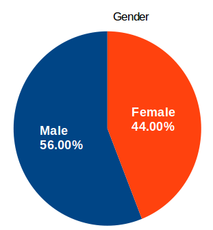
I would like to generate a pie chart out of it that would look like this:

image description

Do I need to create an intermediate table summing the different options I have in the “Gender” column or is there a better, automated solution for this?

(I have other columns with more than two options and I would like to do similar pie charts for these as well)

Thanks in advance!

I would use Pivot Table for all such kind of data analysis. You can then generate a Pivot Chart from the Pivot Table. In contrast to a normal chart, it adapts automatically in case you use filter.

In this special case mark all data including the column heading. Create Pivot Table from current selection. Drag the “Gender” field to “Row Fields” and to “Data Fields”. Double-click “Gender” in the Data Fields and select the function, here Count. Exit Edit Layout mode. Mark the inner cells of the Pivot Table and generate the desired chart.

If you open “Displayed Value” you will notice, that you even can get the percent values. You also can drag “Gender” a second time to the Data Fields and choose a different function or displayed value. But here such works not nice together with the chart.

Thanks! Exactly what I was looking for. I’ll try to learn more about pivot tables.