Can you force intervals to count from 0 rather than the left side of the plot?

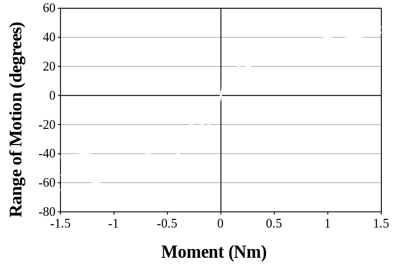
I have some scatter plots that contain data that goes from -1.5 to 1.5 on the x axis. We would like to extend the x axis out to about 1.7 in each direction in order to show where our data ends. We would also like to have major interval marks every 0.5 on the x axis.

If we set the x axis to go from -1.5 to 1.5, the figure looks like this (I’ve whited-out the data because it’s still pre-publication)

If we set the x axis to go from -1.7 to 1.7, the figure looks like this

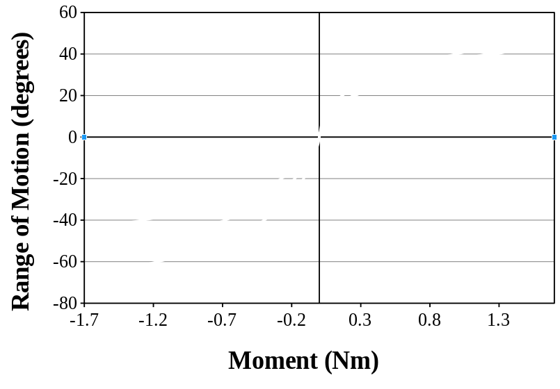
The problem is that the major interval marks always begin to count from the left side of the figure. What we want is to have interval marks exactly like the first image (at -1.5, -1, -0.5, 0, … , 1.5), but have the graph extend out to 1.7 in each direction.

Is there any way to force the interval marks to start at x=0, and extend outward from there? If not, I’m going to have to redo all of my figures in another program :\

Thanks!

Which version of LO are you using? I am using v5.4.5.1 and could not reproduce the problem. Also, when editting (formatting) the x-axis, it might be possible to juggle the Major Interval and the Minor Interval Count values to force a label to appear at x=0?

I’m running v6.0.5.2 on openSUSE. Just to make sure that I understand, when you attempted it, you were able to get the x-axis to range from -1.7 to 1.7 with major interval marks at -1.5, -1, -0.5, 0, 0.5, 1, and 1.5?

I fooled around with the minor intervals briefly, but I don’t think that there is any way that I could get the minor interval marks exactly at the values that I want, and nowhere else.

Now I am getting the problem you are having. Wen I force the scale of the x-axis to range from -1.7 to +1.7, I get the same result as you have shown. But if I let the chart be created with default values, the x-axis ranges -2 to +2 with marks at -1.5, -1, etc. This display is neat because all the data is contained within the borders and no data points at a border. Same with a range of -1.8 to +1.8 and interval 0.2. You might have to compromise.

You ask
Is there any way to force the interval marks to start at x=0, and extend outward from there?

Is it not possible to choose a combination of x-axis end-points and intervals that will include zero and all of your data in the range, and have convenient numbers along the axis? In my experiments, avoiding prime numbers (ignoring the decimal point) and some odd numbers almost always gave pleasing results.

From my experiments, it seems not possible to do exactly what you want. If you want the x-axis to be symmetrical about x=0, then the minimum and maximum values of the x-axis must be multiples of the Major Interval. If you could be satisfied with end-point values of +/-2 instead of +/-1.7, and graduations at -2, -1.5, -1, -0.5, etc., then the chart will work and there is only a little space wasted.