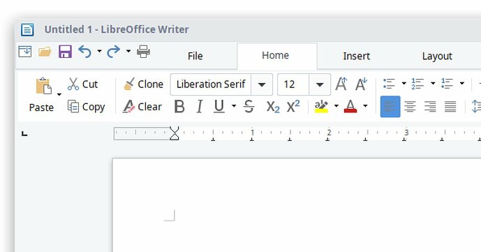
LibreOffice looks DATED and PIXELATED. Is this intentional?

I’ve have tried downloading 6.1.5. and 6.2 onto my Microsoft Surface Pro Notebook

It uses Windows 10, 64-bit.

The icons IMO look like they are from a very early version of Windows.
Is this intentional?

I don’t think it is. I imagine it is more likely to be my notepad settings.

UPDATE: I appear to be having issues with Java…could this be related??

(more pixelated than this but I don’t know how to add images, sorry!)

Please help.

Thank you

(Edit: activated screenshot -AK)

UGLY and OLD are personal subjective opinions. I don’t think tastes have their places here. In principle, LO comes with a choice of icon sets from which you select the one you like best. Some of them are inherited from the OS. So, blame the desktop designers.

For my own purpose, I avoid ribbon interface which discourages from learning the “right” (maybe also subjective!) usage, i.e. working with styles only. With styles, you can get rid of the ribbon and allocate maximum screen estate to the document, not to ancillary buttons and tools.

Apart from tat, a subjective question will yield subjective appreciations from pros and cons viz. such and such icon family, losing from sight the ergonomy and usefulness of the application.

fair points ajittoz, I have edited my question accordingly. Thank you for responding

(I’m also looking old and probably ugly. It’s not intentional. It’s due to age in my case.)

I’m, however, actually doubting some usage of categories. An Office suite should work well, and its interfaces should be clearly structured and easily handled.

If you are discontented insofar… From the image I cannot clearly judge what is due to the means you used to get and post the image, to the scaling probably, what I would see on your screen, and what actually is annoying you. Of course, the image as I see it looks a bit like graphical Mac UI or ‘GEM’ from the early 1990ies. On my screen LibO looks much better. No MS Surface Pro at hand.

Are you using OpenGL for the rendering? Did you already experiment with all the available view related setting?

LOOKS AREN’T EVERYTHING…

.

The ultimate answer for @JimboB1 could be a picture???

.

Thoughts of a simple office user

.

(I could not link the image directly so you have to follow it.)

.

BTW: The design could be better, and hopefully design will follow function. :wink:

Very fair comments…i have updated my text to be slightly more instructive and much less subjective :stuck_out_tongue:

(Thats the second time I’ve tried to do that which should give you an indicator of my technical competency)
Which neatly leads me onto my inability to link a photo…I have a screen grab saved on my desktop…but I don’t understand how to link it :frowning:

I have played with all the views and after comparing them to online screenshots…they all seem out of whack…

I suspect it is an issue with my desktop
I am now experiencing Java issues and have a JRE

There are both images and SVGs of the various icons.
In your case it looks like the small images are being used which are then appearing pixilated.
On my phone at the moment so I cannot look deeper.

I think there is a setting which affects the use of SVG icons.
Don’t remember for sure and cannot look at the moment.
Perhaps one of the other helpers here can point you where to check some settings.

Well, I just installed LibreOffice and found the same ugly pixelated icons, but if you go to Tools, Options, View, you can change the icon styles to something much better.

The only flaw is that the tick marks in the View menu indicating the active menu bars are still hideous shapes that have been zoomed and stretched from much smaller icons. Is there any way to change those?

This is not intentional. Go to Tools> Options> View, then change the icon theme to any theme that says (SVG)

1 Like