Font kerning applied by Writer

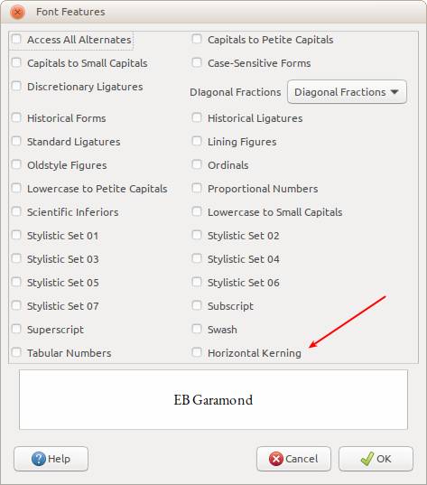
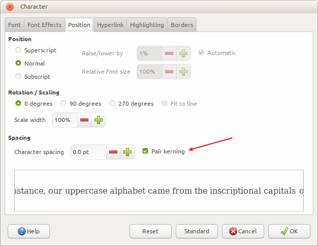
Hello, I used LibreOffice for more than 6 years and every year it gets betters and more stable, and recently I started reading about typography, and the most important feature for writing is kerning, to activate it I found two places : the first is in Character>Font>Font Features dialog and the second is in Character>Position, my question is what is the difference between them and how they work, and what kind of letters spacing they apply to text : Metric or Optical ? and what happens when they are both activated ?


image description

Kerning as OpenType feature (+kern, the option in your first screenshot) is enabled by default in every font I know, so you should not worry about it: it will be always applied. Turning out the option in your second screenshot has, it seems, the same effect of adding :-kern to the font name, that is, it disables the kerning rules defined by the font. Just keep the second option on and everything will be fine.

The second screen shot is related to character style… It allows to temporarily override global settings for the font. For example, if you want a word laid out with extra large inter character spacing, you’ll set extra space through the character spacing parameter. This will be applied only to the sequence so styled. The rest of the document will be composed with the font parameters.

So, IMHO, the dialogs have different purpose: the first one controls the OpenType features in a more user-friendly way than the +/-keyword added to the font name, the second one is just a style setting for a designated range.

But OTF feature Horizontal Kerning is always (unticked) disabled and Pair Kerning is the one that is enabled (ticked) by default !
If we keep the second Pair Kerning enabled that means the correct kerning rules made by font designer inside OT font will all be ignored !

For the time being, I have almost no experience with OT fonts, or rather I don’t use the selectable variants because my documents don’t call for such “decoration”. However I’m in tha task of reviewing and editing my templates, so maybe I’ll experiment with them.

I’ve only used up to now the character spacing and pair kerning when I wanted to stretch or shrink a specific word.

@medmedin2014 the dialog on your first screenshot is a bit (or a lot!) misleading: the fact that an option is not selected doesn’t mean that’s not being used. In fact, you can see there that the standard ligatures are not selected, but I bet they are used! Also, on EB Garamond the old style figures are also enabled by default, but that option is not checked!

@RGB-es thanks for your explanation, another thing how can I know which opentype feature is enabled even it’s not ticked ? and does the kerning provided in the first screen capture corresponds to metric or simply to optical kerning ?

@medmedin2014 LibreOffice use the kerning pairs defined by the font file so you get what the font developer provides. High quality fonts define a lot of pair kernings manually, while the others use some automatic algorithm to define the kerning tables. Don’t worry too much for the difference: test your fonts by printing some text (never trust what you see on screen) and if you like the result, then it’s a good font. Bad kerning is easy to spot! (1)

There is no easy way to know which OpenType tables are used by default, other than asking the developer. Generally speaking, all fonts should use standard. required and contextual ligatures, kerning and a couple of options used for diacritic positioning and non Latin scripts. For the rest, it’s up to the font developer so you need to check the font documentation for more information. That’s particularly clear with numerals: some use proportional, some use tabular, a couple use old style…


(1) https://www.xkcd.com/1015/

BTW, I just filled this feature request:

Bug 126755 - [Font Features dialog]Show predefined OpenType tags

and this bug report

Bug 126754 - Wrong OpenType tag for fractions in “font features” dialog

Be careful with that dialog :slight_smile:


Also, if you don’t mind the self promotion, my free book about Writer have a full chapter about typography :wink:

@RGB-es Thanks really for your well explained replies :wink: you are really big help.