
I have a Calc bar chart with long labels for the x-axis. Even though there is plenty of space between the chart wall and the axis to show even the longest label, the label text is truncated.
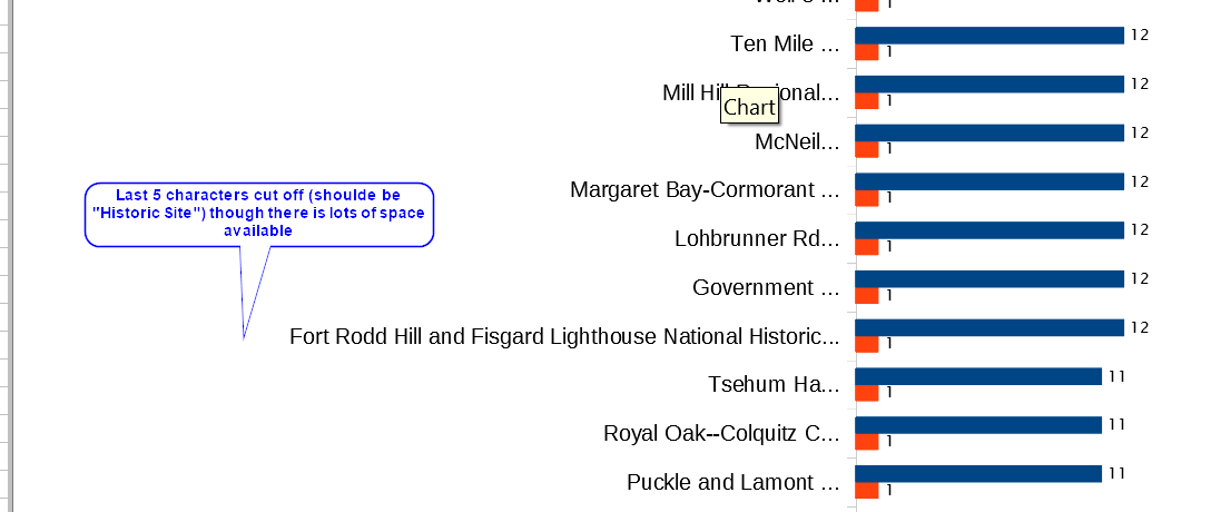
I can’t find any way make it show the whole label. If I drag the chart area smaller, the label just moves over and is still truncated. Even using a tiny font doesn’t work; the labels are tiny and still cut off. On the spreadsheet the column containing the labels is wide enough to show the whole label (if that matters).
Is there any way to keep the labels from being truncated?
Update 2019-10-06: I found that if I add 4 spaces at the end of the text, then a non-space character, all of the label is visible, though the ellipsis (…) is still displayed. If I just add 5 spaces, it does the same but the spaces tend to mysteriously disappear; the non-space character at the end prevents that. The extra spaces and the non-space character are not shown on the chart, since the last 5 characters are still cut off. It’s not an elegant work around, but better than nothing. I would still like a better solution.
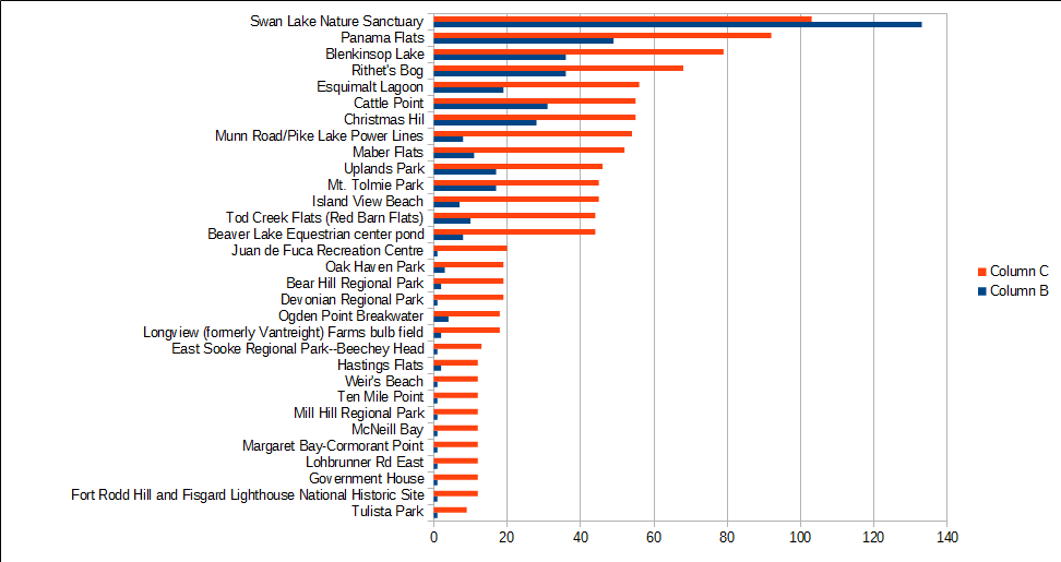
2019-10-07: I have now added the spreadsheet file, with a reduced set of data. I noticed while I was resizing the chart to make it readable on a smaller screen that the number of characters cut off the label changed. No amount of resizing after that would return it to the 5 character cut off, or eliminate the cut off part.
