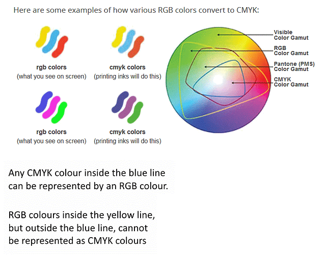
There is no solution to this problem and it is way beyond LO.
Colour handling in computers is based on additive synthesis from three primary colours R, G, B. There are several models (colour spaces), each with its own primaries. For instance, NTSC and CCIR (former analog TV) cannot be converted exactly to each other because all their primaries are different; some colours cannot be represented in the other space.
Think of the primaries as defining a triangle with a specific point inside being called the “white point”. The standards define the coordinates of the vertices of the triangle (a gamut).
The standards for computers roughly agree on the R and B primaries and largely differ on the G primary. A popular colour space i sRGB which i contained inside ColorMatch, itself fully enclosed by Adobe RGB 1998.
That(s for theory. Now for the practice.
A screen device must implement the primaries. Unfortunaltely, there is no material matching exactly the primaries.
CRTs use electro-luminescent powders, but their triangle is not equal to the standard gamut: it is fully contained inside the standard gamut. Every maker has his own recipe for the powders; consequently, different brand CRTs won’t render a “mathematical” RGB the same. However, the white point can be tuned rather precisely thanks to analog settings in the electronics.
LCDs offer a much worse rendering because they use filtering. Everything start from a white light source (either provided by cold cathode tubes – CCTs – or by LEDs). This white source is rarely (never?) equal to the white point and you can’t adjust it because the spectrum cannot be tuned. Then you have filtering cells with coloured dyes obscuring part of the white light. Defining a dye bandwidth is much more difficult than making an electro-luminescent powder. The net result is the gamut of an LCD display is much smaller then a CRT one.
Another aspect to take into account is “amplitude response” (technically called the gamma). When you send an excitation to your display, the device responds approximately as x ^ (1/gamma). This can be partially corrected by sending the device a gamma table to compensate for the screen non-linearity. However, LCDs have a strong tendency to quickly rise to saturation. It seems difficult to have a balanced rendering between dark tones and light tones (the latter becoming preponderant). This fact leads to artificially darken a picture (which will then be badly rendered on CRT and also on print). Gamma correction is extremely difficult on LCDs because they are practically full digital without possibility to separately adjust the primaries (single white light source!).
Colour in printers is base on subtractive synthesis. White light is the paper, but there are so many papers and so many “whites” that discrepancy start here. Patches of ink are then deposited on paper and previous ink layers. Due to the subtractive nature, primaries are different from light emitting devices: CMY. Usually K (black) is added because the CMY combination results in a brownish tint. Once again, CMY defines a gamut and you can easily imagine this gamut is quite different from RGB.
The colours which transfer well to print are those in the intersection of RGB and CMY. All others must be artificially rendered in a false color (the closest on the boundary of the hexagonal intersection?).
There is also the problem of the inks. I guess CMY have a precise colorimetric definition but ink makers surely don’t provide the exact tints. And you also have divergences between makers.
An improvement has been attempted through printing with more than 3 (4 including black) inks. Driver processing becomes very sophisticated but colours still can’t be rendered exactly.
To circumvent this difficulty, device properties are recorded in so-called ICC profiles. Software can use the profiles to automate conversions, but conversions are valid only inside the gamut common intersections.
As a conclusion, don’t trust your screen, your eyes and your printer. You might succeed creating colours which print as you’d like (but having something twisted on your screen). However, the file may not print the same on another computer with a different printer or even the same printer with a different cartridge brand.
Final note: the 4k and 8k TV standards have defined a considerably larger gamut with primaries outside what the eye can see. I doubt that we can yet find screen conformant with this colour standard. This would solve the display part of the problem, but not the print part.

