
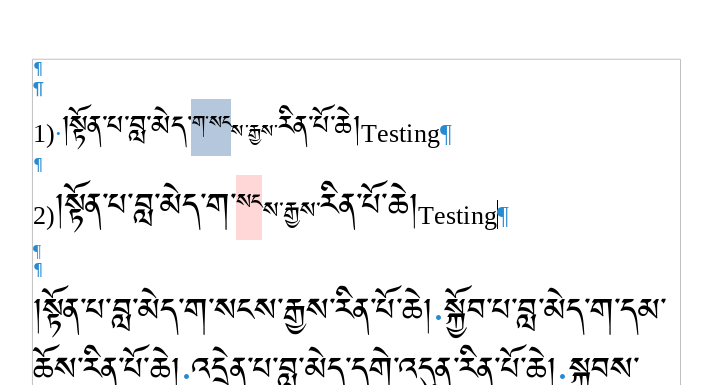
How can I fix bugs with line spacing smaller than 1(single) in fonts where the baseline is at the top of the letter? In my case it is happening with tibetan fonts. In this screen shot screen_shot.png number 1 is a tibetan font aligned with english, but for tibetan sometimes is not good because different sizes of tibetan are not aligned. Number 2 is not aligned with english, but for tibetan is good. The bug appears with font number 2 in the paragraph below, when the first two lines of the paragraph overlaps.This bug is also reported with Arabic fonts here: Bug #1772430 “[upstream] Proportional line spacing under 100 % m...” : Bugs : libreoffice package : Ubuntu
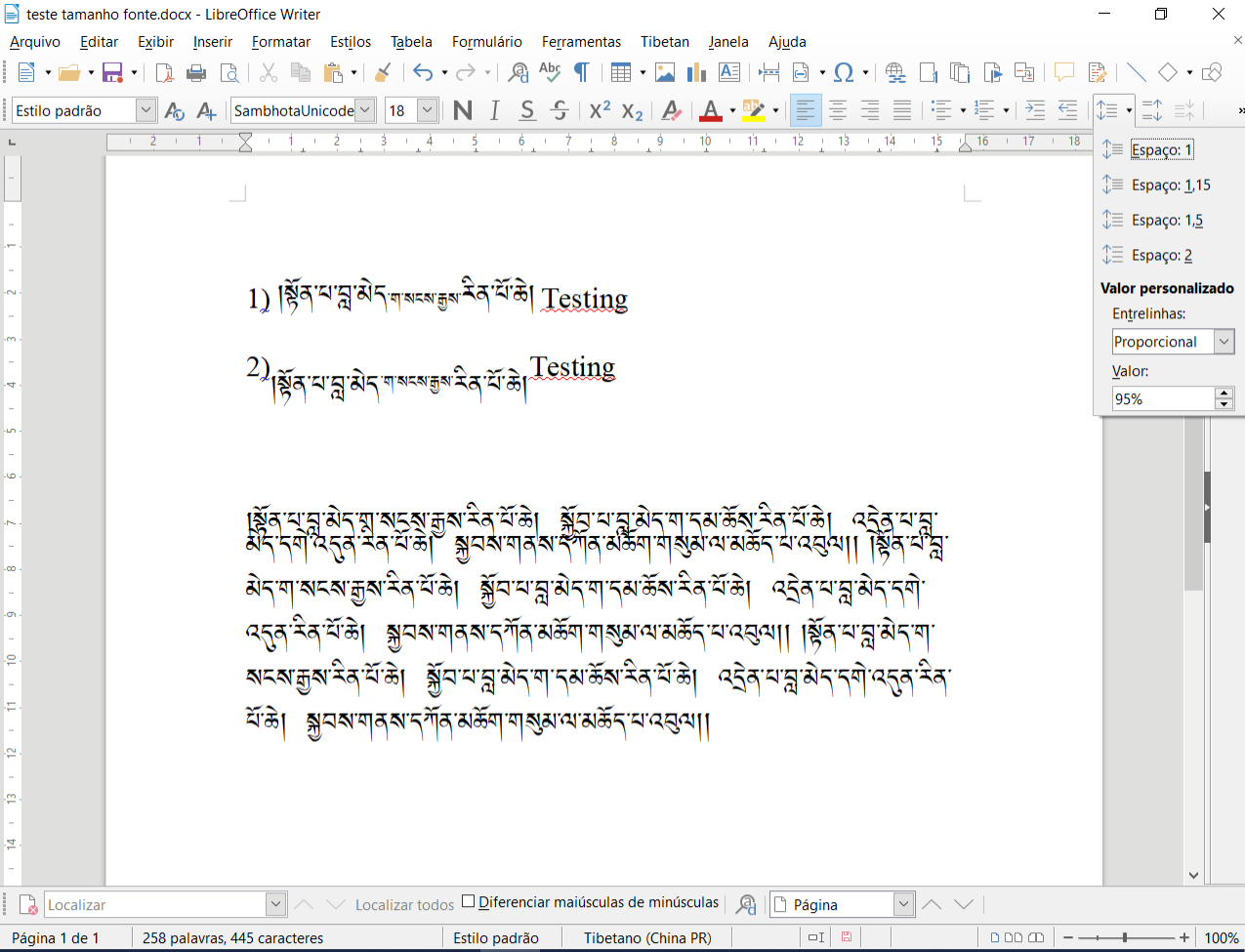
A sample file is here: teste tamanho fonte.odt . In order to display correctly, download the free font TibetanMachineUnicode from PKTC - Software Downloads . Microsoft Himalaya font already comes in Windows.
Since this may be a bug, edit your question to provide OS and LO version.
The Ubuntu bug report is about 5.4.6. Here with 6.2.8.2 (and i am not at latest release), I don’t experience the bug. Since I had to change my preferred font, I routinely use an 80% spacing factor to revert to my previous page layout. I didn’t notice such a behaviour. Therefore, it is very important you describe your technical context.
I did another test with 4.1.6.2 on a paragraph containing common English sentences! no problem.
Edit your question to explain what you mean with “in fonts where the baseline is at the top of the letter”. Better, attach a sample file with the unexpected behaviour.
Thank you for the comments. I edited the question. I am using Windows 10 (64) and LibreOffice 6.3.4. But it seems to be a general bug.
I notice that your file is saved as .docx, mening it needs two conversions: one when saving and another one when loading the document. Though I doubt there may be a change, what happens when saving as .odt native format?
Are the Tibetan fonts the same in both case? Case 1 seems to have its base line at bottom and layout is a logical consequence of it. In case 2, base line is at top.
The only way to move vertically the base line is the use of the super/subscript attribute. Since you are using several font sizes, I’d suggest creating several character styles (one per font size) with the adequate superscript parameters.
CAUTION! This will not translate correctly to .docx because Word has no notion of character style. Consequently a round trip will ruin the workaround.
Attach a sample file so that I can experiment.
I attached a .odt sample file. The bug remains. Yes, case 1 and case 2 are two different fonts, although with the same glyphs. Thank you.
Mac 6.3.1.2 line spacing only single or double available. Proportional same. all styles
??? Is this a “no-problem with my configuration” answer or an additional comment on OP’s question? Please elaborate, I don’t understand how it is related.
After experimenting, I conclude that in Tibetan fonts, the base line is indeed at the bottom of the glyphs, as is usual in computer fonts. This may be a big mistake relative to Tibetan script composition, but this is how the fonts seem to be designed.
Consequently, Writer does its job as usual, not aware of the specific script rules, that the baseline is in fact offset from the bottom.
Nevertheless this can be compensated at the cost of manual preparation. Look at my fix:
Note: I didn’t download the real font; apparently my Linux box has a substitute for it. The glyphs may not be exactly those expected, but it is sufficient for the experiment.
I selected half the smaller sequences, so that I could have a reference with the unmodified characters. I reverted the selected sequence to the size for the paragraph, i.e. 24pt for case 1, 28pt for case 2.
I then designed two character styles only defining the Position attributes for Superscript. I played with the Relative font size and manual Raise/lower by. I also added a Highlighting colour so that I could visually identify the “touched” characters. These styles were names Sup24_16 and Sup28_20 reminding the sizes (paragraph vs. sequence).
After several trials, I ended up with relative size 67% and raise by 14% in both cases. I think I achieve approximately the same size as the original sequences.
The fix is: define your own character styles, one per relative size (in case you want several smaller “citations”).
Type your paragraphs in your “standard size”. When you want a smaller sequence, use the required character style. At end of sequence, revert to initial size with Default Style character style (not paragraph style).
If you are not familiar with styles, read urgently the Writer guide: I don’t think you can handle the Tibetan script constraints outside a systematic use of styles.
I also noticed your sample is exclusively written in Default Style paragraph style with empty paragraphs for vertical spacing. This means all your stylistic variations are made manually, which is the surest way to face unmanageable difficulties when editing document formatting.
To show the community your question has been answered, click the ✓ next to the correct answer, and “upvote” by clicking on the ^ arrow of any helpful answers. These are the mechanisms for communicating the quality of the Q&A on this site. Thanks!
In case you need clarification, edit your question (not an answer) or comment the relevant answer.
This is a good solution.