Custom cubic spline smoothing equation for line in chart?

Can a line equation be altered?
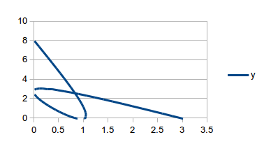
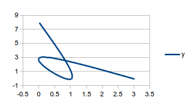
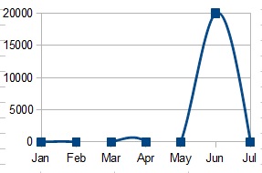
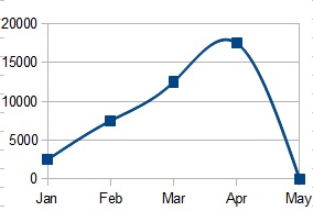
I have a smooth line, XY scatter chart using a cubic spline equation, the problem is that the cubic spline equation produces negative values when plunging to zero. When graphed, this causes people to wonder “how do you get a negative number of widgets”, or the graphline vanishes and reappears as it goes microscopically above and below zero.

Is there a way to either “override” the cubic spline equation with my own (identical, except with a if y<0 then y=0 line), or to create my own equation along the lines of:

M_Bison_Cubic_Spline(passedinfo)
    y=LO_Cubic_Spline(passedinfo)
    if y<0 then y=0
    M_Bison_Cubic_Spline=y
End function

Then how would I tell my ochart=blah.Charts(0) to use my custom equation? Am I completely off-base here? I know I’m mixing and mangling terminology, let me know if I can help clarify this.

Lastly, everyone keeps saying “you get what you pay for” and stuff like that… It’s B.S. Your software and support has been invaluable (this is my first question that I couldn’t find the answer to), so thank you.

1 Like

This can be demonstrated by making a XY Scatter graph (smooth lines, lines only) of (0,0,0,0,0,2,0). It’s not a bug in the equation, just a counterintuitive rendering.

First - thank you for your response (sorry about my slow re-response). You started me down a path and I wanted to pass along my story for the next person. Just to reiterate my problem - if you graph “people doing the Harlem Shake”, a 0,0,0,0,0,20000,0 graph, smooth lines, it looks like this…

squiggling graph 1

… which would lead a reasonable person to ask - who were the outliers? - even though there were none (zeros). I have seen other people ask the same question, why do the “smooth lines” equations oscillate so much? Here is an example of four points in a straight (Y=MX+B) line and one that is not…

squiggling graph 2

… you would expect that the Jan-Mar range would be straight, that the curve would start from Mar-Apr and continue in Apr-May. So, I think this is something that would, well, look better with a modification to the equation.

As for your earlier suggestion, I noticed in the source code for the Improved trend lines (CorelPolyGUI) extension, there was a “Spline.java” file. I added a line

if (Ynew[j]<0) Ynew[j]=0;

, compiled it, added the class to the appropriate .jar file, and … discovered that the whole extension isn’t compatible with my version of LO (version 4). But then I figured out a workaround for my particular problem. If my data is in columns A-G, I have created a second copy of the data in columns N-T that turns 0,0,0,0,0,20000,0 into “”,"","","",0,20000,0. This graphs nicely for me.

… So, I found a workaround that works for my particular situation. Should I mark this as solved, because I’m happy even though I think there is an underlying suggestion that may help make these curves prettier?

Thank you again!

Well done. Marking as correct is up to you. It depends on your satisfaction level. Altering the question to make it address one specific factor (cropped curve or curve equation) might help. In answer to this: “you would expect that the Jan-Mar range would be straight” I do not think this is possible because Mar-Apr are also on the same a straight line as the earlier value, yet Apr needs to be at a the apogee of the curve. This can only happen (in spline curves) if there is a slight dip b/w Feb-Mar to point above Apr when the line exits Mar. Spline smoothing inevitably causes this kind of wobble in the line. While it is mathematically possible to curve the line after exiting Mar, I don’t think the spline equation caters for this. I could be wrong here though. I have edited your post to place the graphs on the AskLO server. I will also mark your question and response up. Thanks for contributing. This has been an interesting discussion.

“yet Apr needs to be at a the apogee of the curve”… but its not! If you look closely, the apogee is before Apr. If I were to make a smoothing function, I would make it like this:

First, if y(x2) is greater than both y(x1) and y(x3), or <, then it should be the apogee - the instantaneous slope at x2 should be 0. If y(x2) is between x1 and x3, the instantaneous slope at x2 should be the slope of the x1-x3 line. Then I would adjust a sinusoidal curve between each pair or xs, fit to their slopes.

Good point. Sorry I missed that first time (bad day yesty). I have just realised there is a heap of detail in ODF v1.2 specification, Part 1, under 20.26 chart:interpolation that indicates the formulas used. Cubic splines are detailed pp.693-694. I can’t replicate it here in the comment due to formatting :frowning: Bug fdo#37889 implemented this detail (code commit included). Bug fdo#47787 is seeking to correct B-spline interpolation (so evidently it was not perfect first time). Bug fdo#53875 was an attempt to get the B-spline formula changed but was closed as WONTFIX due to the requirement for spec conformance. I think, if you made your case clearly, that an “enhancement” could be proposed to have the cubic spline interpolation formula altered / improved. Can you have a read of the spec and comment here again with your thoughts? Feel free to provide a further answer instead if you like (with greater detail), as it is good to have the information publicly available for all. Thanks.

I looked at the ODF spec and thought about dusting off the ole’ math books on series (some things are easier to decipher as code than as pure math equations). Then I looked through the bugs that you had listed, and bug fdo#53875 explained exactly what happened. Allow me to paraphrase:

…Guy1 popped on and asked, “What happened? The smoothing equation used to work, but now it doesn’t. The BSpline and Cubic Spline are now identical, and neither of them work how you would expect them.”

… and Guy2 answered, “I know. I could easily make something that looks better. The problem is that in the ODF document, the cubic spline equation is well defined - as that. If we were to change it, it would no longer be a cubic spline.”
So, I think they were waiting for permission to include a new smoothing function. I grant it! Include a new non - spline smoothing function! Make a third option! Power to the people!

I completely agree, although it would be good if some of those involved in the original correction could comment. Currently the chart:interpolation attribute is specified as having the values “b-spline”, “cubic-spline”, or “none”, so I imagine this could be extended to cover other smoothing algorithms (Wikipedia). What I am not clear on is the relationship between these general algorithms and the smoothing spline (Wikipedia) group, which the b-spline and cubic spline appear to be two sub-types. Please go ahead and raise an enhancement bug if you have a specific smoothing function in mind that you would like to see implemented.

I invited a few people from the discussions you mentioned to have a look here. Maybe they can shed some light on where (if anywhere) we should go from here.

I am not entirely certain this is the problem you are having, but does adjusting the axes offer a solution? Given a series of X-values: 0,1,0,3 and corresponding series of Y-values: 8,0,3,0 and charting these values using a line with cubic spline smoothing I obtain this chart:

Cubic spline smoothing, default

As can be seen, the line is cropped when the zero values are graphed because the line smoothing forces the line beyond the edge of the graphed area. By editing the chart and adjusting the axes however the entire curve can be displayed e.g.

  1. Right-click on chart > Edit….
  2. Right-click on X axis > Format Axis….
  3. Scale tab > uncheck “Automatic” against Minimum and enter -0.5.
  4. Positioning tab > set Cross other axis at to “Start”.
  5. Click OK.
  6. Right-click on Y axis > Format Axis….
  7. Scale tab > uncheck “Automatic” against Minimum and enter -1.
  8. Positioning tab > set Cross other axis at to “Start”.
  9. Click OK.

The result should allow the full curve to display more clearly:

Cubic spline smoothing, adjusted axes

The main disadvantage is that the axes are no longer zero-based. The Improved trend lines (CorelPolyGUI) extension may offer further / alternate methods of addressing your problem.

Currently the spline interpolation is an interpolation for 2D curves, considering x-direction and y-direction equal. So you can draw spirals and loops. It is not designed to be used with functions.

You are likely looking for a functional interpolation, where the points, which are added by the interpolating algorithm, behave the same as if they were true functions points, and where y depends on x. Such interpolation does not exist in LO. But I agree, that such kind of interpolation is needed. There already exists suitable code in OOo1.1.5 using splines, but other ways are perhaps better. If LO has an implementation it will be possible to get it later on into ODF standard.

So for now you cannot avoid the deflections (not sure whether it is the correct term). You will need to calculate the line yourself, for example by using a macro. One way to do so is, to write the table for the points of the interpolating line into the spreadsheet by your macro and add these points as data series to your chart.

Added as a bug/enhancement at https://www.libreoffice.org/bugzilla/show_bug.cgi?id=71799. Thanks!

I have confirmed the bug. Thank you for clarifying this Regina. Much appreciated.