Chart clustered by month

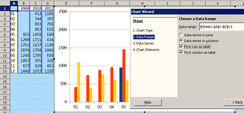
I’ve been searching the topics and I can’t seem to figure out how to do this. I have a simple two column spreadsheet and I want to create chart that where the bars are clustered by month.

The spreadsheet is in the format of

mm/yy data (the mm/yy column is in date format)

and I simply want a bar chart with the months along the x-axis and in the first group I would have 01/09, 01/10, 01/11. the second group of bars would be 02/09, 02/10, 02/11 and so on. Is there a tutorial or instructions on how to do this seemingly simple task?
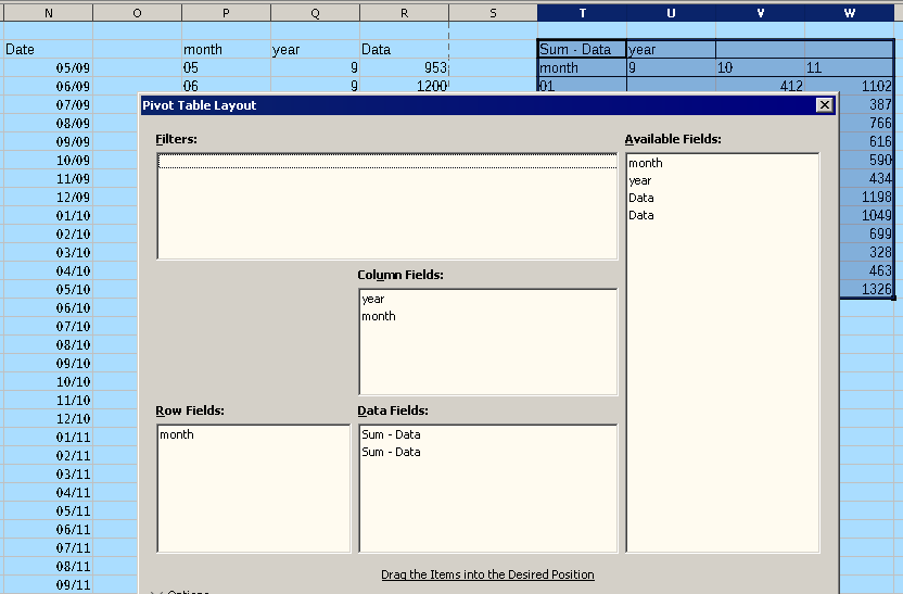
05/09 953

06/09 1200

07/09 1763

08/09 2074

09/09 1249

10/09 1063

11/09 837

12/09 1448

01/10 412

02/10 744

03/10 883

04/10 963

05/10 1458

06/10 1711

07/10 1937

08/10 1784

09/10 1385

10/10 855

11/10 928

12/10 1072

01/11 1102

02/11 387

03/11 766

04/11 616

05/11 590

06/11 434

07/11 1198

08/11 1049

09/11 699

10/11 328

11/11 463

12/11 1326

I think that is better to reorder data, using columns for years and rows for months.

EDIT: To sort the data by date, you can copy the column of dates, and paste (in the image: column P) as unformatted text (Ctrl+Alt+Shift+V, the same that menu Edit - Paste Special - Paste Unformatted Text), and select Separated by /, OK.

Select dates and data in columns P to R, and use menu Data - Pivot Table to order the data.

Tested with LibreOffice 6.4.7.2 (x86); OS: Windows 6.1.


Add Answer is reserved for solutions. If you think the answer is not satisfactory, add a comment below, or click edit (below your question) to add more information. Thanks.

Check the mark (Answer markCorrect answer mark) to the left of the answer that solves your question.

Can I use a pivot table on my existing spreadsheet and convert the “mm/yy” field to the appropriate “YYYY” column and “MM” month? Or a better question might be how do I convert “mm/yy” into separate “mm” and “yyyy” columns?

Thank you.