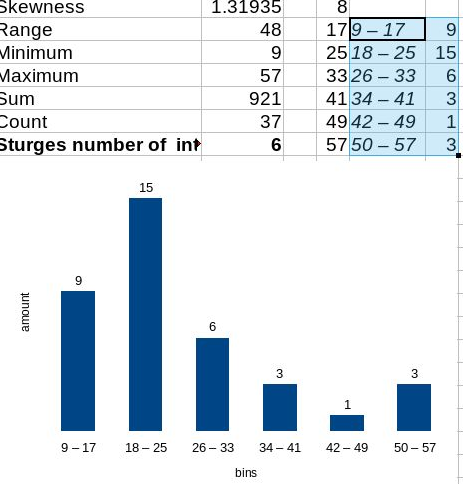
Why is there not a histogram option in the chart wizard? This is one of the most common kinds of chart used in data analysis. The best I have found is some long winded approach using the FREQUENCY function. However, often one just wants to quickly check the distribution of some data (to see if it is normal for instance).
There seems a good opportunity to steal a march on a well known competitor here. The histogram options in MS Excel are pretty inflexible. In particular I have not found a way to set specific bin ranges, which one would often like to do with continuous data. The Analysis Toolpak has gaps between columns, which is not appropriate for continuous data.
It would be great to have something available in LibreOffice which was mouse clicks away, but also post-create configurable. That is, it would recognise whether the data was discrete or continuous, automatically choose appropriate bins, but then give opportunity to specify them after.
I teach a university introduction to stats module. It would be great to be able to use LibreOffice Calc, but it is without a histogram wizard, so I have to use Excel (and it’s substandard histogram wizard). I like to promote open source software, and this would be an ideal opportunity (and I would not have to boot into a sub-standard operating system 

