Any way to close the gap between Asian paragraph text and furigana/ruby text?

(Libre Writer 4.1.6.2, Windows 7 32-bit English)

So I’ve been working a lot with Japanese fonts lately, and, as with many decorative Latin fonts, there is often a whole lot of unnecessary vertical space built in to the fonts. Unfortunately, due to the very blocky nature of the Japanese (/Chinese/Korean) language, it’s extremely unnecessary, so I would like to figure out a decent way to “remove” the extra padding from within a text document in Writer. This padding is also negatively impacting furigana/ruby text (aka “Asian phonetic guide” text), because the furigana will actually appear at the edge of the font’s border, including padding, meaning that with certain fonts the furigana can be floating several millimeters above the actual character it’s supposed to be attached to, sometimes even being closer to the characters in the previous line because of it. For example:

rendering of furigana/ruby text

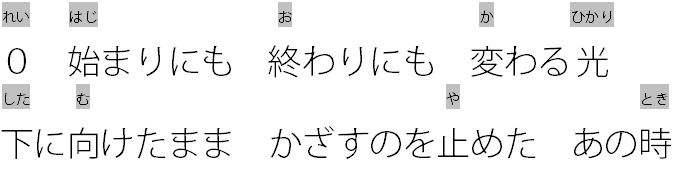
The font in question is 小塚ゴシック Pro L, I think the “English” version of the name is Kozuka Gothic Pro L, it’s an OpenType font. The grey borders in the furigana should give you an idea of how extreme the padding is, and I need to somehow artificially eliminate all of it in order for furigana to work properly. I had this same problem with OpenOffice before, to be honest, and it never got resolved then. Here is a visual illustration of the problem:

visual illustration of problem

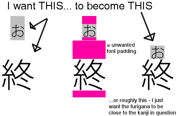
Editing paragraph lines WILL NOT work, because that only applies to the bottom edge of the lines in question. I basically need the TOP edge of every line to be editable in a similar manner.

I dont understand. Don’t you want the Furigana to sit closer to the line of text beneath it and these lines of text to sit far enough apart to clearly indicate the association? The grey leading seems to be at the top of the Furigana. Would increasing / fixing the line height of the main text help? This is usually how the default leading in a font is adjusted.

EDIT: Thanks for clarifying with an example screenshot. I have created a basic test here using the ヒラギノ丸ゴ Pro W4 (Hiragino Maru Gothic Pro W4) OTF font that ships with Mac OS 10.6.8. It seem to have an unusually large Leading metric, so perhaps Asian fonts are designed to cater for additional space requirements, such as that demanded by ruby text? Certainly in LO the ruby text is included within the overall line height metric such that reducing the Line spacing appears to crop the ruby text e.g., underlying paragraph text highlighted in pale grey and ruby text in slightly darker grey:

Hiragino Maru line spacing 28pt

Hiragino Maru line spacing 24pt

If the the Japanese paragraph text from the second example is set in WenQuanYi Zen Hei:

WenQuanYi Zen Hei line spacing 24pt

… the large leading is reduced to a more expected level. This may indicate that the problem is font-related. Adjusting the Position (e.g., superscript / subscript) of either the paragraph text or ruby text also offers no effective workaround for closing the gap between the two related lines of text.

It appears this limitation is described by bug fdo#44784 (and also fdo#68735 and fdo#83145). It requires a CJK expert to accurately determine what the rendering metrics should be for the various locales / scripts.

Here’s a mockup of what I’m trying to accomplish: http://puu.sh/bu7g0/d7c816cae7.png
The top padding is exactly what I’m trying to remove, but adjusting the line height only adjusts from the bottom edge of the font. And here’s an example of a font with “proper” vertical spacing: http://puu.sh/bu7L2/35af60bf51.png

Could Menu/Format/Paragraph/Alignment - Text to text - Alignment help?

Nope, all that does is shift both the primary character and the furigana down together, only in instances where there are furigana, so it completely demolishes the character alignment in each line. http://puu.sh/buXK2/2856d68810.png My understanding of how furigana works in LO is that it creates a “subline” attached to the primary line (on a per-character basis), and adopts most of the font properties from that line/text, except for placement/size, but they are treated as a single “character”.

For the record, adjusting line spacing doesn’t work, because it doesn’t affect the furigana at all - it just pushes up the text in each line from the base line, which winds up actually pushing the furigana even closer to the line above it without bringing it any closer to the line it’s supposed to be on.

@wohdin, yes it appears CJK font designers include a large Ascent metric to cater for Ruby text and that LO cannot adjust this without impairing the visibility of the Ruby text. I will update my answer.

It’s most definitely a font-specific issue, because I only encounter it in certain fonts. A font I recently worked with, HGゴシックE-PRO, didn’t have this issue, but even fonts that appear to be in the same series seem inconsistent, which makes me think that it very well could be an intentional design. Thanks for looking into this and giving a thorough explanation, though. If there were a way to edit fonts individually to fix this, it would be manageable, but I don’t know if that’s even a thing.

@wohdin, as a workaround, you could certainly try. I tend to use FontForge but there are other applications that will likely do the job. Perhaps try reducing the general Ascent metric?