Problem with cross-platform font spacing in all LO apps

The problem: spacing between lines of same font different in Windows than in Mac/Linux
Our company has users with Windows, Mac and Linux versions of LibreOffice. We love the cross-platform compatibility. However we have run into a big issue: in Windows, the spacing between lines of the font Titillium is far bigger than in Linux / Mac. This makes our .odp-files useless in Windows LO, because text does no longer fit in its text box and/or on the page, so this is a huge cross-platform issue for us.

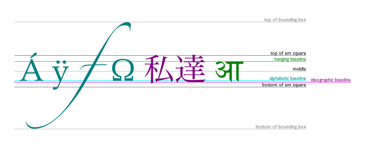
This is the difference:

Probably vertical font metrics issue, unclear whether this is an operating system issue or a LibreOffice issue
I have Googled as well as I could and found that this probably has to do with the rendering of vertical font metrics. However, it’s unclear to me whether this is an OS or LO problem. For example: “The vertical metrics parameters in the font file are used by application software when it renders text to the screen to determine how to position lines of text relative to boundaries above and below, and one line of text relative to the line above or below. So though an application calls OS routines to render a string of text (character, or string up to an entire line), it is the application that determines the vertical positioning of that text, and hence the space between lines of text.” (source)

If it is an LO issue, any suggestions?
If this is a problem caused by LO, is there any way to circumvent it so that .odp files render the same in Windows as they do in Mac/Linux? I have some reason to believe it is at least partially a LO issue, as MS PowerPoint renders the spacing between the lines differently than LO, when I open the .odp. Also, Firefox on Windows and Ubuntu render the font identically.

If it is an OS issue, any suggestions? In that case, I realize this might not be the place to ask for a solution. However, if there’s anyone with suggestions for a workaround or how to edit font vertical metrics succesfully, I am very open to those ideas.

Thanks a lot!

Thank God someone has noticed this! Alex’s response, after some testing, I see is a fix that is not workable most of the time. After trying several fonts (besides the one I must use for my work product) that are the same on both platforms, I only found Arial to render identically. IT IS NOT AN ACCEPTABLE ANSWER TO SAY, USE ARIAL.

If this has not shown up regularly it is merely because not too many people are using Linux and Windows for interchange or they live with the annoyance.

I’m experiencing the same problem with the Trebuchet MS font… and font/spcing is rendered differently between Win 10 and Win 7 as well as Ubuntu… I’m using v5.4.4

Hi SC

I’ve recently been going through a very large number of questions on this site. This is the first time that I’ve come across your issue. In addition, in the very small number of cases where there has been a difference reported between OS it has always been that win + linux were the same & it was mac that differed.

I do not have a solution, but I do have a test which may help illuminate the entire issue:- take some pages which dramatically illuminate the issue (such as illustrated in your OP) & produce a PDF from the same file on all 3 OS. Look then for any variance, both within & between OS. All 3 PDF should be identical.

You mention Titillium as the font. Is this the only font showing an issue? (if so, drop it).

You may want to check out the Ahem font, explicitly designed for html writers to make tests.

Finally, this graphic from the w3.org will be useful in preventing misunderstanding in terminologies during font discussions:-

TextBaseline keywords:

  • top: top of em square
  • hanging: hanging baseline
  • middle: middle of em square
  • alphabetic: alphabetic baseline
  • ideographic: ideographic baseline
  • bottom: bottom of em square

30 August update:

Are you stijncornelissen in libreofficeforum? I hope not (though suspect you are) as you will then have someone else to consult with. It does seem to me that the quick answer is “use another font”.

If this helps then please tick the answer (:heavy_check_mark:)

I have the very same problem here. With 2 different fonts: Trade Gothic Next (a well-known and high quality font by linotype) and a university specific font (I guess it is purchased by linotype/monotype as well). It is a big issue for me. OSes: windows 10+libreoffice 5.1 and opensuse leap 42.1+libreoffice 5.2