
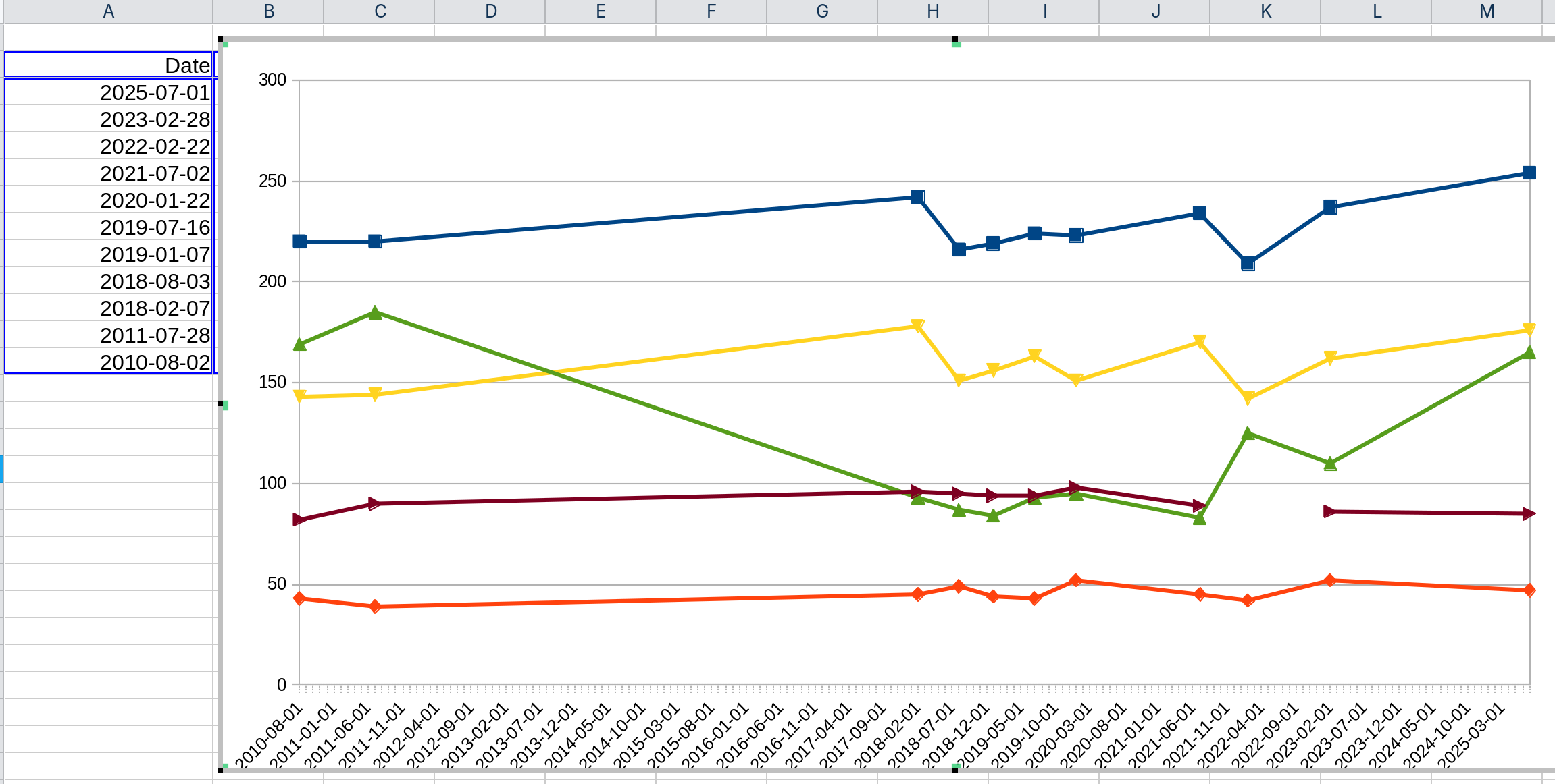
I have several data series mapped in Y axis and 11 dates specified on the X axis. Chart creates the graph correctly but it fills in tons of extra filler dates in between my 11 values. How do I prevent this?
Please always attach your example file in such a case.
We can’t see your settings for the diagram.
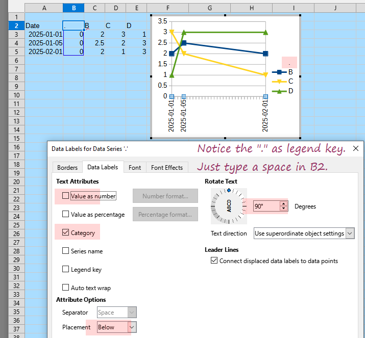
Insert a new column with data (column B in the screenshot) with " " (space) as label and 0 as values.
Edit the chart (I used a Line chart), select the new serie, and choose menu Insert - Data Labels.
Unmark Value as number, mark Category, set Placement to Below, and Rotate Text to 90 degrees.
Set the line Style to
- none -.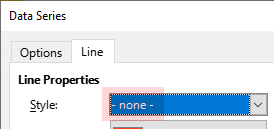
a simple chart.ods (19.0 KB)
1 Like