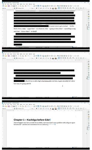
Apostrophe is weird in one paragraph but fine in the other

Hi there, I’ve looked around and although I saw some topics with similar problems, their solutions didn’t work for me so here I am.

As can be seen in the added screenshots, in the first paragraph, apostrophes have some weird added distance between them & the next typed thing. I tested it out in two other parts of my document, but there it works fine so it isn’t my normal keyboard settings. For some added context, I’m doing a paper on Japanese art history so I am adding Japanese characters every now and then, but that’s never caused this problem before. The rest of the document is set in UK English. I even selected the problem area, set it to UK English again and tried some random words to use with apostrophes, but to no avail. Does anyone have any idea what I did wrong and how to fix it?

UPDATE: I figured out what’s happening. So the weirdly spaced apostrophe is in the font of “NSimSun” which is the standard font for when I’m typing in Japanese. What I can’t figure out, is why it’s happening when I’m typing in English and the rest of the surrounding font is Liberation Serif. It just switches to NSimSun just for the apostrophes in that paragraph and it’s weirding me out.

A few leads:

  • if your text uses some “fancy” font (by “fancy”, I mean chosen for its aesthetic value), it may lack the corresponding curly quote; then a substitute font is looked for. Depending on your default configuration (either in Tools>Options, LO Writer>Basic Fonts (Western) or Basic Fonts(Asian) or even Default Paragraph Style), NSimSun may come into play.
  • look for your “primary” language. If it is Japanese, it is likely that choices for Japanese are preferentially selected for symbols and punctuation.

Writing a multi-lingual document is difficult. To avoid issues such as yours, format through styles exclusively. Your styles should clearly set the language so that Writer does not apply heuristics when in doubt.

Attach a 1-2 pages representative sample so that I can diagnose more accurately the problem.

PS: when asking here, it is good practice to mention OS name, LO version (exact numeric release, not “latest”) and save format. The latter is the most important for document formatting stability.

Thank you for the quick and comprehensive reply! A follow-up though, what are OS names? And where can I see what version I am using? Also, how would I go about attaching a sample, same way I attached the image in my original post? Apologies for the many questions, English isn’t my native language and I’m not that technology-savvy either

In this case, I’m using LibreOffice Writer and saving it as .odt files

Windows 10-11-12, MacOS 10.x-11.y, Linux (but which distribution and version)

Tools>About LO and there is even a button to copy relevant information you can then paste here

When you type a question or a comment, there is a tool bar above the entry area. Upload tool is the 7th from left. It looks like an office mail basket with an up arrow.

Alright!
My OS is Windows 11, running on a Lenovo Ideapad 5.
The LibreOffice version I’m using is the following:

Version: 25.2.1.2 (X86_64) / LibreOffice Community
Build ID: d3abf4aee5fd705e4a92bba33a32f40bc4e56f49
CPU threads: 8; OS: Windows 11 X86_64 (10.0 build 26100); UI render: Skia/Raster; VCL: win
Locale: en-GB (nl_NL); UI: en-GB
Calc: threaded

And a sample document, I’ve kept my first and second paragraph. As hopefully will be experienced, there’s nothing “wrong” with the second paragraph, the issue lies solely in the first paragraph. In theory I’ve solved it by changing the font of the entire paragraph in the original document to Liberation Serif, but I’m kind of curious as to why it happened in the first place. It’s hardly the first odt file I’ve written in English with Japanese words intertwined, and never had this issue before.

Apostrophe Catastrophe.odt (166.2 KB)

I think I found something by examining the XML encoding of your text.

As can be shown when selecting Applied Styles in the style side pane, you don’t pratice styles beyond paragraph styles. All intra-paragraph “variations” are done with direct formatting (DF).

DF is an entirely manual operation on text without visual feedback about its extent. Obviously, from technical information in text, you already edited the document many times, resulting in formatting fragmentation.

I found an apostrophe with DF limited to this sole character where language is ja_JP. This is enough to force reference to a Japanese font (in “this thesis will be<<’>>s …”). Then, starting after the “s” (“s there is …”), you have another sequence in ja_PN until end of paragraph. The two subsequent DF are also ja_JP. I didn’t check the location in your text (because this is quite difficult and boring).

How to fix?

I use to say that DF is the mother of all evil (some visitors find that I am obsessed by DF) because there is no feedback for every attribute you can set with DF (beyond italic, bold, colour, …). Formatting successfully a sophisticated document with DF requires super guru expert knowledge of Writer features. Your escape route is in styles, not only paragraph styles (which Word knows of), but also in character styles without which you won’t manage your multi-lingual document.

I am perfectly aware that M$ Word conditioned us into intra-paragraph DF because it has no notion for character, page, frame and list styles. But it is easy to learn, at least the basics.

Once you start styling your text, DON’T use DF any more. DF has precedence over styles; don’t mix it with styles (unless you master the subtleties of styles-DF interaction – and we’re back at my caveat about expertise).

Your document is polluted with DF to such an extent that I recommend to start a new blank document where you paste your discourse as unformatted text so that no formatting is imported.

Configure/define your styles in a consistent way and apply them on your raw unformatted text.

Refrain from adjusting manually your document. Play only with styles. This is the simplest approach. It will pay when you come to formatting and layout tuning.

Consider styles are a kind of semantic markup denoting author’s point of view regardding significance and importance of paragraphs, words, … Don’t bother initially about appearance. Just make your styles different enough so that you see they’ve been applied. When writing job is finished, tune the style. If your markup is correctly done, you need not modify any word. Focus is now on geometric properties of styles, not on semantic contents of text.

PS: there is a particular markup in the document; have you use Word at some step in the past?

Thank you, once again, for the meticulous reply & looking at went wrong.

It’s true that I had no idea that DF was such a big deal, and that I’m more used to Word. I switched to LO about two years ago and although I thought I got the hang of the basics, it appears that’s not entirely the case. I’ll be looking at some basic guides for how to use styles then, I suppose. But maybe I’ll keep that for when my bachelor’s thesis is done and I have plenty of time to play around with it.

One last question though, with refraining to manually adjust text etc, does that also include highlighting and text colour? I use that to visually remind myself that something needs expanding or editing, such as saying stuff like “Lastly, this thesis will something something conclusion bla bla will add later.” I’ve got ADHD so I’m terrified that without obnoxious colouring (neon green highlighter and fuchsia pink font) I’ll forget something needs expanding or editing because I will simply skip over it in the text otherwise.

As for your last question, although I have no idea what you mean with ‘particular markup’, I did start this file from scratch as an odt file in LO Writer, although the original document does have a title page, table of contents, page numbers and I did copy text (ctrl shift v) from a pdf and google spreadsheets, among other things. In addition, I’m using unicode for the “ō” because of romanisation rules, and that went wrong as well because LO system language was set to Dutch (my native language) and I couldn’t get it to work in that, but upon switching to English so I could post here to ask what that was all about, it (suddenly?) started working. I’m not sure if any of these things could account for it?

IMHO, you should start reading at least the Writer Guide immediately. Even if it looks you spend time which could better be used for your work, your productivity will be boosted but a more efficient Writer driving. Working with styles is really a treat.

Answer is not a mere yes or no.

Your highlighting is somehow “external” to your work. It is supposed to be temporary. And it is visually strong so that you can spot this DF immediately. However, if you also highlight your thesis text in the same way, this is not distinctive enough.

You have another tool which seems better fit to your task: comment. Put the cursor somewhere or select a word, sentence, … and Insert>Comment. A small note opens on the side with an arrow pointing to the selected location. You can enter detailed annotation about this location and this comment is also timestamped which may prove useful to monitor your work progression.

Since it is not added highlight, you don’t interfere with your formatting.

The basic unit of significance in any writing is the paragraph which, in principle, targets a single idea, notion or concept. You annotate it with a paragraph style. Your main topic will then be styled Body Text.

Your argumentation development is split into larger “blocks” preceded by a heading (chapter, sub-chapter, …). The heading is styled Heading n, n being the level: 1 for chapter, 2 for sub-chapter, …

Some paragraphs are not directly part of your argumentation. They have a different paragraph style to denote the divergence. For example, a footnote is automatically styled Footnote. But your main topic also contains quotations (Quotation paragraph style) or comments (custom paragraph style to create). I think you see the idea.

Inside a paragraph, all words are not “equal”. You highlight their importance with character styles, like Emphasis for … emphasis or Strong Emphasis for a bigger importance. You can have trademarks, foreign words (like romanised or kana Japanese words in the middle of English text, though the kana are different enough as not needing a special character style), irony, understatement, … Each specific nuance gets its character style.

The principle is to abstract your text into broad categories, each corresponding to a style, paragraph or character. But don’t be too fine-grained. I’d say that a dozen paragraph and a dozen character styles are sufficient for common documents.

What I state for text is also valid for pages. Your thesis will have a cover, some front material (dedication, acknowledgements, …), a TOC, its main topic, an alphabetical index and a bibliography. Every time a group of page has a different “geometry” (margins, numbering, header, footer), you need a different page style. But don’t consider the effective contents of the different areas, care only for the “high-level” characteristics. For example, chapters often repeat the heading in the header. The geometry is the same across chapters, only header text is different. This can be handled easily by styling the chapter heading Heading 1 and inserting a field in the header to capture and display level-1 heading. The benefit is a single page style for all chapters.