Hi.

I’m trying to make the header text equally close at the top and bottom, but there is more padding below. In paragraph style - Borders I set the padding to zero (left, right, top, bottom). what am I doing wrong?

Hi.
I’m trying to make the header text equally close at the top and bottom, but there is more padding below. In paragraph style - Borders I set the padding to zero (left, right, top, bottom). what am I doing wrong?
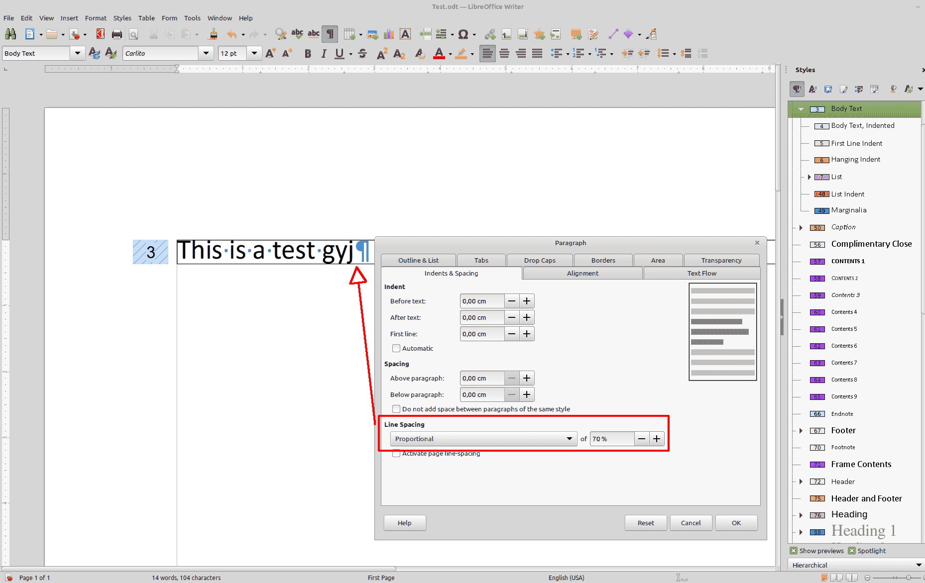
The paragraph allows for any potential descenders, characters like g, j, y, p.
Attach a sample file for close examination. Don’t forget to mention OS name, LO version and save format.
Thanks. The file was originally a word document (docx) and saved in odt format. I am attaching a sample file.
Test.odt (35.8 KB)
Version: 24.2.0.3 (X86_64) / LibreOffice Community
Build ID: da48488a73ddd66ea24cf16bbc4f7b9c08e9bea1
CPU threads: 8; OS: macOS 13.6.4; UI render: Skia/Metal; VCL: osx
Locale: en-GB (en_GB.UTF-8); UI: en-US
Calc: threaded
For your purposes you have to diminish the regular line spacing to less than 100%. IMHO a bad solution.
.
Your sample file is not the same as your screenshot: you hinted at header, i.e. text repeated at top of every page, or perhaps, in a confusion of words, at heading, a title at start of chapter, sub-chapter, … which could assume because of “4:”.
Your sample is made only of “bulk” discourse styled as Body Text where border if fully symmetric.
All I can tell is your style dictionary is polluted by nearly 1000 (!) stray character styles related to numbered lists. This is the consequence of converting from DOCX.
Resubmit a representative sample correspopnding to your screenshot.
Test2.odt (9.9 KB)
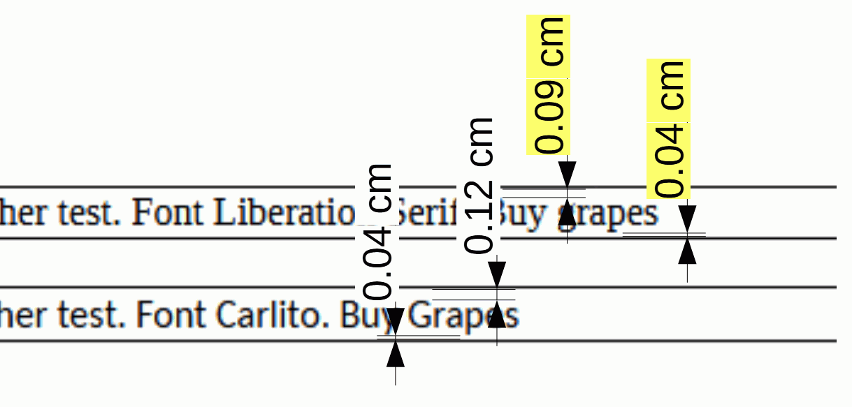
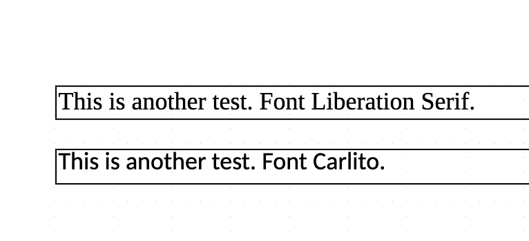
Thanks! Just added a new file in .odt format (created from scratch, no imported). Seems like the Carlito font is where the trouble’s at. I added a border around two sentences to test it out - one’s in Liberation Serif and the other is Carlito. Followed the exact same steps for both of them. In the second one I still get that extra bottom padding.
Carlito is not installed on my system, so I can’t confirm. Another “Sans” font is substituted and border padding is symmetric.
Possibly you meant extra space at the top?
Don’t underestimate the value of white space for readability; it can be the difference between turgid and scintillating.
As @EarnestAl stated: Different fonts can have different properties.
Your approach may be the idea of an electronic typewriter, but different font families may have different proportions. For an overview download this book, read chapter 4, Fonts, color, and the magic number:
DWL-SecondEdition.odt
I’m adjusting from using Word, so I am aware that I need to relearn many elements I had previously taken for granted.
I checked with some versions of LibreOffice back to 6.4.7.2 and I get the same result as my screenshot.
I then checked my installed version of Carlito, 1.103 Beta. I downloaded the latest version from Carlito - Google Fonts which was 1.104. I removed the old Carlito font and installed the new one; same appearance as I posted earlier. I would expect 1.103 Beta to become 1.104 in time so I wasn’t surprised.
Maybe it is a font issue in Mac, font cache issue, or maybe you have an earlier version of the font?
Version: 24.2.1.2 (X86_64) / LibreOffice Community
Build ID: db4def46b0453cc22e2d0305797cf981b68ef5ac
CPU threads: 8; OS: Windows 10.0 Build 22631; UI render: Skia/Raster; VCL: win
Locale: en-NZ (en_NZ); UI: en-GB
Calc: CL threaded
You may test with Restart in Safe Mode (menu Help).