[Calc] [Chart] Adding external label to a legend

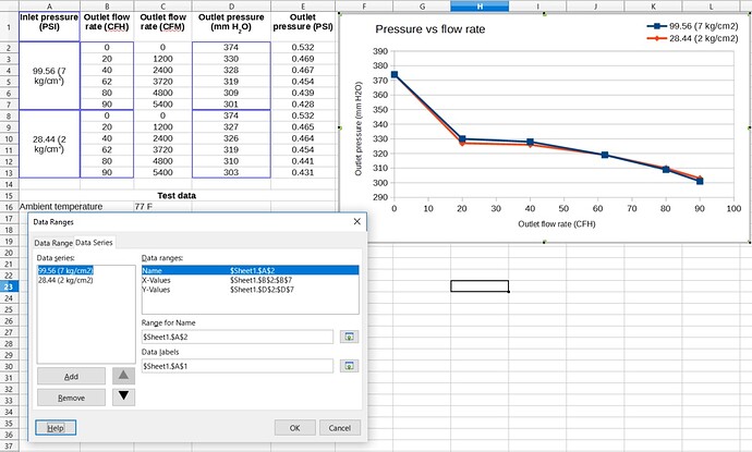
I have a data series that I would like to label as follows:

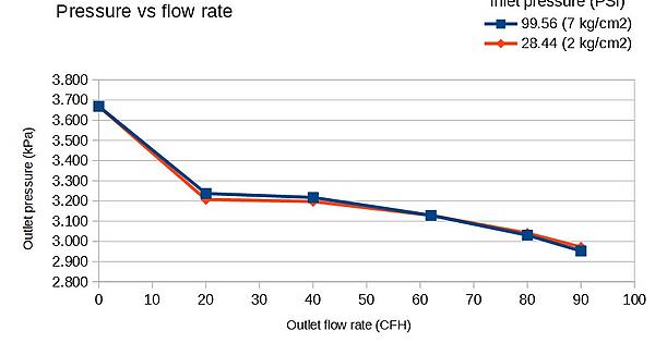
On the chart, I would like the legend (top right corner) to be labeled (as if it had its own, individual title, separate and distinct from the chart’s Title) with the text of cell A1 (“Inlet pressure (PSI)”). I’ve tried playing around with the “Range for name” field and “Data labels” field, but as far as I can tell the “Range for Name” entry box is just responsible for labeling the entries within the legend itself, and changing the input in the “Data labels” field has not given me any visible changes.

I also cannot insert a text box and re-position it without getting a ton of formatting errors that I would rather not have to slog through and correct individually.

I appreciate the help.

I.m not sure if this really answers your question, but may work? Dodgy but seems to work for me.
Double click on the Chart and select the icon. this will allow you manually enter your chart titles. Format these accordingly, Font Size, Style etc
When completed, your can drag and drop these anywhere on the Chart
Hope this helps
/home/ding/Pictures/Charts Naming.png

This sort of works. However, I can only add in one Subtitle field. It sounds like you’re managing to insert multiple Title fields. How is this done?

Since I cannot embed images into a comment, see this Imgur link below for the results.

Hi, when using the function, you have the following options available as Titles.

  1. Title
  2. Subtitle
    3.X Axis
  3. Y Axis
  4. Secondary X Axis
  5. Secondary Y Axis
    Obviously, you will have used 1. 3. 4. already. Suggesting to use the remaining fields purely as a Text Field and drag to wherever suits on the Chart
    Cheers

Hello,

After digging around in the chart settings using MRI I don’t see anything for setting a Title or such for the Legend (nor do I recall seeing anything in the past).

However there may be an alternative. Please see the answer by @mariosv in this post → how to have in graphs title, subtitle, x axis and y axis referred to cells.

I’m not sure if this helps anyone, but you can get a sort of workaround by the method used in this post.

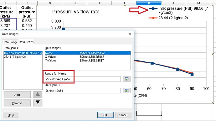
I changed the Range for Name field of the first Data Series from “$Sheet1.$A$2” to “$Sheet1.$A$1:$A$2”. Note that this requires expanding the physical footprint of the legend. Results are as below. It’s not the prettiest solution, or the ideal one, but hopefully it helps someone.

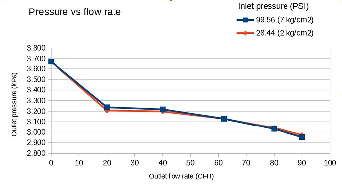
By filling the Subtitle field, and using the original Range for Name field, I get something that looks more like this. Depends on your preferences, I guess.