Linux 64 bit,
There seems to have been a change between 7.2.7 (which is the version I’m using quite happily) and 25.8 (the version I’m urged to upgrade to) in the way cells display when you click in them.
I cannot see anything in the settings to manage this behaviour. I hate it, and want 25.8 to work like 7.2.7
It’s hard to explain without pictures, so …
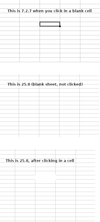
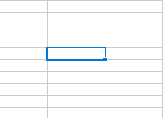
The topmost image is 7.2.7 (new empty sheet) after clicking in a cell. It simply highlights the cell with bold grid lines.
The centre image is 25.8 (new empty sheet) before clicking in a cell:
The bottom image is 25.8 (same empty sheet as the centre image) after clicking in a cell.
It expands the cell area to include the cells immediately above and below the clicked-in cell, and there are no grid line boundaries.
I find this visually confusing.
I want to see the cells above and below, and I want the clear visual indication of which cell I’m actually editing.
How do people with compromised vision cope with this? It’s terrible.
is there a setting to change this behaviour somewhere?