How to apply paragraph style font? (or how to find direct formatting?)

I have a book of many chapters. Originally it was primarily written in Arial, but I now intend on changing to Georgia. I have encountered a massive problem however.

To change the font, I returned to the template in which all chapters are written. In this template, I changed the font in the paragraph style of the root style (top of hierarchy - in my case called “Cz Root.”) from Arial to Georgia.

It initially seemed like a success, until I started to find random characters retaining the Arial font. I have no idea why this is happening. The most frustrating thing is that it’s really difficult to find these characters, but I know they’re all over the from selecting random bits of text and seeing the toolbar font display go from “Georgia” to [blank], indicating there are non-Georgia fonts used in the selected text.

I have tried the following solutions which either don’t work or are too problematic:

  1. Reapply paragraph style (either through Toolbar “Update Selected Styles” or re-clicking the given paragraph style in the Styles sidebar). The Arial font characters remain unchanged.
  2. Using the Find and Replace tool to find Arial font cases. For some reason, most of my text is being highlighted as Arial, when only a tiny proportion of it is indeed Arial. Plus, I fear changing the text in this way will be the equivalent of applying direct formatting which I’m trying to avoid as it can cause more problems down the line.
  3. Apply Georgia style to all text with direct formatting. (select text > click on font display in toolbar > select Georgia) This seems to work, but same as above, I should be avoiding direct formatting. Plus, this causes me to lose the occasional instances of intentionally using a different font.
  4. Remove all direct formatting. (select text > right-click > Clear direct formatting) Works, however, this causes me to lose all italics in my text.
  5. Find all instances of direct formatting and clear the direct formatting of Arial characters accordingly. This would be ideal as it seems the least risky. However, somebody already asked how to do this with no proper answer.

I want to find the best way of fixing this, either if somebody can resolve the problems with the ideal solutions, or give me another solution. Bear in mind, it is a book of several hundred pages which I’m currently proofreading, so I need something efficient and reliable.

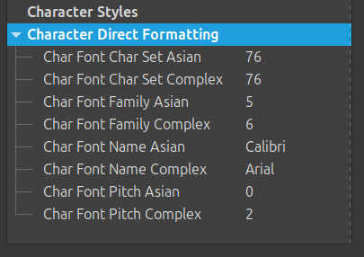
I’ve attached a sample of what is happening. Maybe I’m missing something.
Direct Formatting Issue.odt (21.9 KB)

Thank you.

(edited typos)

In 25.2 to see direct formatting, click Format - Spotlight and select direct formatting. See Spotlight Styles

This gives you the opportunity to set your italics and bold as character styles too

[Edit]
The entire sample is direct formatted. Make a copy of you document and play with that.

Italics could mean different things, emphasis, quote, foreign word, etc., normally you would create different character styles but you could just use the character style Emphasis.

  1. Click Edit > Find and Replace
  2. Select the Find field, click the Format button and select Italic. Nothing else
  3. Click Find All
  4. In the Character styles pane, double-click Emphasis to apply the character style.
  5. Repeat for Bold and use Strong Emphasis character style, and for Bold Italic (create a new character style beforehand)
  6. Make character styles for any other direct formatting that you want to keep and do the same.
  7. Select all and press Ctrl+M. You might get surprises as the short sample has so much direct formatting that presumably permeates the document.

Play with this sample first to see how it might work.
Direct Formatting Issue121075EA.odt (49.9 KB)

BTW it might have been quicker to use the existing style structure and modifying mainly Default Paragraph Style and Heading style to achieve the appearance that you wanted. Nevertheless, you have recreated much of the inheritance structure so carry on with that.

This is all great, the spotlight function especially. Some concerns/questions remain however:

  1. I can’t find a way to “select all” text (and then press Ctr+M) which includes the footnotes/endnotes.

  2. Character style includes font. In my document I use different fonts occasionally, applied through either a different paragraph style or character style. When the paragraph style and character style fonts clash, I’m unsure which is used? I created a Georgie italics character style and applied it to a Times New Roman paragraph, and it retained the Times New Roman. Yet, I have a Calibri character style which successfully overrides the Georgia paragraph style. Some clarity would be great.

  3. There are paragraphs which are highlighted under the character direct formatting spotlight but which appear to have no direct formatting. Is there anywhere I can find why the characters are being highlighted, i.e., to see what direct formatting was applied?

  4. Does clearing direct formatting via Ctrl+M clear only the character formatting? I use tab breaks occasionally which I don’t want to lose. Also, in general, clearing all direct formatting seems a bit scary as I’m afraid I could be forgetting about something.

The precedence rule is as follows:

  • direct formatting overrides everything
  • character style overrides paragraph style
  • paragraph style is the “bottom layer”

The Style Inspector is available through the sixth tool icon in the side pane. This icon looks like the style one (second from top) with an added magnifying glass.

No, all direct formatting, including indent adjustment, tab stop modification, spacing, …

The precedence rule is as follows:
direct formatting overrides everything
character style overrides paragraph style
paragraph style is the “bottom layer”

Character style doesn’t seem to always override paragraph style when I apply it. I tried using the default emphasis (Arial font, italics) on a piece of Times New Roman text and it made it italics, but not Arial.

The Style Inspector is available through the sixth tool icon in the side pane. This icon looks like the style one (second from top) with an added magnifying glass.

I’m not sure how to interpret the numbers it gives me. Is the picture below what you refer to?
image

No, all direct formatting, including indent adjustment, tab stop modification, spacing, …

But not tabs themselves, right? I tested it and the tab wasn’t removed.

Then you have a Tmes New Roman direct formatting over all others.

They are shown in “internal units”. Personally, I don’t try to interpret them but just use them to denote direct formatting Which I try to systematically remove.

The notion of direct formatting relative to Format>Clear Direct Formatting is not that obvious. AS you noticed, some settings are persistent across the command.

Then you have a Tmes New Roman direct formatting over all others.

I have attached an example of paragraph style font seeming to override character style font.

They are shown in “internal units”. Personally, I don’t try to interpret them but just use them to denote direct formatting Which I try to systematically remove.

I’m not sure how the inspector shows any more info relative to the spotlight. Upon comparing the character style of direct formatted text and non-direct formatted text, the only different I could find was in the “complex” font even though I use the Western font. Does any change in these settings, even if not applicable, show up as “direct formatting”?

The notion of direct formatting relative to Format>Clear Direct Formatting is not that obvious. AS you noticed, some settings are persistent across the command.

I’ll take that as a "no, tabs are not removed, they stay persistent.

Example.odt (17.3 KB)
"

There is a difficult-to-understand notion in styles: the “transparent state”, because there is no way to report it in the user interface.

In character style, the Font tab (like any other tab) initially is in “transparent state” (unless the style is inherited or derived from some other), i.e. no attribute is forced set or unset. The UI is totally unable to show this state. It display what is currently inherited.

In case of your Emphasis character style, since it inherits from no other character style, state is similar to Font of Default Paragraph Style. But this soes not mean that attributes are set accordingly. Thus, font face is shown Arial but it is not authoritative (it is transparent). Pressing Reset to Parent (= reset to “transparent” state) does not change it, while variant changes from Italic to Regular.

You must explicitly set Arial to force it. To make sure, first set it to some font, OK, reset it to Arial, OK. Now your Emphasis is guaranteed to force Arial.

1 Like

If the thick book looks good in Arial font, then: «Never chance a running system!».
Your thick book contains a hodgepodge of manual (direct) styles, which – as already mentioned – becomes apparent when you want to change the font, the typeface style, or the typeface. That looks like a lot of work.
I can only recommend copying everything and pasting it into a new virgin layout as plain text. It’s best to use a professional layout program for a book, because both ‘LO-WRiTER’ and ‘MS-WORD’ are completely unsuitable for creating a good book and practically tempt you to misuse the typography.

This is your personal opinion. Opt for semantic styling for completely separating contents from look. Author should focus on the topic, adding markup to emphasise the nuances in meaning. This markup is simply a collection of styles: paragraph, character, page mainly.

The look is then tuned in a second stage by playing with the styles. Of course, this requires that no direct formatting is present in the text, including no empty paragraph to force vertical spacing.

This is not inherent to Word or Writer. The effect is induced by the user interface. Ribbon or tab interface is more prone to this deviance than the “standard” interface which offers paragraph style menu (alas no character style menu). But the “best” approach is to display the side style pane to access them all. Even better, since the set of applied styles is rather limited in any document, attach your preferred styles to keyboard shortcuts. I have the habit of prefixing shortcuts with Ctl for paragraph styles and Alt for character ones.

1 Like

Thanks but no thanks on the recommendation. I spent many hours learning LO Writer and formatting my book through it. Though it has it’s problems, it’s absolutely suitable for formatting complex books.