How to get spesific range for X and secondary Y axis from spreadsheet?

Now this has been giving me some headache for a while.

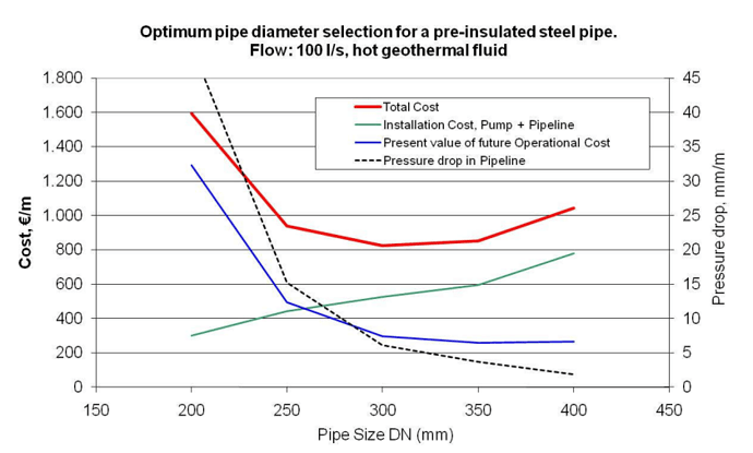
I am trying to make a graph comparable with this

I have been able to add the second Y axis, and when I change the language of the spreadsheet to English, I was able to manipulate the values. Doing that has no effect on the chart itself, but in the exercise there is relation between these things.

However, I am not able to change the values of the X axis at all. I am only able to change primary Y values (not allowed to add second image).

Now if I add the Diameter, it plots with the other values, which is not ideal.

So my question, how can I force LO to show second Y axis in relation to values presented in the spreadsheet, and how can I make the X axis do the same?

I am using version 7.4.2.3 Fresh.

This is a question concerning the creation and editing of charts, but not at all any issue with the view you get on your specific system.
In such a case attached images are useless, or cause -at least- loss of time. I can’t even be sure if your chart has “Line Chart” or “Scatter X-Y” type - and if you assigned your fourth series to the second Y-axis. This to know is essential for a reasoable answer.
Always attach an example file (here in .ods) demonstrating what you actually have, and allowing a contributor to easily test their ideas how the intended changes might be done.

Meantime, take a look at related questions:

Pressure_design.ods (199.1 KB)

Here is the file I am working with. I put in some notes in there for what I am trying to do. Maybe that is not possible for the time being, but who knows.

I had figured out how to add the extra axes, but I am trying to have the axis depend on information from the sheet it self, instead of me defining it not so well.

Hadn’t found the second link, so thank you for that, will check it out.

To rectify something in or add something (attachments e.g.) to your question neither use the Answer tool(only for actual answers) nor the Comment tool, but edit your question.

You may read the Charts part of the Calc guide for the basics.
Concerning this special case a glance on the attached document may be helpful.
Pressure_designReworked.ods (161.5 KB)

A general advice:

  • Design your sheets with only the functionality in mind first. No formatting, no cell borders, no merging… If some attributing and fomatting is needed to explain results to a different user/customer (or to impress the boss). it should be the last step.
  • Use units consistently.

How come you get the ability to select X-value?? My workbook only allows me to select y and name.
If I would have gotten this option, I never would have asked here :slight_smile:

I pasted some images showing the dialogs I used.
Every series allows to edit three ranges: The first (a single cell given there mostly) for the Name, an X-Range, and an Y-Range. Of course, the settings must be compatible in a sense.
Don’t forget the relevance of the chart type. “Line” is next to always just nonsense.
Don’t forget the relevance of a correct setting for any series to be assigned to the secondary Y-axis.
Did you know the setting for reverse order?
Don’t omit reading.

Well, this was quite unnecessary of me.
Sorry for this trouble.