Inserted Pages Always Go To End of Writer Document

No matter which gestures I use to insert a new page in a writer document, the result is always to add a new page to the end. This has been true for my Windows 10 version of LibreOffice over many releases covering versions 5 thru the most recent version of 7.

As I do not see other reports of people having the problem, it must be something peculiar to my options/usage which, briefly include:
1 I have 3 custom. page styles, one for unnumbered pages, one for pages numbered left and one for pages numbered right.
2 The numbering behavior works as expected: Introductory pages have none, the first numbered page is a recto layout and the alternative sequence of right-left, occur when adding pages consecutively, but when I come back to attempt to insert an additional page in the middle of the document, as stated,
the result will be a new page at the end.

Please edit your question (don’t start a conversation at this stage; it would only clutter the topic) to better elaborate on “when I add a page”. In Writer, you never add pages, you add text and pages are allocated to accommodate this text.

You can impose a page layout on a part of the text by switching to another page style. This requires to insert a special page break. How do you proceed?

I don’t write understand the problem. What is your expectation? That the final page number won’t be incremented?

Pages don’t exist until they are filled with text or objects. You can create a new page by inserting your cursor at the end of the page prior to where you want a new page and either: start typing, or press Ctrl+ Enter.

The page numbers will all be moved forward so the final page number will be incremented by one.

As far as I know, there is no such thing as an ‘insert page’ command in Writer. LibO is not DTP software that allows you to insert pages at some point in a document. Instead, it regards your text as a flow of content. If you change the font face or size of the body text, you will notice that text that was on page 10 will now be on page 8, because the letters have become smaller or narrower. If you put the cursor somewhete on page 9 and enter a few hundred words at that spot, you will see that text on page 10 will move to page 12 or 13. Therefore, a page is undefined in word processors.
If you wat to insert a page, press Ctrl+Enter to start on a new page, enter the text that you want on that page and press Ctrl+Enter again.

My apologies to all three of you who provided helpful replies.

I understand that from your perspective, there is no functionality whose title you might call “Insert a Page,” but that is semantically what I think I am attempting to accomplish when I try to describe a document which at time T0 has Pages 1 and 2, but which at time T1, I need to cause it to be laid out, formatted as having Pages 1, 2 and 3.

As I tried to indicated with the briefest of statements, I know how to cause that to happen via gestures associated with UI widgets whose description relates them to page-level concerns, or paragraph level concerns, and all I mean to say is that irrespective of which gesture is used with which widget, the result for me is always that the newly-generated, empty page will be #3, even if the gesture is initiated with the cursor focus on Page #1.

Setting the terminology aside, I am rather certain that my problem arises because the other settings of page dimensions and margins, for the type of document I am creating, cause the text-flow logic to behave in the way that I have described. In other words, as I tried to indicate, the problem is mine, not any bug or design deficiency in the software.

For whatever benefit my trouble-shooting/analysis may have for anyone else with similar document needs [and I did see some dating back over 4-5 years when I searched to see what information might already be available, before posting my own problem], the problem is most likely to arise when one is trying to author/compose mostly graphical content, with little, or no textual content. In those circumstances, we attempt to maximize the screen viewing space the the user will ultimately be navigating – reduciing margins and borders to their minimum in order to leave a maximum amount of visible content without having to scroll or zoom.

So, imagine, if you will, pages styled with dimensions such as 14x10 [landscape] holding only an inserted jpeg image and a thin border, maybe augmented by a caption. If that is what you have at time T0, when you attempt to use any of the correct means of opening space for a new page to be inserted between two existing pages, depending upon what anchor type is applied to the image and what wrapping rule is asserted, it is very possible to obtain the result I have described. The gesture will be processed, but the layout engine may determine that the contents should be squeezed up, leaving the newly available real estate at the bottom of the document.

The recommendations, some of which can be eeked out of previous postings, are to attempt to perform all the Insert Break gestures before the Insert Images operations will fill up the space. When, however, as will ultimately happen, you need to open up new space in the interior of the document for new content, the best procedure is to work with large, visible white space. Then, only after the document is nearly complete and ready for pre-production [especially where the production is to export to PDF] modify the parameters of the Page Styles to minimize the white space. That, at least, is how I was able to resolve my problems.

I don’t have a touch screen so I can’t comment on gestures which is an OS or 3rd party issue, but for images:

  • Images Anchored to page will always stay on that page; a new page by page break immediately prior to your image might not show any any change, a second page break will produce another page beyond the image. There are only a limited number of uses for Anchor to Page so that option is hidden deeper now than in earlier versions.
  • Images Anchor to paragraph or Anchor to character can overlap, jump unexpectedly, and can’t be placed above their anchor point.
  • Many people are more comfortable inserting images anchored As character so they don’t jump around and they can move with text. You can make this default in 7.1.something and beyond in Tools > Options > LibreOffice Writer > Formatting Aids and under Image in the field Anchor selecting As character in the drop down box.
    If you have mainly graphical content this might be the best option; no wrapping required, just use line break or paragraph break to start text again below the image

In any event, adding pictures at completion, in order from start to finish, will cause the fewest problems. Even Anchor as character can cause issues as the images sometimes get shoved into the footer instead of following the flow.

In addition to @EarnestAl’s valuable remarks, look in your document for the interaction between Allow overlap (Wrap options) and Keep inside text boundaries (Type tab). These are the two main settings which can cause “jumps” of position or locks.

But this does not explain why your new page always appears last.

Yes, your suggestions in additions to those provided by @EarnestAl, are helpful.

I will, therefore, check the box saying I have a solution, so that my posting will not generate and additional perturbation of the forum.

That said, what I have at this point in time, less of a rock-solid set of instructions for solving my problem than an accumulation of ideas gathered from older and more current postings that constitute more of a trial-and-error heuristic. I would like to ask the forum what I might do to provide something better, if I am able, with limited knowledge of the Writer product and with little resources for developing what I believe really ought to be a video tutorial example.

If via this forum [or if not, via any other user-centric, not developer-centric, customer support facility], it would be helpful to have an example document along with a consistent set of images, which demonstrate the behavior of the software in response to different combinations of settings and different U/I mechanisms for provoking the generation of new pages, I would be happy to prepare/submit that material. But, having said that, I believe the reason that any tutorial on this topic requires audio/visual presentation is that you would really like the presenter to have that great balance between being able to describe what is going on from a user point of view AND have that developer knowledge to be able to explain why the change of a check-box operation, or why the change of a critical paragraph attribute, or why the setting of a page margin’s dimensions, etc. causes the observed behavior when a request is made to insert a page break at a given location. Attempting to write a textual explanation of the different ways to skin the cat, given the different parameters which might be examined, results in a very, very long stream of text, difficult to comprehend – the more so, if the user is fundamentally attempting to create an image-centric document having little or no textual content.

So, if there is anything I might provide that might be found useful by the development/documentation/customer-support teams, please contact me as I am willing to devote time and energy, if not talent, to the challenge.

I don’t think developer knowledge is necessary for such a tutorial. I am no developer, but I gained my expertise with Writer by building along the years a mental model of the application of what I think are its basic principles.

This mental model mixes my view of abstract author job and a layered approach of document processing.

When it comes to image-centric documents, I don’t think Writer is the ideal tool because you need to anchor your frames to paragraphs (or consider them characters). Therefore paragraphs are needed, even if empty for the sake of offering an anchor point. As long as your images are as wide as the page, you’ll find no real difficulty to lay them out. But if you want to have a more structured presentation than a “vertical” sequence, using tables might be an easier solution because you control the number of cells in a row (you can also merge them to achieve more complex layouts both horizontally and vertically). Each cell is independent from the others; this simplifies the task with As character mode.

The most important point in your comment is the emphasis on the user point of view. However this requires that the user accepts to forget everything he believes he knows about using a document processor. The focus should be put on the process of translating author’s thought into writing with all its nuances. Unfortunately, too many people want to “decorate” text first instead of describing the importance of words/sentences (emphasis, irony, comment, explanation, remark, …). When the semantic skeleton of the document is in place, formatting it is easy and straightforward because there is usually a one-to-one mapping between significance and styles.

Surprisingly enough, the same can be said about frames (or images). With that in mind, final position of images is highly predictable. There may remain very few corner cases which can be settled with high-skilled tuning of frame styles or quick’n’dirty direct formatting (which is acceptable if tis exceptional).

You might like to use the Writer Guide as a reference, available on documentation page.

Thank you for the link. I do always try to locate and read every source of information about a topic before posting, but, heretofore, I have usually used the Help Menu inside the application which, as I am certain you know, failing to find that I have a locally-installed copy of the Help, let’s me work from the web. That does have the sometimes-not-so-helpful result of taking one to a version of the topic that may be from a down-level version of the software – so your recommendation to grab the latest pdf document is welcome.

That said, I am finding that the insert-above-or-below behavior of a Table [contrived to result in a page per row] is somewhat more predictable and manageable than attempting to insure that insert-before-or-after produces the desired result. This, I suppose, is primarily due, as you have previously noted, to the fact that I am not authoring a text document with a couple of images, I am authoring a photo album with minimal textual content.

So, if I may, I would like to continue this thread with what I believe to be a closely-related corollary to my efforts. You, or others, however, may find that I am really opening a new topic, and will do so if that is what would work best.

The closely-related topic(s) have to do with attempting to introduce a minimal amount of text associated with each image via the nicely-provided facility to Insert a Caption. Several years ago, when I was concerned with authoring a massively integrated amount of text, replete with columnar controls, footnotes and endnotes, with a reasonable amount of graphical content, I visited these forums and found a way for a user to Create a New Caption style. Now I cannot find any documentation, or any references to old postings which seem to provide instructions which accomplish that task.

I can use New or Modify to configure the attributes of a Caption to meet my need, but even though the document will have that style, and will show it in the Styles panel, it will not pop-up my Custom Caption as one that can be selected to add to a given Frame/Image. Since one of the characteristics of the Caption styles which make that category important is that your bookmarking/outlining/table-of-contents facilities know how to track Captions, but only the default ones, not my Custom Caption.

Since I still have an .odt file from 2017 which does have my Custom Captions, I can turn that into a template, and sure, I can recover the Custom Captions that I used 4 years ago, but I sure would like to be able to create new ones in Writer 7.2. Text inside captions is easier to manage in the face of overall document layout/formatting which is why I think adding this to the current thread is fair, but I will proceed in any manner you are kind enough to suggest.

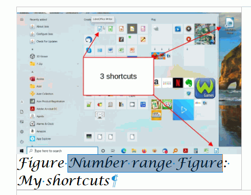
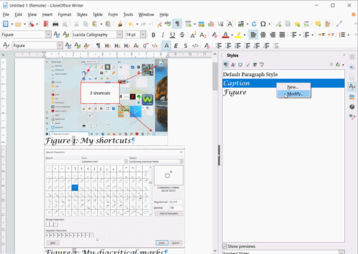
Rather than create a custom style why don’t you modify the existing Caption (or Figure) style? Here I have changed to a handwriting font at 14pt

Note well: The number is a field as shown by its grey background. If you click View > Field names (Ctrl+F9) it will toggle between number and field name (Number Range Figure).

FigureNumberFieldToggled

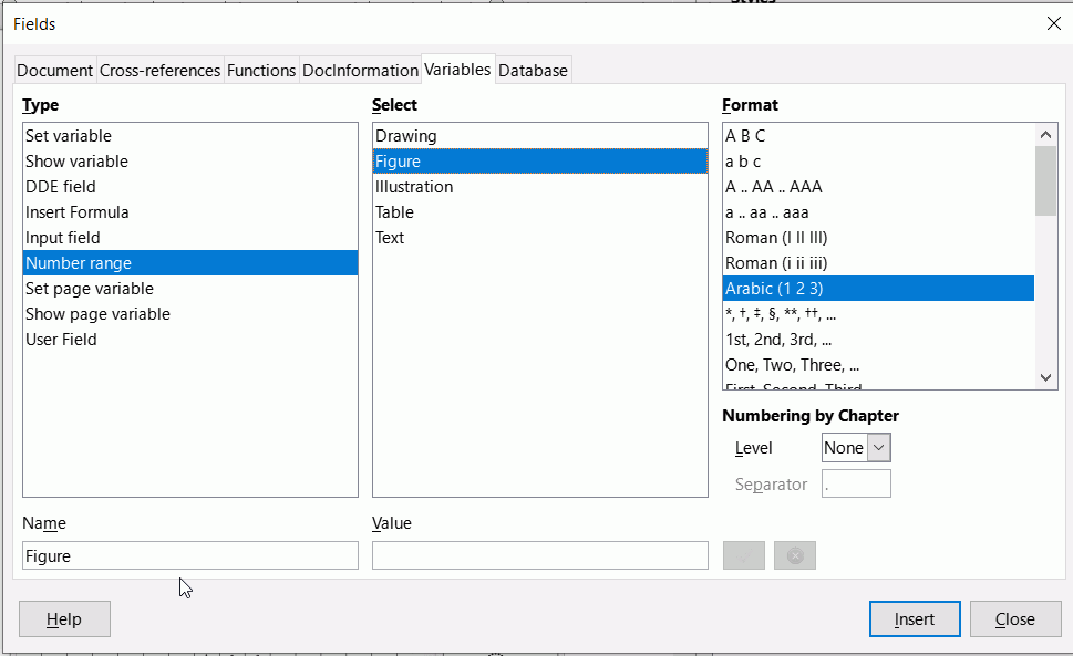
Having identified the field name, open the field dialog, Insert > Field > More fields (Ctrl+F2) and click on the Variables tab, select Number Range, Figure, then modify the numbering to suit.

For this question, I very quickly made an album of sorts. I had already set the default for new images to anchor as character so all I had to do was to select select a bunch of pictures in File manager and drag then onto the page, they all went in order, one above the other; after that it just a matter of captioning each. I modified the caption style halfway through and all the previous captions changed to reflect the new style and the subsequent ones picked up the new style. No tables needed.

Thanks for such a quick turn-around and well-explained example, but the simple answer to your question is that the primary purpose of the Custom Caption is to reduce the number of characters to a minimum so as to leave maximum space for the posting of important information without consuming much space on the output document. Yes, I can also use font metrics to reduce space, but the audience is primarily us octogenarians and I do them no service if I strain their eyesight.

So, as far as I understood the facilities and the objective, as I had managed to do some years ago, I wished to have Captions named. Fig, Map and Illus.

Consider your audience; abbreviations tend to confuse rather than illuminate, especially if eyesight is poor. The image is the important part, your captions should be short and clear.
The captions, apart from the number field, are plain text once inserted so Find & Replace (Ctrl+H) can change Figure to Fig., or even deleted entirely (you can do that by selecting None when inserting the caption)

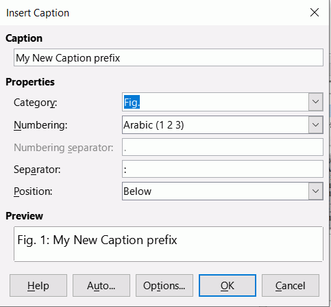
You can just write over Figure with your new text and you can then choose that instead for subsequent captions. Note that Figure still remains as a choice and is not actually overwritten.

NewCaptionPrefix

Thank you, EarnestAI, you are indeed a hard-working, helpful young man. It is that sort of talent and energy that makes Open Source work.

Just for the record, I was able to get a reference to this very problem which shows up here and led to folks taking the time to submit an enhancement requested which was well vetted here, but as far as I can tell the capability was not ever implemented. Fundamentally, if you really analyze the requirement and the current implementation there is a flaw in the data model. A million years ago, in my time, I think Dykstra would have included it in his “too early optimization” mistake. The present data model coerces the description of an object [a particular class of style] to be equal to the identifier of the object. The correct data model would not only separate the ID from the Descriptor, but in the process would permit proper I18N support for folks trying to publish for multiple languages/locales.

BTW: I was also able to find another old posting covering the same challenge but in a slightly different context and the thoughtful suggestion was to make massive changes to the .xml files that are inside of the .odt container, using command-line tools and well-contrived RexExp. So, since I do have an .odt file from 2017 in which my Custom Captions work, I have found that I can edit the .xml to get new Captions with new names more appropriate to my current project and audience. It’s not nearly as nice as reading that well-written Users Guide, but at least it’s not using HexEdit.

Signing out, with best regards.

If I understand right, you’re trying to design a photo catalog. I did so several years ago. This kind of document is closer to DTP (desktop publishing) than text flow handling, i.e. page surface is the important factor.

I ended up with one table per page (to avoid complications with splitting tables across pages). Since it is a catalog/photo index and not the real photo viewer (there are better applications for that), all images were scaled to the same size.

Each cell contains a thumbnail, a “caption” and a description. I write “caption” because it is not created with Insert>Caption; it is a paragraph with a dedicated paragraph style. I don’t use Insert>Caption here because the task is repetitive (every image has a “caption”) and the command creates frames. Having ~one thousand frames would have a major impact on Writer performance.

If you want the captions in the TOC, all you have to do is to attach the caption paragraph style to some outline level in the style Outline & Numbering tab. In my case, this is not necessary because the caption is the filename with a systematic naming convention.

Regarding custom caption categories, you can create any you like. Begin with a new number range. It will be available in Insert>Caption. If you use it, the caption will be paragraph-styled with a style of the same name as the number range. Customise it to your taste.

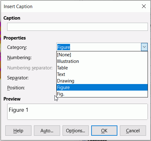
Of course it was implemented; the image I posted shows the dialog box being used to make a custom caption. Here is the new caption available in the selection:

NewCaptionPrefixInSelection