
LOL, I know it should be done by clicking on the “like” again. But I am not allowed to click it. As soon as my mouse cursor hovers above the “heart”, the cursor changes to the  “prohibited” symbol.
Of course. My statement only emphasises that there is an already complicated task to flow and layout text with all its adornments (face changes, size, weight, spacing, …). All non-text is put in “holes” punched in the text “composition”. Relationship between these “holes” and text must be very precisely specified if you want reliable, stable and predictable results. This is not a simple task at all. Positioning these elements with the mouse (à la Word) does not guarantee stability by lack of formal specification of the result. I don’t blame you for your rant. It is a natural reaction when you leave the "quick’n’dirty’ insertion for more elaborate ones. It then becomes extremely hard to drive built-in features to achieve your expectations. It took me years to figure out the whereabouts of present frames. It is indeed imperfect (I still meet issues) but it really solves many common problems.
So, once again, describe exactly what you want to see in your document, preferentially in a separate question for cleaner advice. There are never exactly the “same problem”. Give as much details as possible and attach a sample file for better analysis.
You can do so in Draw, but not in Writer as far as positioning “objects” relative to text is concerned. “Objects” in Writer are managed as frames (anonymous absolutely independent frames in the case of drawing objects). Frames as implemented are stand-alone: they can’t be associated or “grouped”. Their only relationship is vis-à-vis text. This is a big difficulty for captioning. The command simulates nesting behind the scene but this is fake: it anchors the “inner” frame to some text (the caption) in the “outer” frame whose size is computed in order to visually “enclose” the inner one. Change something in the “inner” frame and the nesting is completely lost.
But if you want to insert automatically images side by side, this can be done with a smartly configured frame style. But this works only if you don’t manipulate the pictures with the mouse. Absolutely no manual action. All positioning constraints must be expressed in the common frame style. This is a stricter rule than on text where a few direct formatting here and there can be tolerated (provided you fully understand the consequences). Direct formatting is not intuitive at all (it is a legacy of Word-induced workflow by lack of adequate concepts); it is a real killer poison on document layout.
1 Like
Just to remind you: MS also asks for money, and usually you are not free to say “No.”
This post was flagged by the community and is temporarily hidden.
Inserting images is very easy and not a joke. The problem is you haven’t bothered to learn.
Read the chapter in the manual about images in Writer and make sure you understand Anchor and Wrap options.
Do not anchor two images to one anchor.
1 Like
Reading the manual should only be done to execute complex operations. The basic ones should work out-of-the-box without having to integrate complicated concepts. Inserting a picture in a document is a basic one and unfortunately the behavior is kind of fuzzy.
That’s basically what makes the difference between a software designed for general public and software designed for experts.
And that’s the sad story about why people continue to pay for Microsoft Office instead using a 100% free software developed by the community…
2 Likes
I learned about Wrap and Anchor, still my work was completely ruined and I missed a deadline. Please don’t belittle people who have come here to highlight issues just because they might not be using the software the same way you do.
@plush ,
Many are moving away from M$ and trying a new path. Yes, and you have to learn.
Upload a sample file here and tell us how it should be designed.
Easiest solution: hit return before importing the 2nd image.
Not so easy solution: change the anchor type(*) to ‘as character’ and put a space in between them.
(*) Change the anchor type:
- insert image
- right click on image
- choose “Anchor → as character”
(you must repeat this for each image.)
LibreOffice SHOULD deal with 2 images in the same place by converting them from the default “to paragraph” anchor to “as character” anchor, but whether that’s a bug or just incomplete programming or a feature to have the app allow multiple images in the same anchor point creating havoc with image placement—is for people above my pay grade.
1 Like
Writer handles images anchored to the same object (e.g., paragraph/character) without problems. It’s just the default image setting to allow overlap may make several images to be above each other. And making images automatically anchored as character is not a correct thing. Disallowing overlap by default might be a better change, if someone files that request.
Please do not implement stupid methods and then expect someone else to tell you that you need to fix it. Anyone in normal head-space knows the current state is unusable. It’s completely counter-intuitive.
1 Like
@snovotill: “counter-intuitive” is only a word to hide yourself behind your routine.
Writer is a tremendously powerful document processor, bridging partially the gap with desktop publishing applications. As it is powerful, it doesn’t restrain author creativity and does not impose any strict procedure over image insertion.
I admit very easily that getting predictable, reliable and reproducible placement of images (or more generally frames) is one of the most daunting tasks in Writer. This is the price to pay for the power (e.g. automatic reallocation of frames when you edit text) and versatility.
You must accept Writer is not based on common (rather not fully rigorously specified) principles and has chosen another path. Writer is style based. Styles are ubiquitous. In particular, images are inserted as frames and frames are controlled by frame styles. However, I repeat, taming frame styles is not immediate.
But formatting your images through styles is much more reliable than trying to manually fix image hick-ups. Learn how to master styles.
Manual formatting (aka. direct formatting) was provided to ease transition from other apps, like M$ Word, for simple documents. For “complex” documents, forget Wrod procedures which are either manual (because there is nothing beyond paragraph styles) or M$-imposed-on-you (to simplify your life, they say).
No. Counter intuitive means that you have to RTFM or click around when you are trying to write a quick and dirty document, and that’s exactly what this is.
Do you really think you can use ANY software without RTFM, at least skimming over a few pages?
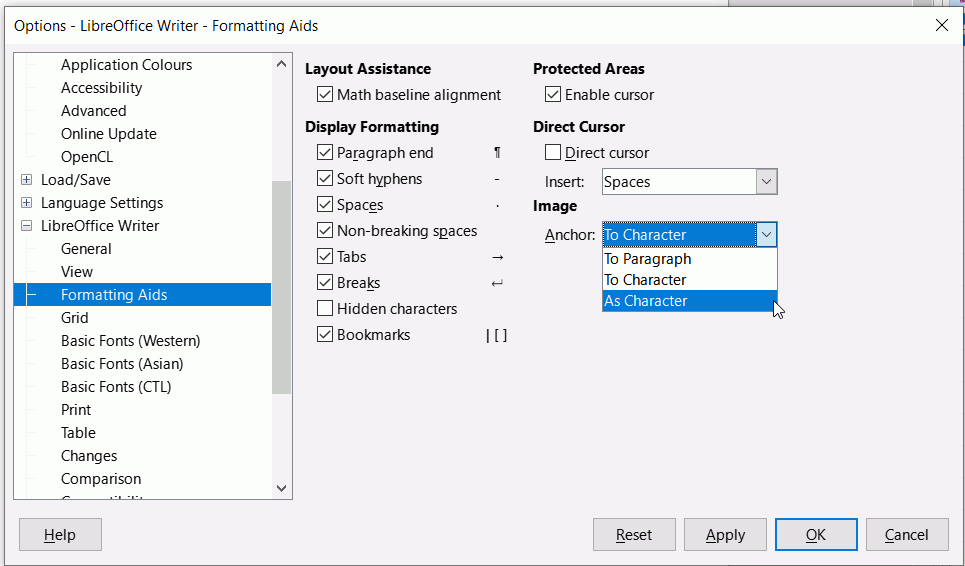
As you have obviously been using Microsoft Word for a while and are used to its idiosyncrasies, you might find it useful to change a setting in Writer to imitate Word’s default. This works only for LO version 7.x.x.x. and above
Click Tools > Options > LibreOffice Writer > Formatting Aids and under Image change to As Character
1 Like
Thanks for this, i have version 7.x.x.x. but the Tools tab doesnt give an “Options” and although i have followed all that it does provide, “Libre Office Writer” and Formatting Aids just isnt in there! Exasperated.
The path is the menu path. Click Menubar icon to display the menu of it is not visible
If you are on Mac then it is Preferences - LibreOffice - LibreOffice Writer - Formatting stuffs Aids
1 Like
Thank you , I’ve done it now…praying next time is different,
A picture in a frame
As every good layout designer does: Fix, i.e. anchor, every image and every large table, on the page, never relative to a paragraph or even to a line of text. Let the body text flow around it. Only place very small images, such as a short formula, directly on a line.
The layout designer knows the size of the page and fits the images into it in a structured manner. It is advisable to place each element of a page, including images, tables, and body text, in its own frame, which is also fixedly placed on the page.
A good layout designer has the photographer, technician, or designer prepare all the images as needed. The same applies to the editor with the text. The initially empty frames offer each contributor fixed guidelines and no forced progression. The priority is therefore on the space available for each element. This is the common concept, tried and tested, but time-consuming to prepare and plan.