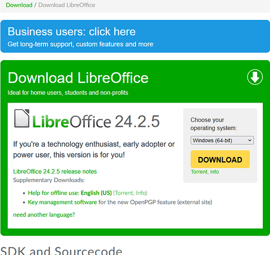
I use LibreOffice 7.6.7.2. currently. When I installed it, the download page looked different.
Now it only has two options: business users (which sends to a confusing page), and LibreOffice 24.2.5, which is said to be simultaneously “ideal for home users, students and non-profits”, and also "If you’re a technology enthusiast, early adopter or power user, this version is for you!"
This is confusing.
I’m just a home user who wants a version that is stable, doesn’t use experimental features or wild changes, and doesn’t get super frequent updates.
I suspect that this is simply a holdover from the previous website design, but in that case that “technology enthusiast, early adopter or power user” text really needs to be removed.

