Mismatched headers, but same settings

LO 7.6.4.1, Win 11
I have the settings for RIGHT PAGE Style and LEFT PAGE Style set identically both in the Page and Header tabs, but the right page header is crowding the body text:

LEFT
image


RIGHT
image


In the first image of each, the light gray bracket next to the page number shows that Right is not as far from the text below it as Left is. How do I correct this?

Sample file uploaded (see pages 4-5).

Your sample file didn’t seem to upload.

Discours - Header sample.odt (408.8 KB)

Sorry.

What paragraph style do you have for each Header?

Both have the default HEADER style.

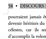
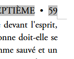
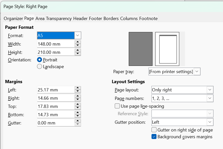
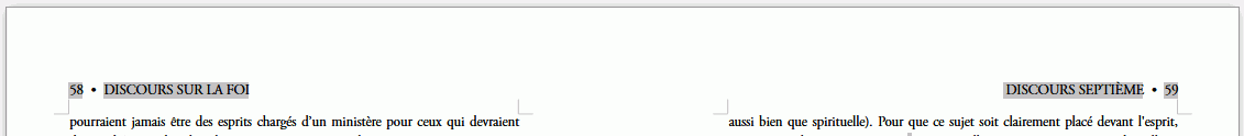
I don’t see any difference in distance between the bottom of the header and the text in 58 compared to 59 on my system, not for 7.6.4.1, nor back to 6.4.7.2.
In Book View


It might be some sort of graphics issue. I assume you have restarted (not shut down) Windows to make sure it isn’t a OS glitch. Are your graphics drivers up-to-date?

Click Tools > Options > LibreOffice > View and if Use Skia for all rendering is ticked then tick Force Skia software rendering and OK. Restart LibreOffice and see if the issue has gone away.

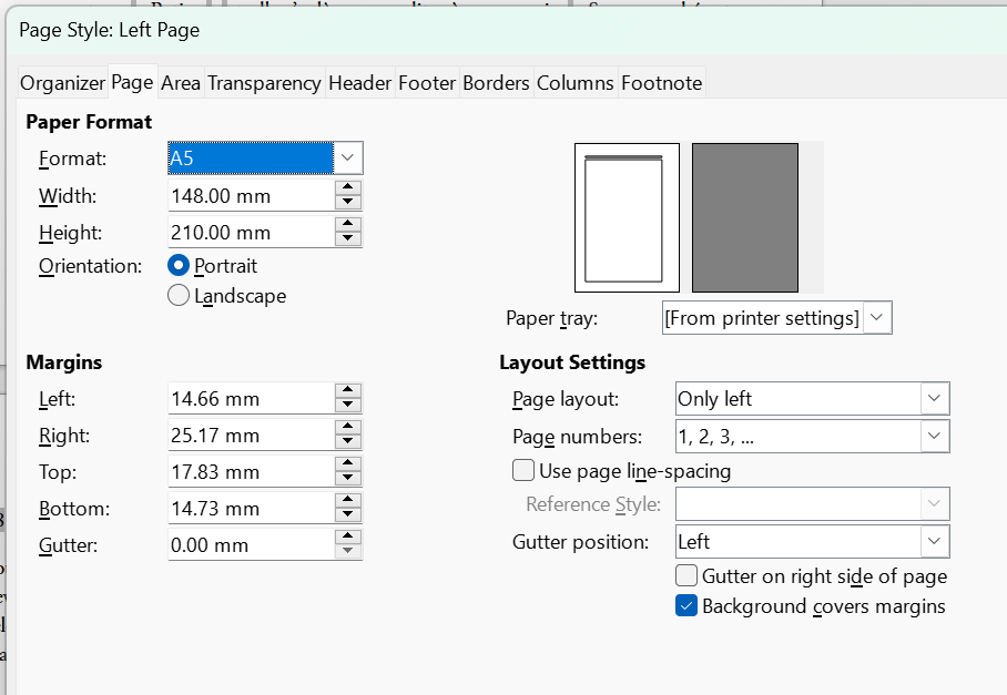
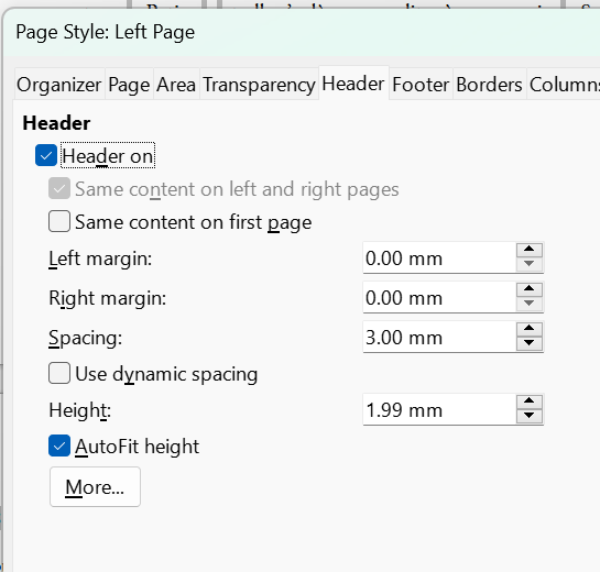
I do see that there is direct formatting over the header style because Default Paragraph style was set with a first line indent rather than Body Text or using First Line Indent which already exists. You should use Header left and Header right instead of the same and then direct formatted.

OS isn’t an issue, up-to-date drivers, Skia already set as you indicated. I switched to Header Left/Right for Left/Right pages. Restarted Windows and still see the Left/Right variance (PDF sample attached, demonstrating that it isn’t a video issue on my screen).

image
image
Discours Headers-18-19.pdf (335.8 KB)

What does it look like in LibreOffice Safe Mode? Click Help > Restart in safe mode > Continue in Safe Mode, open file and check.

The issue remains

I reset the user profile for my 7.6.4.1 but still cannot reproduce the effect you see. Maybe untick Use Skia for all rendering.

Your document appears “normal” on my Linux box, but shows several issues.

  • You practice heavy direct formatting. Since your fonts are not installed on my PC, they are substituted. This results in a different text flow with de-sync from your intended page layout.
  • Your don’t understand how to use/customise at least paragraph styles. You only have Heading n and Body Text. The latter is being used everywhere with direct formatting for anything other than headings. Writer ships with various built-ins such as Title and Subtitle (and many others) to make a distinction between discourse and other (structuring?) elements.
  • A very bad habit is to use a paragraph break Enter to distribute text of a single logical paragraph over several lines (thus mixing layout/formatting with writing). This has a consequence of creating fake entries in TOC when applied to headings. If you want to create a caesura in a paragraph, you must type Shift+ Enter which does not end the paragraph, just cause a line break.
  • Also, you didn’t pay thorough attention to the style of your empty vertical spacing paragraphs. Once again, you enter empty entries in the TOC.
  • You don’t use character styles. Variants like italic, bold, underline, change of font properties, … should be done through application of a character style, not direct formatting.
  • Your text originates from Word. In Word (under Window$), you very easily mistype a non-breaking space for an ordinary space. Your text has many many spurious NBSP (e.g. between the names of a person or even between ordinary words. Thes NBSPs are faulty.
  • I see many ListLabel99 character styles. These are remnants of Word lists, hinting at an incomplete unformatted import and also lists created with direct formatting, i.e. with the toolbar button.
  • The bullet in your header looks here like a cursive Z with a horizontal bar. Apparently, it is taken from the Unicode Private Use Area at U+E075. Avoid this as it is not portable (even at your favourite printshop, unless the font was provided by the printshop). Unicode comes with a wealth of standardised bullets from which you can choose. The closest to your screenshots is probably U+2022 BULLET.

You might achieve to layout your book, but any edit will be a pain and turn tuning layout/formatting into a nightmare. As soon as a document is larger than 5 pages (some even suggest 3 pages), you must imperatively follow a styling method. The most effective is semantic styling where styles mark up the significance of paragraphs and words, not their visual aspect. This is the only method IMHO which makes formatting optimisation a treat.

I highly recommend you take a break to read both Writer Guide for an introduction to styles and the excellent Bruce Byfield’s Designing with LO which emphasises the boost in productivity brought by styles. This break will not be a waste of time, even if you have a deadline, because you’ll write much faster.

@EarnestAl - unticking Skia did not remedy the problem. I’ve sent this doc to others, who see the same problem, so I’m thinking it’s not a system problem on my laptop. Exporting to PDF seems to back up that assumption. Update: deleting my headers and recreating them fixed the problem.