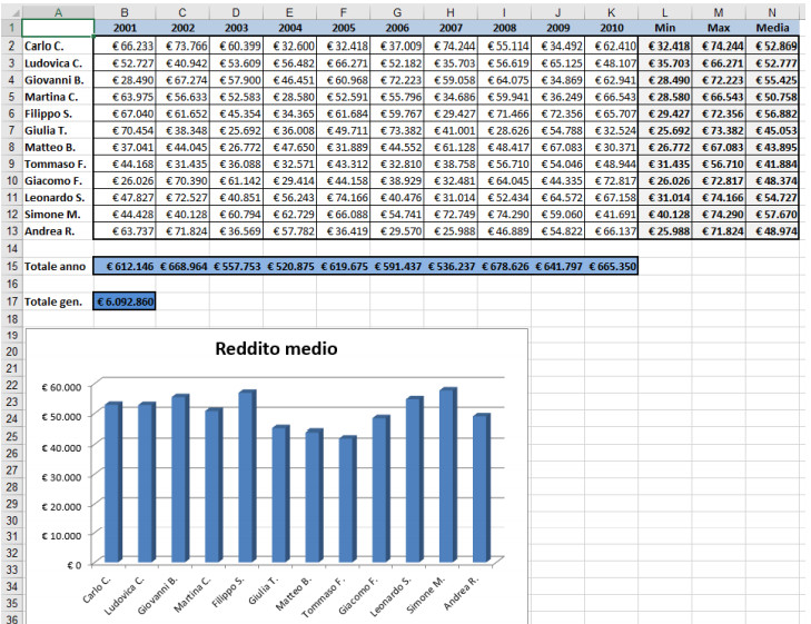
I need to create a histogram chart that represents the average income of some people and should look like the following image (the invented names of the people are in column A). The data for each income is in a table, on column N.
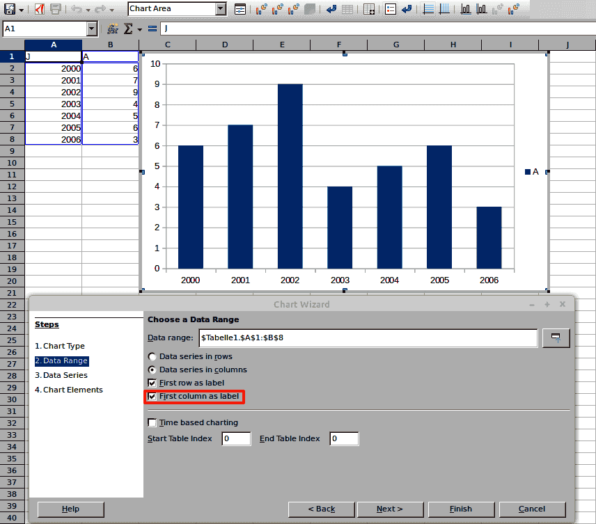
I have created the histogram chart but I cannot write the name of the person who has the income under each rectangle of the chart. In my sheet, unlike in the image, instead of the names of the persons (Carlo C., Ludovica C., …), the numbers of the rows (1, 2, 3…) appear under each rectangle.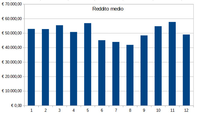
How can I put the people’s names?
Bye