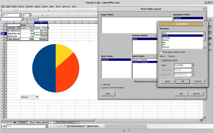
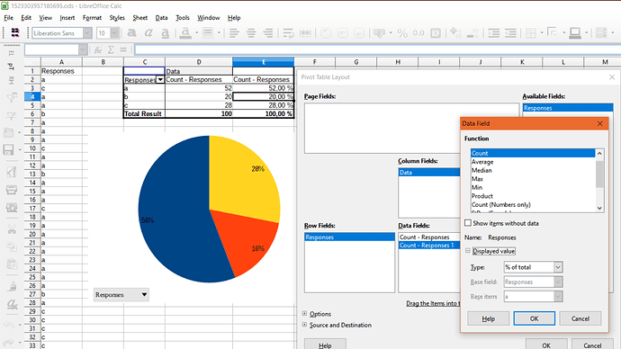
I have a one column spreadsheet with 3 different entries across 1200 records, basically 3 different responses to a questionaire answered by 1200 people. I need to make pivot tables showing frequency distribution by #responses for each catergory and also a table showing percentage of responses and then a pie chart. I only have instructions for excel, and can’t even get the first step to work in Calc. I can’t get the #s to show up, only the response categories.
Gonna try to attach a screenshot of my actual table and chart. Everything is hunky dory till I try to label the pie, but I still cant get that to happen. My table is a little different so maybe that’s why.
Not sure how to make that image appear inline but hopefully the link works for you.
(Edit: activated screenshot)


