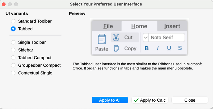
I tried the tabbed mode UI in Calc and the UI does not look like the preview in the Settings nor various videos I looked at in Youtube. The File, Home, etc. headings are off to the right and appear squished.
What I see:
What I think it is supposed to look like:
I searched the forum archives but didn’t find anything at least with the terms that I used.
Any tips?
System:
Macbook Pro M3, Nov 2023, 36GB
Libre Office:
Version: 24.2.5.2 (AARCH64) / LibreOffice Community
Build ID: bffef4ea93e59bebbeaf7f431bb02b1a39ee8a59
CPU threads: 12; OS: macOS 14.7; UI render: Skia/Metal; VCL: osx
Locale: en-US (en_US.UTF-8); UI: en-US
Calc: threaded


