Writer Styles Screwed up After Migrating from Mac to Windows

I have a lot of trouble with eyestrain and light sensitivity. In addition to special glasses, hardware fixes, and system fixes, in LibreOffice, I reset the default font to Andika, and I edited the styles, for better readability.

If I try to create a new file in LibreOffice on Windows, the styles are a mess. Instead I copy a file from my Mac, and replace the contents, so I can use the styles from my Mac. But the styles are still a mess:

Screenshot 2026-01-16 151810

I think Heading 1-3 come from the Mac, while Header, Heading, and Heading 4 come from Windows.

What’s a good way to create a consistent and readable set of styles, and get it to work with old and new documents?

I prefer for successive headings to use the same basic font, bold, either italic or not but consistent, etc.

You show the drop-down menu from the toolbar. This menu builds up progressively from a small initial style to your currently used collection. It is a kind of “adaptive” cache driven by your style statistical usage. It gives you no idea about the dependency relation between styles.

The style side pane offers several “views” on the style collection. The style side pane is displayed with Styles>Manage Styles or F11 (except under MacOS I think because this key is caught by the OS or Finder). One of the view mode is Hierarchical from the drop-down menu (you didn’t mention your LO release – location from this menu changed from bottom to top of list).

The hierarchical view shows the style inheritance tree. Any attribute you set in a “top” style is forwarded to the “down” styles, unless you forced the same attributes. This explicit forcing cuts the inheritance.

Therefore, if you weren’t consistent (or rather, careful enough), you might have overridden the attribute somewhere in an intermediate style in the inheritance chain. You may also have changed the factory inheritance chain, in which case the “detached” style no longer inherits from its factory ancestor.

For a better diagnostic, attach blank documents, one from your W$, the other from MacOS (identify clearly which is which).

From that I assume that you created a new template and made it default?
Would the steps have been

  1. Open a new blank document
  2. Right click Default Paragraph Style, select Edit style and in the Font tab, select Andika
  3. Right click Heading style, select Edit style and in the Font tab, select Andika
  4. Click File > Templates > Save as template
  5. In the new dialogue
    1. Give the template a name
    2. Select My Templates
    3. Tick Set as default template
    4. Save

This should give consistent styles. Don’t use Default Paragraph Style nor Heading style in your documents; they are there to allow you to make global changes to their child styles.

A word of warning, if you open a new blank document and paste from another document, your styles for the pasted text will be changed to the styles in the copied document. This doesn’t happen if you have already some text in the new document that uses those styles.

1 Like

Okay, so how do I apply the new styles to an existing document?

(Some of the docs are text-only so I could copy, paste as plain text, and redo all the headers, but others have tables, footnotes, etc.)

How about, just open a new blank document, it presumbly includes the styles that you want, in the Mac and save it as MyStyles.odt or something.
Open it in Windows and

  1. Click File > Templates > Save as template
  2. In the new dialogue
    1. Give the template a name
    2. Select My Templates
    3. Tick Set as default template
    4. Save

Try Template Changer » Libreoffice Extensions
Or maybe "Style switcher" » Libreoffice Extensions

1 Like

Can you supply a sample from the Mac and the same with messed up styles from Windows

This is the result in Windows.

BrokenStyles.odt (13.3 KB)

It’d be harder to get an example from MacOS; Even if I haven’t edited a file since switching to Windows, when I open the file, it has the same broken styles.

Your sample looks fine to me in the absence of description of what is “broken”. The only thing I can tell is it is not based on any template (in the technical sense of Writer jargon) unless you modified the system default template.

If I open Tools > Options > LibreOffice Writer > Basic Fonts (Western) I see

9pt font seems way too small, not easy to read. I would seriously consider changing the font size to 12 pt, maybe 11 pt. See these guidelines https://www.msd.govt.nz/about-msd-and-our-work/work-programmes/accessibility/accessibility-guide/design-for-print.html .

OpenDyslexic font is quite different to Andika, I would be inclined to choose one or the other for the main body of the work, that is, Default paragraph Style, List, & Caption (and probably Index).

The default styles in a new installation of LibreOffice are consistent and well sized. The only thing that you don’t like is that some of the heading styles below Heading 4 are italic but then It is hard to see a use case to go beyond Heading 4.
To use the default styles with the fonts you want:

  1. Click File > Templates > Manage templates. In the dialogue, find the template set as Default, it will have a green tick. Right click and select Reset Default, the template will remain but will not affect every new document. Close the dialogue.
    DefaultTemplate&Reset
  2. Click Tools > Options > LibreOffice Writer > Basic Fonts (Western) and change the fonts to those wanted, e.g. Andika or Open Dyslexic. I would recommend not reducing the font sizes. OK

New documents will now use the LibreOffice defaults but with the newly set fonts.

If you want all Headings to be italic, then in a new blank document you could set heading style Heading to italic. Then click File > Templates > Save as template. Enter a name, select a category, My Templates is good, and tick the box, Set as default template, Save.
SetDefaultTemplate

1 Like

Thanks for these instructions.

I need printable final versions, and I often end up printing draft versions to read them, so I prefer to set font sizes which work well on paper, and to zoom in if needed on the screen.

I have a light sensitivity, and I get a halo around bright lights. I can’t use dark mode due to the halo effects, and I struggle with thin fonts in light mode, perhaps due to the same halo effects.

Fonts and Font Sizes

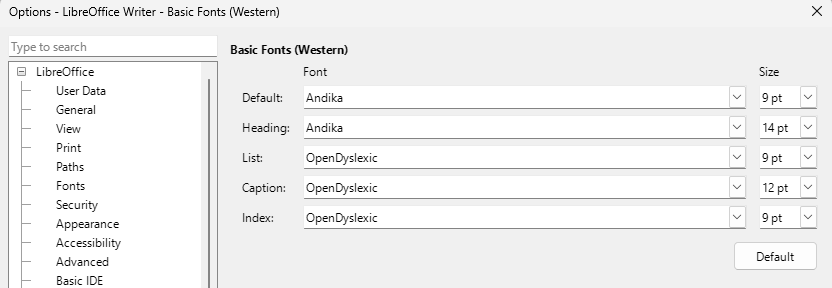
I have an easier time reading 9 pt Andika than 12 point Liberation Serif. Your mileage may vary. I would rather have a single readability font straight through, or similar-looking fonts like Andika and Skeirs, than mix them with OpenDyslexic. Unfortunately, Opendyslexic and Roboto fonts don’t support all the scripts/charsets I use, and for me, Liberation and Noto fonts aren’t as readable as any of the above.

Screen Issues

I have a far easier time reading paper and/or e-ink than conventional glowing screens. But trying to print or transfer files, take notes on paper, and then type up the notes adds a lot of extra work and wasted paper. I have a light sensitivity, and a halo around bright lights, and use low-brightness screens, and prescription sunglasses, but that only does so much.

System Constraints

Windows defaults to thin Segoe UI and to thinner rendering than older versions of MacOS. I have to find Windows settings which let me use the Windows Explorer without too much painful eye strain, and then make other apps work with these Windows settings. Windows has options to increase font size and scaling, but they don’t fix the rendering. So far, the only fix I’ve found (for Light Mode, or flipping colors if you can’t avoid Dark Mode) is to 1. Reduce the screen resolution, as far as possible; aside from increasing font size, the mismatched scale adds more gray pixels around text, 2a. Go into the Cleartype Tuner, do not return to the default resolution, and pick the boldest options; it will give a darker gray for these pixels, and effectively bolder text, and/or 2b. either set up or install a color profile with a lower gamma; it will give darker shades everywhere, and effectively bolder text. (If you can and do use Dark Mode, then maybe you can use the opposite.)