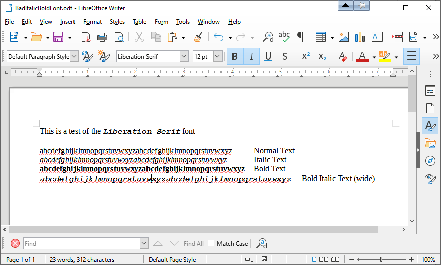
I just updated Writer from 7.1.4 to v7.1.5.2 (I felt lucky today) and the bold italic text (Liberation Serif) looks awful. There is too much spacing between the letters. It looks like the kerning is off. Bold Italic Liberation Serif text 14pt is now appears to be twice as wide as normal text. Has anyone else noticed this? I will have to go back to the previous version until this is fixed.
TIA
In which file format do you save your file?
Was the file once a DOC or DOCX file?
Have you already checked which style sheets are assigned and whether values for the kerning have been changed?
You can upload a reduced and anonymized file here so that someone can have a look at it. To upload, edit your question and use the upload icon.
Alternatively:
Go to the Help menu and use Safe Mode (it’s just a test, not a fix) to see if the problem still exists.
I assume that you did check spacing to see if the value was not set to something more than 0. Select the troublesome text and in the menu click Format > Character > Position and check that Character spacing is set to 0. Cheers, Al
I managed to solve the problem. I don’t know whether to pat myself on the back, or give myself a swift kick up the backside. LOL
Just to show you there was a problem I uploaded a sample screenshot. Notice the last line is extremely wide and should be roughly the same width as the others. All of the files were ODT files. I discovered the kerning problem was only this one font “Liberation Serif” and only with BoldItalic. Italic was fine and bold was fine as shown in the screenshot. All of the other fonts were fine for BoldItalic. I even resorted to installing LO in a Win10 Virtualbox and it worked fine with the same document. Strange eh? So I thought the font was damaged and compared all the fonts in the VB to the host machine and they were the same. I uninstalled v7.1.5.2 and went back to v7.1.4 and the document appeared fine. Installed v7.1.5.2 and the kerning problem came back. And the solution to this sad story of mine that fixed this one particular font’s kerning problem?
Ctrl-Alt-Del
(I forgot the Windows cross your fingers and hope to fix it technique: “When in doubt, reboot!”)
The wonders of Windows’ font cache I guess. That looks like Courier New to me

