
PT Serif is a free font of the PT font family, just download and install: https://old.paratype.com/public/
OpenType support was added in LO 5.2 (I think).
So the old version you are using has no support for OpenType features.
All of the fonts mentioned are included in LO 5.3, and are also freely available on the web for download.
Update to a current version of LO and you will have everything you need.
You also may be able to use the “G” fonts. The G stands for Graphite with is an alternative font features system which has been supported in LO/OO much longer than OpenType.
Try this font setting:
Linux Libertine G:frac=1
(On my phone so I cannot test at the moment)
OK I now have 5.4 installed and can access those fonts. I am still not happy with the result. I am used to fractions reading as a numerator with a horizontal line below it and the denominator below that. This diagonal divisor bar is new to me and unsightly. Is there no way to get a plain horizontal divisor bar?
Yes.
In OpenType those are called Alternative Fractions.
(also called stacked fractions and nut fractions out in the wild)
At my laptop now … will make some examples and add them to the answer above.
Thanks will not get back here until tomorrow afternoon but will look forward to your answer. By the way I installed that LO 5.4 on top of my previous version. Didn’t want to uninstall and then not get the new one. Now I have to find a way to get rid of the old one as it stops my writer printing. Any suggestions on Centos 6.9
OK. That will give me some more time to organize.
Have you tried using a Math formula? You can control precisely the placement of all elements, eventhough it is a bit tedious.
OK.
Added the Alternative Fractions info to the solution above.
If this helps, please click the up arrow and the checkmark.
OK I have removed all of LO and then reinstalled just 5.4. That went well, I then added the Verajja font. If I add the ‘:afrc’ to the end of the font name I still do not get any fractions as I would like them. I am using Verajja Serif 18pt. I even tried creating a style called fractions and set the font there to Verajja Serif:afrc, still with no response. When typing is the fraction supposed to auto adjust or do I have to select it and then do something else?
If I add the ‘:afrc’
You should try :frac. If none of the options work, the font don’t support it.
I am not quite certain what you are trying to do, but I think this may be a possibility. Excuse me if I have misunderstood.
Are you trying to create superscript or subscript fractions? You can do this by defining a Character style and the FONT EFFECT tab allows you specify normal / subscript / superscript. You could define a character style called SUPERSCRIPT, for example.
You can also change the normal font to superscript (CTRL/SHIFT + p) or subscript (CTRL/SHIFT + b). (CTRL/SHIFT +X) resets the line.
Autocorrect also allows you to choose these characters (TOOLS > AUTOCORRECT > AUTOCORRECT OPTIONS) on my system to show the choice.
There are also a limited number of fractions available on some fonts. See INSERT > SPECIAL CHARACTER to find them.
Hi Peter. I am trying to create labels for mechanical tools. I am aware of the insert special character but that only has quarters etc. I need to write things like 17/64 in a more presentable manner. Which brings me back to where I started. I can create these fractions but cannot align them with the other text. Thus 1 1/8 finishes up with the one and the eighth on apparent different bases according to the line. To do this I am using two different font sizes, which is annoying and slow.
I’m not sure but OpenType fonts could be a solution. See here the following link’s thread:
Using the formula editor
As an alternative, you can use the formula editor (Math component of LO suite) to format your fraction. It does not require OpenType features and works with any font. And, not least, placement of all elements are under your control.
Insert>Object>Formula, then type the required formula, e.g.
(made with Liberation Serif)
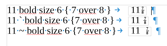
“Standard” font size is 12pt, consequently I shrinked the fraction 50% leading to size 6 which is applied to the bracketed block containing the fraction as 7 over 8. Since I found the fraction had not enough weight I added bold which applies to everything at its right.
I used grave accent and tilde spacing elements to experiment with separation between whole part and fraction. You can also use a string of space characters surrounded by quotation marks (a space character is slightly shorter than a tilde space).
Adapt to your case. You can even make it a “template” instead of copy/paste model if you have many labels to create.
EDIT 2018-03-13
Making your custom formula is quite easy. The procedure is described in the Math Guide at end of Chapte 1, Formula library section. Short summary:
-
Create your formula in your current document as:
<?> " " bold size 21 { <?> over <?> }
-
Return to the Writer document, your formula is displayed with empty square placeholders. Right-click on it and choose Save a copy as from the contectual menu.
-
Navigate to a convenient directory, give it a name and select .odf (LO Math formula) or .mml (MathML) format and
Save.
You can now erase the formula or customize it for your needs.
Using this new model is straightforward:
- Put the cursor where you want to insert another similar formula.
-
Insert>OLE Object(not Formula) - In the dialog, check Create from file and click
Browse(or similar label – I’m not presently under the English UI and I translate “logically”) to navigate to the directory where you stored your formula, select the formula file and pushOpen. - Push
OK, the formula is inserted. - Double-click on the formula and use
F4to quickly jump from<?>placeholder to the next one.
You know the rest of the story.
If this answer helped you, please accept it by clicking the check mark  to the left and, karma permitting, upvote it. If this resolves your problem, close the question, that will help other people with the same question.
Making this a template sounds to be onb the right lines, however I cannot find any help that shows how to do that without creating a new document. Suggestions please?
I have experimented and found to keep the fractions on the same line position as any text I need to include a whole number next to it. If none were present anyway then a dummy number as seen in this example works.
size 60 " " bold size 21 { 17 over 64}
I still need to figure out how to get this into a template though.
Hi LibreTraining
I am new here and still finding my way around the site.
I have installed that verajja font on my maching but it does not make any difference.
I have tried adding the ‘:afrc’ to the end of the font but again it makes no difference. my fractions still look like this 17/64.
What version of LibreOffice are you using?
The OpenType features were added in LO v5.3.
In one of your other threads you were going to try LO v5.1 - that will not work.
I tried adding 5.4 and installed it but did not get rid of 4.3 first. I now seem to have a mixture of both but which leans toward defaulting to 4.3. I am on Linux centos 6.9. How do I get rid of the older version. Do I have to erase both and then download 5.4 again and if so what happens to my documents etc?
When I look at the applications → office menu I get all the LO apps showing the 5.4 next to them and also the apps without the 5.4. I thought if I selected the 5.4 app I would get that one
OK I have removed all of LO and then reinstalled just 5.4. That went well, I then added the Verajja font. If I add the ‘:afrc’ to the end of the font name I still do not get any fractions as I would like them. I am using Verajja Serif 18pt. I even tried creating a style called fractions and set the font there to Verajja Serif:afrc, still with no response. When typing is the fraction supposed to auto adjust or do I have to select it and then do something else?