Hmmmm … when text that small is rendered onscreen in pixels the rendering engine has to make some adjustments by shifting some pixels left and right, up and down in order to draw the character.
Look at the first letter m - all three verticals are directly inline in the pixels. The rendering engine may have shifted the character to the right to make that happen. When the width of vertical lines in the characters are one pixel or less things can a bit dicey during the rendering. Compromises must be made.
Font files may also contain hinting tables which help improve the look especially at smaller type sizes.
Depends on the font.
Depends on the quality of the hinting.
The rendering engine may also have a lower limit on type size where it stops adjusting due to the limitations of pixels at 72 dpi.
On my phone right now, but will check this out tomorrow on a desktop computer.
I will test Liberation Sans and a font I know is very well hinted down to small sizes, Lato.
Have to look into the features/limitations of the new rendering engine too.
EDIT to add image after discussion in comments above.
Updating the hinting helped!
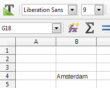
LibreOffice Calc v5.3.0.3
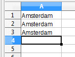
Line 1: Liberation Sans - 9pt - gap between A and m
Line 2: Arial - 9pt - same gap
Line 3: Liberation Sans KM - 9pt - gap gone! … and letter t looks good. (KM=me)
So the new font rendering engine takes advantage of better hinting. It appears that “fuzzy” hinting works better.
EDIT to add font file
LiberationSansKM-Regular.otf.ods
Just rename the file to: LiberationSansKM-Regular.otf
Install like any other font.