Would Drop Caps benefit from more flexibility regarding punctation?

(LibreOffice Writer 25.8.2.2)

Could the Drop Caps aspect of paragraph style benefit from more flexibility regarding opening punctuation (usually quotation marks)?
Screenshot 2025-12-18 104119

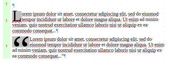
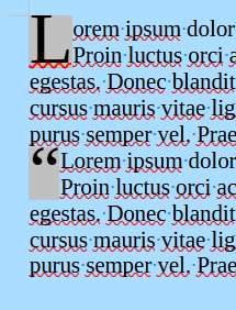
The two “lorem ipsum” paragraphs illustrated above are identical except for the quotation marks surrounding the second: they have the same style, which requests opening letter Drop Caps.

Pretty? Or ugly? When the user requested “Drop Caps” is this likely what they wanted/expected? Or unlikely?

Here’s an example from another site (non-LIbreOffice) that I came across when looking deeper:
Screenshot 2025-12-18 105237

See end of: Drop Caps and Quotation Marks: A Workaround | Celebrating Independent Authors

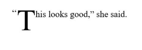
Many users, I suggest, would strongly prefer this second “This looks good” result to my opening “Lorem ipsum”. Should we provide an option to allow the user to choose it? That is, rather than the DropCap simply applying to the first glyph (the quotation mark in my Lorem ipsum) it could be to the first non-punctuation glyph.

My “punctuation mark vs. real letter” distinction obviously need further refinement; perhaps this helps: ::first-letter - CSS | MDN

For this initial stage, let’s avoid the fine-detail “what exactly constitutes punctuation or letters” rabbit hole, and stick with the high-level, slightly hand-wavy principle.

In principle, can we consider something along these lines? Should I propose a feature request in the bugzilla? It would sit alongside my recent feature request Paragraph styling: capabilities for lead-in which may be somewhat related.

I remember having filed a bug report about this unexpected behaviour in drop caps, but I can’t retrieve it instantly.

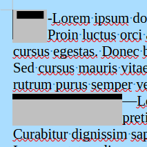
When drop cap character is not a letter or digit but some smaller shape, Writer considers the minimal rectangle enclosing the shape (the “hull”) instead of using the font bounding box. As a consequence, the shape (punctuation and others) is scaled up much more than letters to cover the number of lines.

IMO, the quotation mark above should have the size of the first line plus empty space underneath (second line). This would be more in line with traditional typography.

@ajlittoz Thanks.

At this initial stage (the hard-core detail can come later!) would you agree that some users might far prefer something resembling the “This looks good” result (+/- detail), rather than the “Lorem ipsum” result?

I fully agree with you. I stumbled on this ugly layout when turning a bullet into a drop cap. I’d like to find back my bug report.

I think not “some users” but practically “all users” would prefer the “This is good” variant.

1 Like

Thanks. If you find your bug report, let me know here, then I’ll take a look. Or if you want me to open a “feature request” in the bugzilla, let me know.

At least I found the example file on my computer: BugDropCaps.odt (36.5 KB)
and the bug report is tdf#150200

2 Likes

Fixed for some characters:
image
Not for others:
image

LibreOffice 25.2.7.2

Yes. Your image proposes that punctuation should be ignored for the drop cap. I don’t know how that could be implemented but it’s worth filing an enhancement bug report.

[Edit]
I played around with inline frames and there is a workaround but not so straightforward. Instructions are in the document
FakeDropCaps.odt (37.1 KB)

1 Like

@ajlittoz, @EarnestAl: Feature request submitted: 170044 – FEATURE REQUEST: Drop Caps: option to skip over leading punctuation

1 Like

@davidlee
I am afraid I didn’t clearly understood your idea. I admit I didn’t look very carefully at your illustration.

I thought you were complaining at the excessive expansion of “punctuation” in drop caps. In fact, this excessive expansion occurs on all “limited-height” glyphs (some have been fixed in recent release(s)).

Your example shows a 2-character dropcap " and T. This case is correctly handled with the curly quotation mark scaled globally with the T.

If you skip the opening quotation mark to format it like subsequent text, the mark will be too small and visually disturbing.

You can get a simulation for it:

  • erase the opening quotation mark at start of paragraph
  • do the 1-char dropcap
  • apply a bullet list style where the bullet is forced to opening quotation mark.

Obviously as soon as the dropcap is over 2 lines (I tested with 4 lines), the mark is way too small.

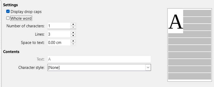
Here’s the current interface, and I have selected tick-box “Display drop caps”.

Bear in mind that our purpose here is trying to gain some flexibility to handle some of the more likely use-cases… I doubt we would ever get total conceivable flexibility for all conceivable use-cases. And that quoted text such as our earlier "This looks...," she said is a considerably more likely case for drop-caps than (say) a mathematical symbol such as :heavy_division_sign:.

So, with "This looks..." in mind, suppose that immediately below “Display drop caps” we have an additional tick-box called something like “Include leading non-text”:

  • enabled(default): present behaviour: the quotation mark is enlarged and is the first (probably only) so-called “letter” (incapable of CAPitalisation in this “Drop CAP” facility!)
  • disabled: the quotation mark is normal size: see “This looks good” graphic in original post.

(A very much secondary issue is whether that might be reflected in the display at the RHS of the display interface, alongside that large “A”. Leave that aside for the moment.)

I don’t possess the Chicago Manual of Style, nor does it appear freely available online. But Googling finds a few places that quote it (13:37):

When the first word of a chapter or section opens with a large raised or dropped initial letter, and this letter belongs to the beginning of a run-in quotation, the opening quotation mark is often omitted.

If the opening quotation mark is included, it should appear in the same size and with the same vertical alignment as the regular text.

Our “This looks good” example seems to conform neatly to that CMS second paragraph.

The fake drop caps document I posted meets that criterium but it’s more work to implement each time. As far as I can see it is the only way to do it at the moment.

I use a Drop Cap paragraph style for the first paragraph of each new chapter of my novels. This affects only the first character of the paragraph. When the paragraph starts with a quotation, I use a second paragraph style with number of characters included in the Drop Caps set to 2.
This doesn’t completely answer your needs, but there is no reason why you couldn’t have a number of drop caps paragraph styles for certain cases.

@GRC: Just checking that I get this properly.

Taking the “This looks good” example at the start of this discussion, are you saying that in your house-style both the opening quotation mark and the “T” would be drop-capped?

Perhaps my feature request (170044, linked above) should be modified also to allow for that option, so that you could have a single paragraph style that gets it right for both cases. (Suppose your editing subsequently replaced an opening ordinary-text with a quoted text. At present you additionally have to change style; under the proposal in this comment it would be automatically right for both.)

Thanks for the feedback.

Feel free to add a note to the feature request. Or I can do so.

Ideally the Drop Caps style should cope with both cases and my suggestion is the work around that I use. I employ the automatic chapter numbering with Heading 1 and the Next Style is my Drop Caps paragraph style. Nine times out of ten this is fine and on the tenth chapter, which starts with quoted text, I have to manually change to my Drop Caps two character style.

2 Likes