Calc xy graph with area below graph filled

Hello,

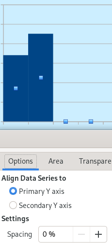
I have a X-Y scatter graph and I want to fill in the area underneath the line.
Is this possible?

Putting the title above into google search brings up a number of
websites which offer guidance, but all that I have tried either don’t
seem to work, or don’t quite make sense.

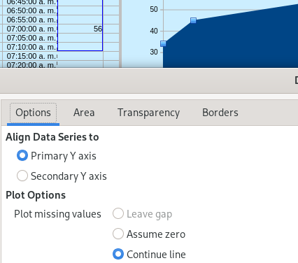
I can provide the spreadsheet if required, but it is just a simple scatter plot with time
on the X-axis and temperature on the Y-axis.

Can you help?

Actually, posting an example would be helpful. For example, if your values are discrete and relatively easily ranged, you could use a bar graph but under Data Range (at the left of the chart building dialog) select First column as label. Then setup a range of evenly spaced values and do a VLOOKUP to populate a helper column with only the values from your actual data range. See the attached example.
Discrete Bar Scatter.ods (16.6 KB)

1 Like

…and set the Spacing value to 0 %.


Also can choose the Area chart type, and set Continue line when missing values (you must change the formula that @joshua4 provided replacing the last 0 by "" (=IFERROR(VLOOKUP(G4,$B$4:$C$15,2,0),"")).
imagen

Thanks all for your replies, and the attached examples.

data - test.ods (51.5 KB)

Here is my example spreadsheet to show what I am trying to achieve, and I
must admit that it’s maybe not quite as straightforward as I implied in my post.
It is a snippet from a larger project.

As you can see there are two scatter plots, one for room temperature and one
that shows whether the heating boiler is on or off, the latter being a simple
0 or 1 value as shown on the right-hand secondary Y axis.
Also note that temperature readings are at 10 min intervals, but the on/off
change can happen at any time, so the values for X-axis are not all evenly spaced.

I would like the on/off plot to be filled so that it appears as a solid bar.

Fill is not possible in a scatter chart.

That makes it impossible to use a bar chart with date x-axis. The smallest unit on x-axis is a day.

But as your temperature reading is regularly in 10min steps, you can try a chart with category axis. However, the on/off will generate an additional item on the x-axis. A suitable chart type would then be a “Column and Line” chart.
data - colum and line.ods (47.7 KB)

Why do you need the on/off stepped curve filled?

Hello,
Thanks for latest reply, especially the column and line example.
This does pretty much what I’m looking for, although it does not seem to be possible
to set the X-axis markers and grid lines as they appear in my example.

Why do I need the on/off stepped curve filled? Just for asthetics – I thought it would look good.
But I can live with it just as a line plot.

So I have two options: Use scatter plots for all data and do without filled on/off plot,
or: Use column and line chart, and accept the X-axis format.

I’ll think about that.
Meanwhile, I guess you have answered my question, so thanks again to all.

In the properties of the x-axis you find a section to position the x-axis relative to the y-axis. When you set it to “End”, then the x-axis is drawn at top and the graph is below the x-axis. See screenshot. Is that what you are looking for?

This is tricky with a wider line
data - test_returnus_025106.ods (50.1 KB)