
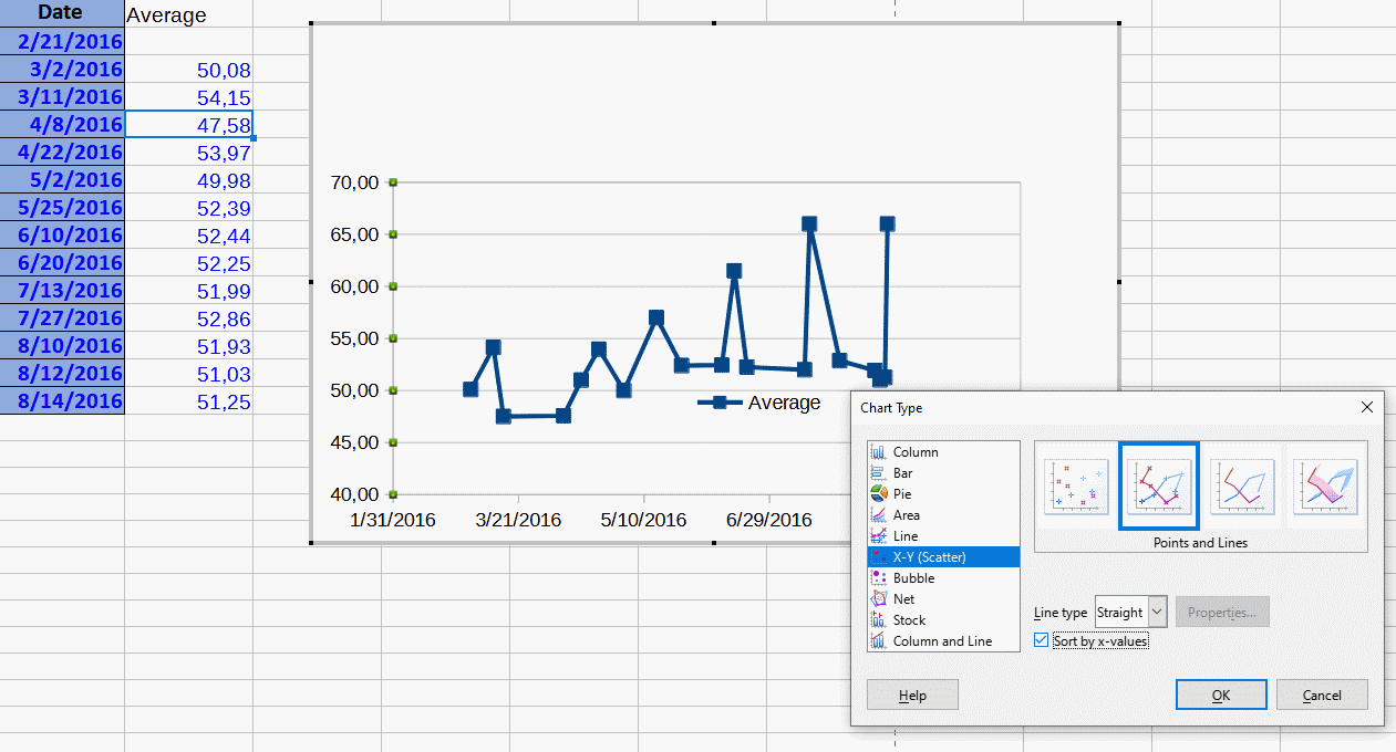
I wish to make an XY plot in Calc that has X-Y data from two different tabs in the same spreadsheet. A sample spreadsheet is attached to this message. I wish to plot time data in column A of Sheet1 on the X axis vs. the data in column B on sheet1 on the Y axis. To this I wish to add time data in column A of Sheet2 on the same X axis vs. the data in column B of sheet 2 on the same Y axis as a separate series. Note that the time data in Sheet 2 column A is has different values from that in Sheet1, but is in the same general time range. How can I do this?
Thank you for the help.
TestXYplot.ods (31.7 KB)
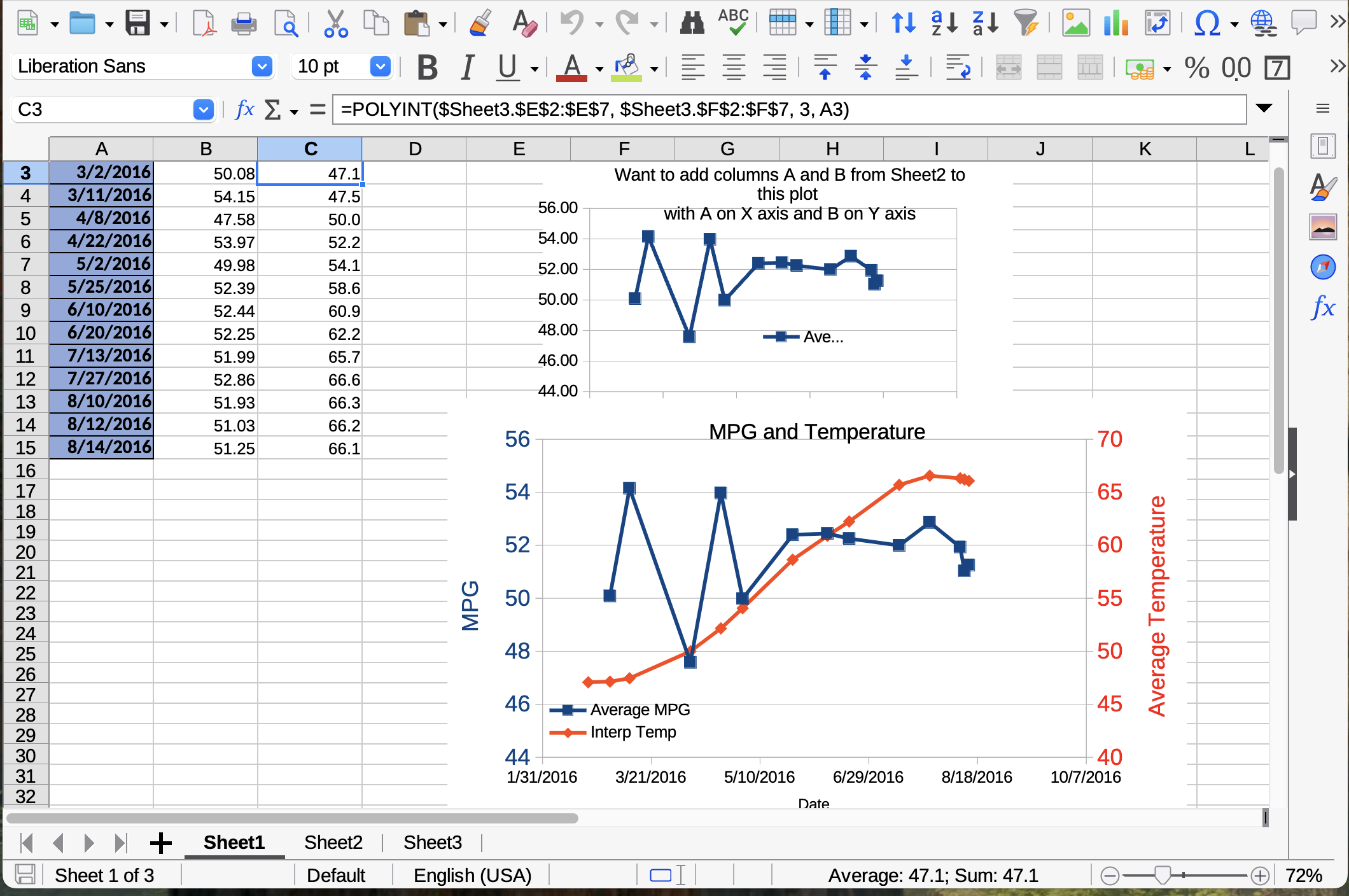
Thank you for the replying to my question. I believe your answer to my question is, as I was afraid it would be, “You can’t get there from here.” However, I found a workaround. I spent the past week learning a little Libre Basic and wrote a polynomial interpolation macro so that I can interpolate the data series, which has different X values, from the other tab onto the tab that has the X axis for the XY plot so that the same X axis can be used for all of the data I wish to plot.
@Zizi64
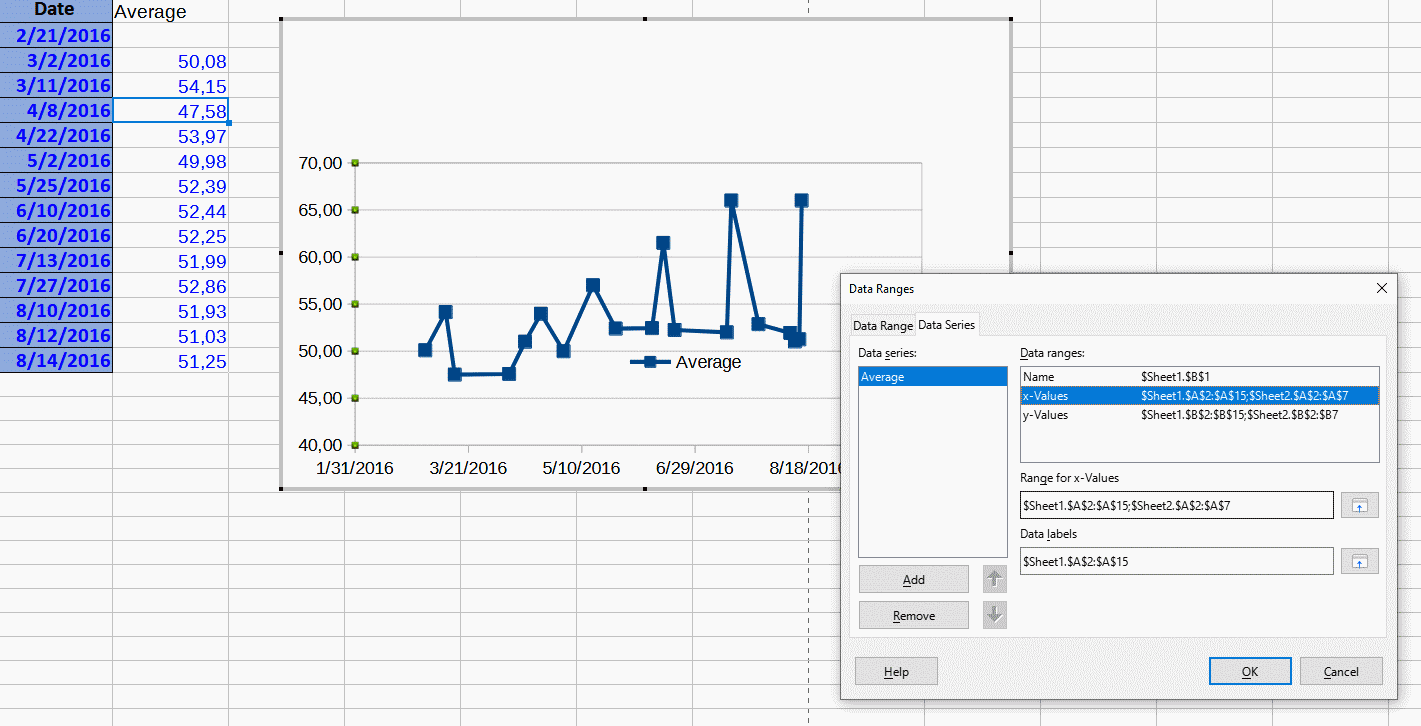
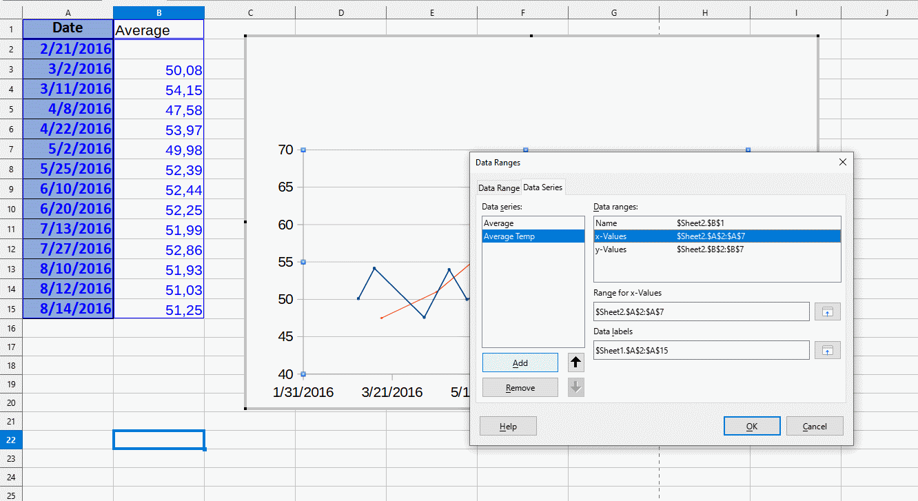
Thank you for the reply. Your solution adds the data from the second tab to the plotted data series from the first tab. This doesn’t really address the problem of how to plot the data from the second tab as a separate series on the plot; that is, so the data from the second tab show up as a separate line with a different color and symbols from the data from the first tab and have a separate legend entry.
See my reply in this thread yesterday evening for a (not very elegant) workaround to this problem.
I should have added a screenshot to my previous two replies showing the results I desired for the plot. The lower plot shows the two data sets plotted as different series. The second data set was interpolated to the same X values as the first using a polynomial interpolation macro I wrote based on one in Numerical Recipes in Fortran. Not an ideal solution, but gets the job done.
Excellent! Exactly what I want. Thank you very much!