How create a line chart in a specific format, rather than the one Calc seems to be choosing

I am new to Calc.
I am accumulating a series of blood pressure readings in columns, together with the date and time of each day’s set of entries, and I have created a line chart to display all six pressure readings on the y-axis.
The two things I currently can’t get right are:

  1. I cannot see how to make the hidden column storing date+time appear on the x-axis. Calc has automatically used 1,2,3… as the x-axis values.
  2. My columns have the most recent values at the top, and the oldest at the bottom. I want to see the oldest readings at the left of the chart and the newest at the right; Calc is automatically displaying the data with the newest readings at the left and the oldest at the right. Again I cannot see how to change this behaviour.
    Any help would be greatly appreciated.

Thank you for the prompt reply.

Yes, your chart is showing in the way that I was expecting.

On my chart I have the date and time in their own columns. I then concatenate them into the hidden column where they certainly will be text! My first point was that when editing the chart, I can’t seem to find anywhere that I can specify what the x-axis series should be.
I can see that there is a Date+Time format of YYYY-MM-DD HH:SS, so I can change to that, but how do I tell Calc to use that as the x-axis series? And will that automatically put the oldest entries on the left?

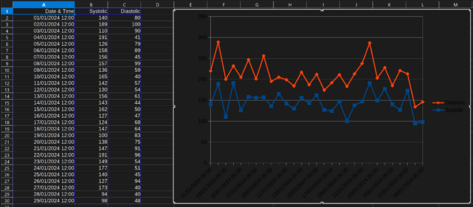
A line diagram is misleading in such a case.

  • Make sure that the date-time-values actually are formatted numbers! (Other contributors already told you so.)
  • Don’t use a Line Chart, but a X-Y (Scatter) chart in such cases!!!
    Only this way you get a diagram with slopes presenting the informtion to the eye usually associated with slopes: Speed Of Change.

Most recent on top is a good idea.

See also this attached erxample. (138.2 KB)

Why?
But if so, don’t concatenate strings, but add the date (represented as an integer number), and the TimeOfDay (represented as a fraction of a day). The result would then be a number as you get it (e.g.) by the standard function NOW(), and you can format it for the display as you want.
Use the format code YYYY-MM-DD HH:MM (the seconds may not be relevant) if you want to get clear information. In case yo register your measurements “real-time” you can use NOW(), copy the result, and paste-special Values Only to the same cell.

Like this?
Blood Pressure example.ods (33.2 KB)

I suspect your date and time’s are text fields not date and time fields - which is why they’re not sorting correctly on the chart.

I have edited this text into the original post, but in case that doesn’t trigger an alert I am repeating it here:

On my chart I have the date and time in their own columns. I then concatenate them into the hidden column where they certainly will be text! My first point was that when editing the chart, I can’t seem to find anywhere that I can specify what the x-axis series should be.
I can see that there is a Date+Time format of YYYY-MM-DD HH:SS, so I can change to that, but how do I tell Calc to use that as the x-axis series? And will that automatically put the oldest entries on the left?


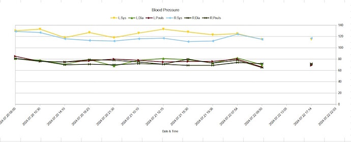
I think I can see now, looking at your example, the x-axis is called ‘Categories’! How was I supposed to guess that?? Is that the answer?

Add the time to the date and format the resulting number any way you want. The number format is not important, if the values are numbers in the first place.

I have succeeded in getting the chart layout I wanted, thanks mainly to Ash733, but the other comments were helpful as well.
The chart now looks sensible, but how do I get the y-axis labels on the left side of the chart?

You want to make sure that the date+time values are actually date+time values and not just text strings that somewhat look like date and time. See also this FAQ.

1 Like