In a chart, How do DataRange, Series, Category relate to each other?

OpenSuse 15.2
Calc 7.1.4.2

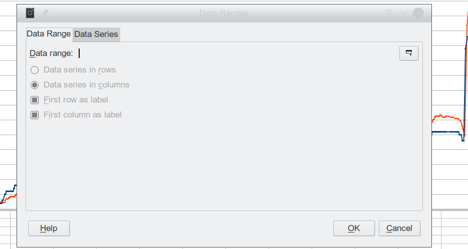
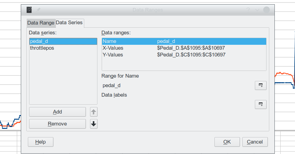
I’m afraid this could be viewed as kindergarten stuff. But as somebody who just wants to chart a series of values, ideally using a “ScatterChart” to associate the X with the Y value, I’m finding these concepts fall all over each other. Eg., apparently DataRange conflicts or subordinates to Series because when editing Series from the chart, DataRange reverts to null. And having partly defined a chart with X and Y axis, using a single Series, I have absolutely no idea what Category might mean… I see no use for that term and after an hour of searching I find explanations that all seem to overlap each other. In order to use the chart dialogs, it would help a LOT to have these terms/concepts clearly defined including how they relate to and affect each other.

Thx for any thoughts.
Rufus

1 Like

Hello,

The Calc documentation has more details you may be interested in. See-> LibreOffice Calc Guide
.
Chapter 3 deals with charts. There is a section in there on Scatter or XY Charts and more information on things such as Category. Excerpt:

Categories
The range for category data is defined in a separate Categories box below the Data ranges
box. Note the difference between categories and data series names. For the data in Figure
72, the categories are the row labels while the data series names are the column labels.
Note
XY (scatter) and bubble charts are unlike other chart types ...

OK. That guide has much more info, and I am in process with it.

On pg.9 I find this confusion shown below. What does “data series categories” mean? Are categories defined within Series? Ie. does each Series require it’s own set of categories? I don’t remember seeing this hierarchy in the docs I’ve found so far, but that may well be confusion on my part. I find it hard to get a handle the pieces are assembled by Chart; and the required order of steps to be taken…

Perhaps this will clarify after I read the whole section a couple times.

Edit: Ah. I’ve recalled that Category defines a set, finite, list of the values for the 2nd (usually?) data point in the X/Y pairs defined by a Series. They are a special case of the X/Y chart where the value of one variable (X or Y) is limited to a short set of fixed values. The Category is that short set of fixed values which would usually become labels on one of the axis; I guess it’s a automated method to get values in a range to appear, once for each different value, as labels on an axis. Hmm. What happens when there are multiple pairs with the same category and varying “free” data points? Well, getting there, maybe. Progress.

Thx
Rufus

@rlaggren
Is there a question here or you have answered it?

I can sign off. It’ll take a while to read the guide, rinse and repeat, then test what I don’t know and come up with more questions. I’m surprised graphing X/Y seems so unintuitive. Must be dumber than I thought.

Rufus

Categories [in Line charts] are the equivalent to Data labels for XY (Scatter) and Bubble chart types; usually the first column of data that define the horizontal position in the chart. (In a chart, is it possible to remove a series "Name" from the legend while keeping the series plot in the chart? - #8 by LeroyG).
You can have more than one serie for the same category.
The Data Ranges includes the category and series.

I’m not done learning here, but thanks you all, I have a usable graph. The main (simple) issue was the text fields. I am posting two snaps of the “Data Ranges” dialog from the graph to show the interesting point that Range does not need to be defined - at least not for an XY Scatter formatted with lines.

Regards,
Rufus