Problems setting a book of hymn lyrics

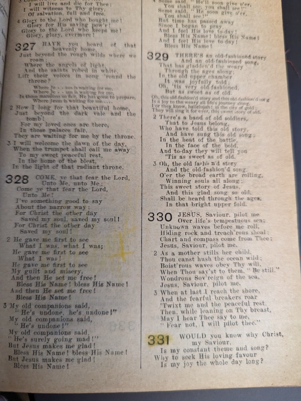
The hymn numbers want to be twice as big and the text, so it seemed like a 2-line drop cap whole word might work… but since each poetic line of the text wants to be outdented, there are several problems:

There must be a space between the number and the first word, which perturbs the formatting, as a wrapped second line winds up further left than the first line of text.

The above can be cured by using a multi-character drop cap and omitting the space after the last digit.

However…

If the first poetic line is short, the drop cap feature dosen’t produce a drop cap. The desired effect in this case would be to have the second line of lyrics start to the right of the drop cap, immediately under the text of the first line of text. This effect can be produced by joining the first two lines with Shift-Enter instead of a separate paragraph. But now the data has to dependent on the particular column width, so it can’t quickly be reformatted to a different page size without examining and possibly adjusting the paragraph separation technique for the first two lines of lyrics for each different page size.

On the other hand, if the first poetic line is long, the drop cap happens, and the line wraps, with the text to the right of the drop cap (and a third wrapped line is indented below the drop cap). But in this case, to distinguish from the first case, the desired effect would be to have the second wrapped line indented to the right of the text on the first line. This doesn’t happen, because the drop cap number has already consumed the indent.

So then maybe a text box would work? That is a lot more fussy to create, and the size has to be manually adjusted to the size of the number, which will have different digits and different numbers of digits from one hymn to the next. The wrapping of lyric text to the right of the text box seems to work as desired.

I was hoping to paste in text from a plain text file (which already exists), and just assign a standard paragraph style, and then a special one for the first line of a new hymn that would cause the number to be formatted as desired (large, drop-cap-word-like), but unless someone can give me some clues to easily convert the hymn number to a text box containing the hymn number, and apply a style and make it the right size in some quick manner, this is going to turn into a huge amount of labor, as it is even tricky to select the text inside a text box instead of the whole box being selected, making it hard to apply the text style to the number.

Presently running LO 7.1.8.1 but could upgrade if it helps. On Windows 10, but planning to migrate to Linux when my new computer gets here.

The text file contains hymn numbers before the first line of the first verse, and verse numbers before the first line of other verses. The verse numbers are no problem, just a different style with different indentation for the first line.

I’m not familiar enough with markdown to put a sample in here, will try to post a picture.

Help us to help you: OS name, LO version and save format.

As a general rule, avoid text boxes or other drawing objects if contents should be related to your main text.

Your purpose is not clear as you don’t give visual examples of the problematic paragraphs. How are your hymn numbered? Manually or as a numbered list?

How are you familiar with styles? It looks like your solution is some character style application on the number (hence the question about how your numbered them).

A dropcap will work as you expect only when your hymn title paragraph always consists of 2 or more lines. Unless I didn’t understand the specification (and again the need for a visual example): are you trying to make a drop cap for the title or verses?

What is your argument about “column width”? Are your hymns set in a table or 2-column page/section?

Thanks for the reply. I’ve updated my question with versions & platforms, and a picture of something similar to what I’d like to achieve. Note that 330 in the picture has two lines by the drop-cap hymn number, and 331 just one line, and note the indentation of the “continued” part of that one line, versus the two line in 330. I don’t like the chorus layout in this sample picture, would rather use italics than small caps, and the same size font. But this shows the hymn number idea.

I hadn’t thought of using a numbered list. Could this layout be achieved with a numbered list?

About the “column width” thing: The goal is to produce different versions on different page sizes, with different font sizes, and so there might be 1, 2, or 3 columns on a page. A large print version would probably only have one column. So how much text fits in one column depends on page size, font size, and number of columns. So the amount of text that fits on one physical line could vary from version to version.

Here is just a numbered list. I made the refrain no list otherwise it adds a number to the following paragraph the third level of the list (at the beginning of the paragraph, press tab twice). You could think of this one way towards your goal. In any event, there is some text.
HymnLyricList.odt (23.2 KB)

I’ll have to spend some time figuring out how you did the numbering, as I’m sure I’ll learn a few things, as I haven’t used numbered paragraphs in LO in clever ways… just for short lists. I always like to increase my “bag of tricks”, but I have some immediate concerns regarding the format, which I don’t know yet whether they are fixable or not using this technique.

The numbers are large, but not drop-cap-like. Instead, the numbers consume space above the first line of the first verse. Figuring out how to make the numbers drop-cap-like is really the point of my question, as I wasn’t finding a solution in the drop cap feature, due to it not working with short, multiple paragraphs.

Besides not being dropped, it looks like there is a larger leading after the first line of the first verse. My guess is that this because of allowing space for descenders of the larger font used for the numbers, even though none of the digits have descenders.

I see you made each verse/chorus block to be a single paragraph with line breaks. That is an idea I played with a bit to try to make drop caps help (but it didn’t). The line break technique seems to be brittle regarding varying text column width. I turned on 3 columns to break the lines in your sample, and and the “primary” line and “continuation” lines are all aligned at the left. “continuation” lines should be indented from the primary lines, but I’m not sure how to achieve that when using line breaks.

I downloaded the text from two different sites with the line breaks already there so I assume it is common to construct the lines of each verse like that.

I am not sure that you can have a list and indent for second line of broken sentences because of the issue I ran into with the refrain.

There is a definite difference in style between hymn 329 and 330 in your image, you should choose which one you want

Try to upload your file (or a stripped down version with just a few pages). You should find the upload icon around the middle of the edit pane toolbar when you edit your question: an arrow pointing up from a horizontal bar.

I have things to try, but need to adapt to your actual content structure.

The layout in your picture “looks” heterogeneous but I think this is an artefact depending on the length of verses. I suspect those indented are in fact long verses cut at the hemistich for some, or arbitrarily for others (when line is full).

I’ll try to find some time today to design an approaching solution. If you want to fully reproduce this layout, the solution will be quite sophisticated. I need to check what I have in mind is stable with edits.

Question: is the first line some kind of refrain or is it just the first verse? In the latter case, the stanza number is omitted and written down only starting from second stanza.

Yeah, 329 in that book has every other poetic line intended. 330 has them all aligned (except for the hymn number forcing a bigger indent). The latter is what I want.

That’s a random sample of a random book where I found the format of the hymn numbers to show what I want, not the actual texts I’m working with. The text I have are presently in a plain text file, with no formatting. I’m trying to figure out how to do the formatting. The text Ernest Al found will work fine for samples.

Sorry for slow response, I was away from computers most of the day.

The first line of the first verse doesn’t have a verse number, but a hymn number. The refrain is (in that book/picture) the text in the smaller type. In 329 it is apparently moved to the left margin to avoid line breaks as the refrain lines are long. In 327, it is indented more than the verses. So that doesn’t seem to be consistent through the book. I want to format refrains the same as verses, except: no number, and in italics.

It was easier than I thought. However, the layout is very “compact”. You may consider giving it a more “modern” look. Unless, of course, you try to reproduce an exact copy of the book.

What I understand:

  • an hymn is made of verses
  • verses are made of “poetic lines”
  • when “poetic lines” are long, they are broken into [physical] lines, either voluntarily (approximately in the middle if there is some rhythmic or poetic reason), or implicitly when the column is full
  • second and subsequent physical lines are indented relative to first line
  • first line of a verse is numbered to identify its beginning (except for first verse of an hymn)
  • first line of first verse is prefixed with hymn number
    This hymn number is 2-line tall, no matter the effective size of the first “poetic” line size
  • hymns may contain a stanza (which uses a smaller font size)
    This is where there is much heterogeneity. In the picture, a stanza is aligned left and another one seems to be centred.

To implement this scheme, I created 4 paragraph styles (all ultimately derived from Body Text so that the font face can be changed simultaneously):

  • Line for the “common” lines in verses
    Indented with a negative first line indent, no vertical spacing, line spacing diminished to look like the picture
  • First Line for the first line of a verse
    Derived from Line, except it is associated with list style Numbering 123 and some spacing above
  • Very First Line for the first line of the first verse
    Derived from Line, except indent is a bit different and spacing above to separate from preceding hymn
  • Stanza for stanzas
    I chose the left aligned version. Font size smaller (9pt) and moderate spacing above and below.

Character style Drop Caps is manually applied to first word of first verse so that it can be given a specific look (here “Small caps”).

Hymn numbering requires a special trick because its size is fixed. The dropcap feature can’t be used because the first “line” can be short (using only one physical line). Consequently, I sent the numbering into a frame. Frame style Frame has been configured so that the frame is positioned at left of column and top of text. I tried to align the top of the number with the top of the capital of the Drop Capsed-word. You may prefer to align with the top of the small capitals.

EDIT Forgot to mention that I played both with padding between frame border and text (even when there is no border) and precise vertical position From top to make this alignment. Only one parameter should be sufficient in this case. END of EDIT

This precise vertical alignment can be done only after having defined the attributes of the number. This number is a field, more precisely a number range (I chose built-in Text). For the purpose of the sample file, I forced the starting value to 329 and checked that the order of frame creation did not impact the visual sequential numbering.

This number is in a paragraph styled Frame Contents (which is LO default). I altered the font for a sans serif family and set size to roughly 1.5 lines. Trying a taller size to match the picture has the adverse effect of indenting the 3rd physical line because of the descender height defined in the font (though not used for digits).

Here is my suggestion: AskLOBookHymns.odt (24.0 KB)

This can be done using a single source for the hymns, but it is tricky (I’d say this is very advanced use of Writer). To get an idea, read In book publishing, how best to change the page size for a new edition? - #5 by ajlittoz to get an idea of the workflow. If you decide to embark on it, it is preferable to ask a separate question as the topic is quite different than the present one.

2 Likes

Thanks for the suggestion layout, I’ll spend some time to analyze it. First reaction is that it looks good, for verses 2 & 3 of each hymn. The refrain looks like what is in the picture I sent, but it isn’t what I want (see my other comments to the original question) but I think that will be easy to change. In this layout, the indentation after the 329 hymn number is too large, but shows the two (separate poetic) lines after the hymn number aligned, which is good, but I see it was done with a line break. For 330, the two (separate poetic) lines after the hymn nmuber are not aligned, the first is indented too far. This has them as separate (LibreOffice) paragraphs, which is good. As formatted, there are no “continued” or broken poetic lines. So I added 3 columns with 3mm between, and that forced breaking nearly ever line. And except for the top two lines of verse 1 (and the chorus in 329) Things looked pretty good. For the top two lines, the continued part of the line did not indent further than the initial part. And for 330, the 2nd line didn’t get indented at all, so doesn’t match the 3rd and following lines.

The single source idea that you linked to is very helpful and confirmed my understanding of how styles work, and the benefits of a master document when text can flow at will (as in chapters of a book). I had figured out that I should do everything with styles, and have styles defined differently for different page and font sizes. I hadn’t figured out the template idea for the master documents (probably because there is no UI for it) so that there need only be one copy of some of the styles. On the other hand, because of the layout of hymns, I suspect that I will need to make different manual adjustments to the spacing between hymns, and maybe between verses in some cases, so that as few as possible hymns are broken across page turns, especially to not separate a refrain from the following verses, so that one doesn’t have to flip the page for every transition from verse to refrain to next verse. So I don’t think my content document can be a single one… if the text changes after formatting, it’ll have to be edited in each format.

Thanks for all your help. Maybe this should be a different question in some particular forum topic? If so, please advise.

I created an ODT file with a bunch of styles. Then using various tools, I extracted the content.xml file and replaced it with one I generated using Python from my text file of hymn lyrics. This is all working well with one exception.

None of the hymn numbers show up, even though they seem to be generated in the content.xml file. So I must be missing something necessary for the frame. When I load the file into Writer, there are no obvious errors (like when the XML rules are violated, one gets a pop-up telling the line and character position of the error), but the hymn number isn’t visible, moving the text cursor using the arrow keys around doesn’t indicate that anything is being skipped, and if I save the file from writer, the XML codes for the hymn number simply are no longer there.

For debugging, I generated a far smaller file, with a single, one-line hymn, which should be numbered “1”. I didn’t figure anyone would be interested in the hundreds of hymn texts all with the same problem.

The file I generated is:
odt-orig.odt (14.1 KB)
The file after saving is
odt-save.odt (12.0 KB)

The missing codes are:

Blockquote
<draw:frame draw:style-name=“it-no” draw:name=“Frame1” text:anchor-type=“paragraph” svg:height=“6mm” draw:z-index=“1”><draw:text-box fo:min-width=“2mm”><text:p text:style-name=“it-no”>1</text:p></draw:text-box></draw:frame>

Perhaps you might find Using Styles From Another Document or Template a useful resource. You seem to be reinventing the wheel?

Well, I’m aware of that feature, but am not sure how it helps. I’ll try to explain a different way. I made a “sample” file using fake data, and all the styles needed for that fake data as well as my real data. Then I tried to generate a content.xml file from my real data (which is in a plain text file) by following the pattern of data from the fake data file’s content.xml file. As mentioned, everything works except that the hymn numbers, which must be in a paragraph-anchored frame, are ignored/deleted when Writter opens the resulting .odt file (having my generated content.xml instead of the fake data). This in an attempt to avoid the manual formatting of hundreds of hymns per project.

For debug purposes, I generated a tiny content.xml to demonstrate the deletion effect, and show the XML generated that gets deleted (even though it is quite like the original, manually created fake data that works, and real data that doesn’t work.

I’ve no clue why it gets deleted… is there something special about frames that requires meta data elsewhere in the .odt file besides content.xml in order to be valid?

Aha! Figured it out. Coding bug put the frame tag with the paragraph anchor outside a paragraph instead of inside. So once I recoded to put it inside, the numbers show up.

Thanks for pointers, samples, and help. This is going to save a lot of time.

1 Like