The font actually in use seems to be DejaVu Sans, but that ‘Roman T …’ keeps returning even if I set the font to DejaVu Sans. It doesn’t seem to be interfering with anything, still I’d rather it was the same as the actual font.

The font actually in use seems to be DejaVu Sans, but that ‘Roman T …’ keeps returning even if I set the font to DejaVu Sans. It doesn’t seem to be interfering with anything, still I’d rather it was the same as the actual font.
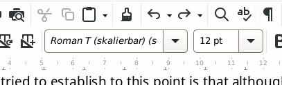
The font in the font box is in italics which means the document uses that font but it is not installed on your system.
In the Sidebar in Styles > Paragraph Styles, right click Default Paragraph Style and select Edit style.
In the dialogue that opens, select the Font tab and change the font to your desired font, DejaVu Sans. OK
Note If the document came from Word then you might need to Edit another style instead, maybe Normal
Chapter 8 & 9 of the Writer Guide can help with styles, download from English documentation | LibreOffice Documentation - LibreOffice User Guides
Didn’t work. Nevermind, it’s not bothering anything. My doc was orignialy WP for DOS. Run through ‘wp2odt’ to get what I have now. The only thing that didn’t translate perfectly was that issue with the size of the footnote area. God knows where the Roman T (skalierbar) came from, it sure wasn’t WP for DOS.
…
Ah! I did a ‘select all’ then applied DevjaVu, and all’s well.
…
Nope. ‘select all’ doesn’t select all. It says that fonts in italics will be substituted, but substituted with what? I’d like to clear the slate here – wipe off any of this bogus stuff that must somehow have come from WP. Can I restore everything to defaults?
Attach the document if it is small enough or a sample so that we can analyse the cause.
It’s 140 pages … let me see if I can cut out a representative sample and … what? can I just post it here and you’ll sort it out? Gawd! I remember WP 5.1 you could ‘reveal codes’ and actually look at the raw code of your doc, even edit it as raw code if something went crazy. How I loved it. Stand by.
Writer formatting is a bit more complex than just “format code”. It is based on styles which are more powerful and more abstract. You can however have an idea about the “raw code” of your document by enabling View>Formatting Marks and other visual hints. A more detailed feedback is the Spotlight feature you enable with check boxes in the side pane (both paragraph and character styles sub-views to get a more complete picture).
Yeah, I sorta get that. It’s like CSS in HTML, as you say an abstracted meta-layer of control. Fabulous if you know how it works  baffling otherwise. OK, here’s one page. The main text reports DejaVu Sans, the footnote reports ‘Courier 10cpi’ but that that’s not installed and will be replaced (with what?). Yesterday the ghost font was that ‘Roman T …’. BTW, all things equal, I prefer the font in the footnote over DejaVu … slightly less packed, easier to read. OK here she is:
test.odf (36.7 KB)
… hope that’s the way …
I’m thinkin’ that the conversion program couldn’t swallow something in the WP original doc and ended up hallucinating fonts that were never there. Anyway the thing looks mostly fine, but I’d like to have the whole thing running on one font and then perhaps make deliberate changes here and there … but no ghost fonts plz.
… that’s really nice – easy to understand, helpful. Well done.
Can’t tell anything. This is a completely converted doc. Fonts are DejaVu Sans and Courier 10cpip* which are not installed on my computer. They are both substituted with a gothic-type font.
The conversion is deceptive as could be expected: everything is direct formatted and you’ll have a very hard time to set everything on balance.
Your best approach as to copy the whole text and paste it as unformatted in a new blank document. Note that footnotes must be handled separately and individually. Then apply styles. Remove numbering and use automatic chapter numbering (and list numbering if you have lists).
I also see that text uses and outdated extra spacing (double-space, mechanical typewriter era) after punctuation. It is now obsolete, even in the USA. Drop it(; it causes formatting glitches in modern document processors under some circumstances.
Ha! Yup, I like the double space … but The Machine doesn’t. It also doesn’t like my:
xxx – yyy
That’s an ‘emdash’ I think? You can tell that I’m 25 years behind the times, yes?
Ok, will cut and paste the whole show.
…
Damn … ‘select all’ doesn’t grab the footnotes.
If I could just figure out what font is actually being used … It has to be shown somewhere, no?
…
F11 > Hierarchical > Footnote > Edit Style … changed font size to see what would happen … no change. It reports DejaVu tho.
Typographic rules state dash usages:
That’s subtle and frequently AutoCorrect adds its own mess. This is why I prefer to work wothout AutoCorrect.
When you’re in doubt about the exact character appearing in your text, put the cursor immediately after it and press Alt+X. The Unicode encoding will appear. Press again the same keys or Ctl+Z to revert.
Sheesh, back in the day you could type whatever you damned well liked. No auto correct here! Remember when Windows decided what you could type? Autocorrected things like people’s names? Rage against the Machine! I stayed with DOS until jump to Linux.
…
If I could just figure out the actual font used where ‘Courier’ is being substituted then I could ‘select all’ and make that change.
I assume you just want to know for aesthetic reasons. In fact, there is no point in it. I understand you’re now under Linux (but you didn’t mention the desktop you’ve chosen: Gnome, KDE Plasma, MATE, Xfce, LxDE, …). Every Desktop manager has a utility to show you a sample of the installed fonts. Find one that pleases you. Then, Tools>Options, LO Writer>Basic Fonts (Western) and set there your preferred fonts for various contexts. This will modify the default template and will be available for your future documents.
In case there is an overriding direct format (DF) in your present document, select the offending text and Ctl+M to clear DF.
I assume you just want to know for aesthetic reasons. In fact, there is no point in it.
More like I just want to know what’s going on. If a font is substituted I’d say it should report what the substitution actually is.
‘Tools > …’
Ah! … now that’s getting into the engine room. I’ll poke around in there. Tx.
…
Bagged it: ‘Noto Sans’ is the mystery font.
Yep, it should, but it keeps it as a secret. Shame.
Nothing’s perfect. With this level of power and control there’s bound to be a few lose ends. Might mention it to the devs as a possible improvement. Now that I’m tuned in to the idea, let me see if I can nuke all my direct formatting and try to get things right at the Styles level …
Funny tho, it still wants to report ‘Courier 10cpi’ … and that’s not coming from my desktop (Xfce) neither.