tags-numbers-charts.ods
tags-list.ods
This site has been operating since 2012 and, as I ask this question, contains 42,100 queries. Most of those questions are about LibreOffice, and every question is required to have at least one (very mysterious) Tag attached.
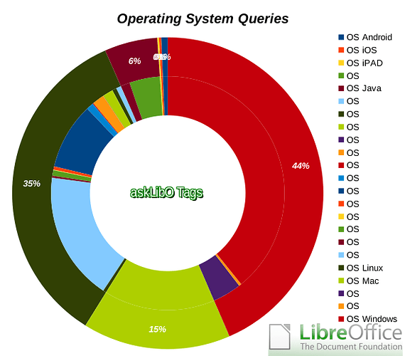
Yesterday I collected every tag for every question ever asked, put them into Calc and did an analysis, with 3 charts made of the results (first below is the image of the chart for the spread of OS reported, then the 3 charts that are currently available):
- LibreOffice Package Queries (36,549 total)
- LibreOffice Version Queries (7,393 total)
- Operating System Queries (7,523 total)
Now, as you can tell, those charts need improvement. Nevertheless, I hear you say, where can we get the results? Well, the ODS is linked above (tags-numbers-charts.ods|attachment).
How did you do it, Alex?
-
Collect the Tags using a wget script (creates 165 text-files):
for a in {1..165}; do get="sort\=used\&page=$a"; wget -O tags-$a \ https://ask.libreoffice.org/en/tags/?$get; done; -
Extract each tag+number from each file as above into a .csv file:
for a in {1..165}; do fgrep -B1 '×' tags-$a | \ awk '{ \ if(index($1,"data-tag-name")) \ { printf $1" "; getline; print $3 } \ }' | \ sed 's/^data-tag-name="\([^"]*\)".*215;\([,0-9]*\).*/\1 \2/' - >> tags.csv; done; -
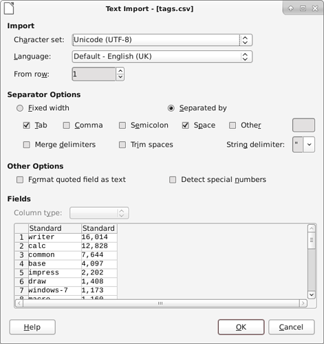
Use the CSV import routine to create a list of all the tags together with it’s number in the aslibo DB:
That creates tags.csv (same as the original file) and needs to be saved as a standard ODS file (available at top as tags-list.ods).
- That list of tags needs de-duping.
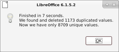
I installed remove-duplicates-fast. It removed an astonishing 1,173 dupes.

- Classify & name the tags + produce the charts.
…and there you have it. Hopefully interesting.
If this helps then please tick the answer ( )
)
…and/or show you like it with an uptick (∧)
(edit: created proper code sections (originals are each all on one line))


