
Hello,
i’d like to build a graph (or something like that), but i dont know if it’s possible.
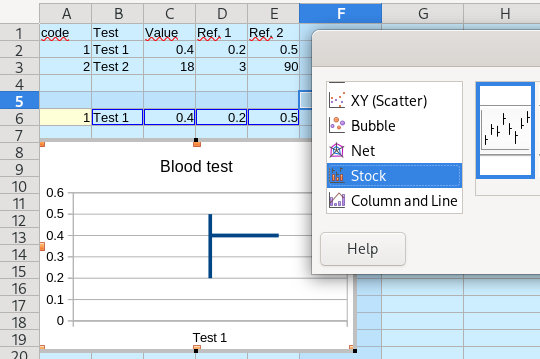
The use case would be that i got my blood test done, so i got various values with a range of values (the ok-range), and my actual value (hopefully somewhere in there).
I’d like to visualize these ranges line-by-line. Maybe having a different x-axis for every line? (and no y-axis, because it’s one-dimensional)
The ranges differ, one might be from 0.2 to 0.5, another from 3 to 90. I’d like for the range to fill the whole x-axis, no matter how the values are, so that they are visually a “block” filling the “graph” (and not one line being very small on the left part etc).
Do you understand, what my goal is? Is it possible?
Kind regards, Nordberg
Maybe use databars which are in cell graph lines. In the sample I added some more conditional formatting to emphasise over and under.
DataBarsOfResults.ods (19.5 KB)
Hello Earnest,
i like your solution. Thank you!
But the bars arent accurate yet, and i have problems fixing it.
What i mean is, that e.g. cell B6, the current value is 0.2, which is on the minimum range exactly, so the bar should be empty, i guess?
Or B8, if the value is bigger than the range, it should look like B6 maybe.
Or C6m when its under the bar should be to the right, and maybe red on the left (if thats even possible?).
I think the Condition 1 under Conditional Formatting with automated min and max, might be the way to fix this, but i couldnt make it work. If i select values there, i cant input cells, and i tried manually putting in the values, but it just zeroed them.
Maybe you have an expanded idea to your solution?
It depends what the upper and lower parameters mean. If they are a possible value, but in the unhealthy range, then you want them included, but highlighted which is what I attempted to do.
I do not know what blood tests test, nor what is healthy or is of concern, but I do think it would be a major mistake to hide values in the unhealthy range