Manage two data series with different range for x-Values

Dear all,
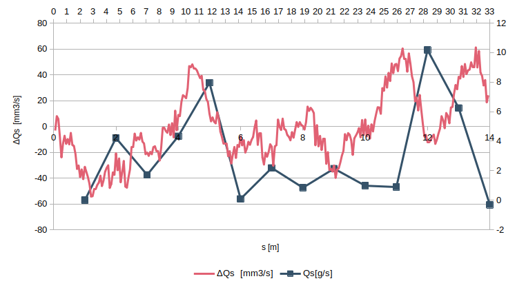
I am trying to superimpose two data sets with different x and y values on the same graph.
I thought this could be achieved by using the minor axes.
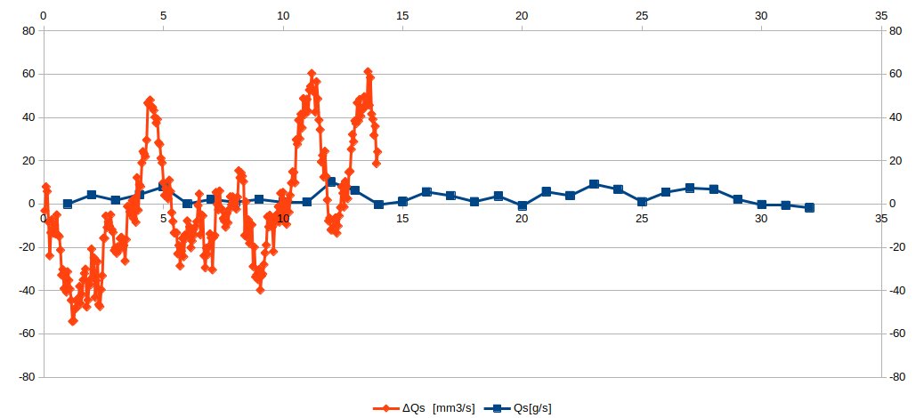
Unfortunately, I can’t seem to associate the data series with the respective axes and the result is as shown in the figure.
Any ideas on how to get around this?

Erri

Update:
I managed to obtain the following result but the blue data set is filtered by many points (Compare with the image above).
Any idea why this happens?

Erri

@erri, Thanks for the new information. Please, repost it as a comment. To do that, hover on “more” (just above these lines), and press “repost as comment under question”.

The blue data in the new chart are the values from 1 to 14.

See related question.

Dear LeroyG,
I agree with you.
But the reference axis for the blue series should be the one at the top with values from 0 to 33.

Add a secondary y-axis for second data series

Double-click on your chart to open it for editing

Right-click on the chart background and select Insert/Delete Axes

Under Secondary Axis, tick the box y-axis

Make a decision as to which data series you want against the secondary axis. Right-click on the chosen data series graph line and select Format data series.

In the Data series dialog, select the Options tab. Under Align Data Series to click Secondary y-axis, Click OK

I don’t think you can have different ranges for x-values.

Add a column (D in my sample) with the X values of red data multiplied by the ratio of maximum X values of blue and red (32/14 in my sample).

See sample file.

EDIT:

Adapted answer to meet @erri comment:

See sample file.


Tested with LibreOffice 6.4.7.2 and 7.0.4.2 (x86); OS: Windows 6.1.


Add Answer is reserved for solutions. If you think the answer is not satisfactory, add a comment below, or click edit (below your question) to add more information. Thanks.

Check the mark (Answer markCorrect answer mark) to the left of the answer that solves your question.

This actually works!
Thanks!
However, it is surprising that LibreOffice does not have a function that allows you to display two series with different data in the same graph. I think this is really useful for any form of comparison.