[Calc] Secondary x-axis for multiple datasets

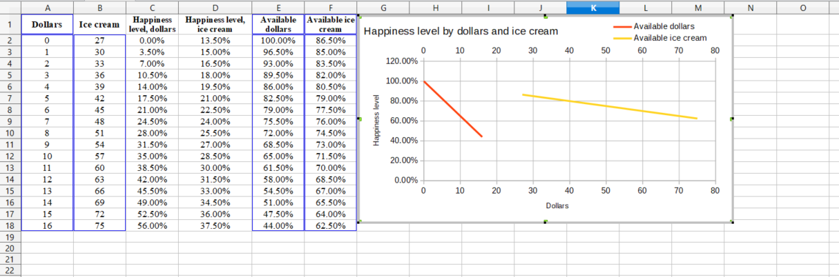
I’m trying to plot two data ranges on the same Y-axis, but cannot for the life of me figure out how to add a data set to a secondary X-axis. See attached pictures and example file.

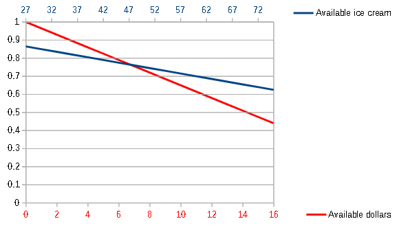
I want the “available ice cream” plotted on the secondary X-axis and primary Y-axis, and “available dollars” plotted on the primary X-axis and primary Y-axis. When the Range of X-values for the “available ice cream” data set is set to the proper range (B2:B18 - “Ice cream”), it just plots it on the primary X-axis (A2:A18 - “Dollars”). See image below. I want it to plot against the range of values in B2:B18, i.e. 27 - 75. This is a scatter graph.

Any help would be greatly appreciated. I can’t find any options in the Format Data Series or Chart Type dialogue boxes to plot on the secondary X-axis, only a secondary Y-axis, which is not enabled.

Running LibO v6.0.6.2, Windows x64. See attached example sheet. secondary x-axis range example.ods

Please forgive me but I don’t understand what you are trying to do or why. You want to plot “available ice cream” as both x and y, and “available dollars” as both x and y?? So you are plotting available ice cream versus available dollars, and available dollars versus available ice cream? How does dollars (column A) differ from available dollars (E) as a percentage? Graphs usually show the relationship between a dependent variable (y) and an independent variable (x).

Those are just dummy names - sorry if it’s confusing. Trying to keep possibly confidential information confidential. Basically, I want to see the second set (“available ice cream”) plotted on the secondary x-axis, and the first set (“available dollars”) plotted on the primary x-axis, for aesthetics. I agree that it’s kind of confusing. Dependent (x) for set 1 is “dollars”, independent (y) is “available dollars”; dependent (x) for set 2 is “ice cream”, independent (y) is “available ice cream”.

I could be wrong, but I don’t think it is possible to have a secondary x-axis in Calc. The purpose of a graph is usually to compare one or several different variables (plotted as y) with a single, common, independent variable (plotted as x). A graph with more than one y-axis and more than one x-axis will be ambiguous. The meaning of your data might be more clearly represented by having two separate graphs.

Still can’t solve with LibreOffice 6.4.7.2 (x64); OS: Windows 10.0.

You can add a secondary X axis but it doesn’t seem to act the same a secondary Y axis. As the percentage has the same span 0% - 100%, why not have percentage as the x-axis? Then you can have a y-axis for dollars and a secondary Y-axis for Ice cream

EDIT: See answer to question 296180. I think that this way it is easier to achieve a good result.

A workaround: Overlay two charts, the top one with the background color set to none. In both charts set same values of Position and Size (F4) for Wall. Set the font color of the Y-axis for the lower chart to White.

See sample file.

Dollars and Ice cream

Tested with LibreOffice 6.4.7.2/7.1.0.3 (x86); OS: Windows 6.1.


Add Answer is reserved for solutions. If you think the answer is not satisfactory, add a comment below, or click edit (below your question) to add more information. Thanks.

Check the mark (Answer markCorrect answer mark) to the left of the answer that solves your question.

If the answer helped you, you can mark the up arrow (Upvote mark) that is on the left (to vote, you need to have karma of at least 5).