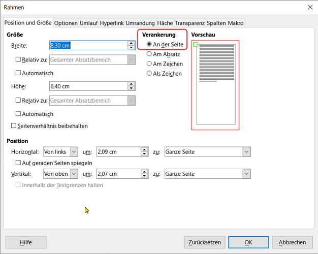
Not at all. The issue here is to understand what anchor To page does. It is a very specialised anchor mode which should not routinely be used. It is a DTP feature. DTP documents are based on pages (primary objects) where text is constrained within areas and does not spill over automatically to other pages. You have to do that explicitly. In such a context, anchor To page is a necessary tool because you must layout the image in some area of the designated page next to the text area.
In Writer, the primary object is the main text flow. You have no page object. Pages are kind of necessary “accidents” to cope with the available output devices which print on quantised media, i.e. text is sliced onto sheets of paper.
Since text location is unpredictable (it depends on too many factors for user to make a reliable guess), it is much better to anchor to the referencing element (usually a paragraph) so that Writer allocates the frame in the same page as its reference element.
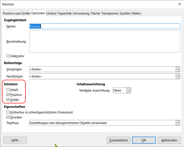
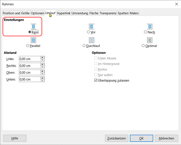
As I already explained, anchoring To paragraph does not define position. You can send the frame anywhere inside the page. This is what I configured in my Frame_at_top frame style: the frame goes to the top of the column. Unfortunately, I could not remember the conflict-resolving trick I implemented in the complex layout document I attached. This trick would shift downwards second, third, … frame competing for the same position. Instead, they overlay each other in my last attempt. This is why I said that my style does what is expected only if there is a single frame in each column.
Understand that anchor and position are independent settings. A frame, except As character can indeed be positioned anywhere in the page. But refrain from moving it manually because you’ll easily and frequently change the anchor, resulting in undesired layout after edits (this change in anchor is one reason for seemingly random changes in position).
Has the publisher provided you a template with the desired styles? Considering the average “quality” of"templates" I see on this site, I doubt it. Styles collection is most commonly limited to paragraph styles. To a lesser extent, you sometimes find page styles. But there is a complete lack of character, frame and list styles (because Word has no notion of them?). And this ends up with documents full of direct formatting which turns tuning to the mandatory graphical charter into a nightmare.
As an author, don’t hesitate to bridge the missing parts in the graphical charter with custom styles of your own in order to reduce as much as possible direct formatting and facilitate conformance to format/layout.
Your ultimate achievement is to separate contents from appearance. Contents (i.e. your creative discourse) should be tagged with styles, the names of which translate the semantic value, the significance of objects (paragraphs, words, pages, lists, …), not how they look. Then all the formatting and layout work is in styles configuration and you should not, never, review text contents during this step. If you must, your styling is faulty.

 .
.

