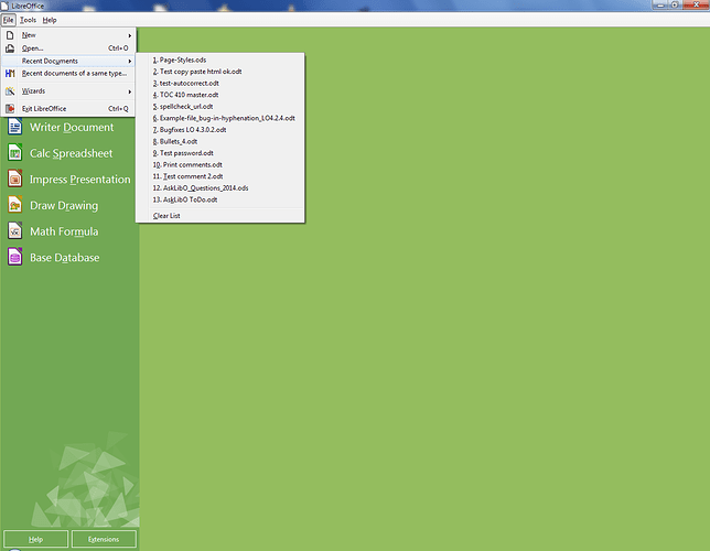
Can I supress the images on the start screen?

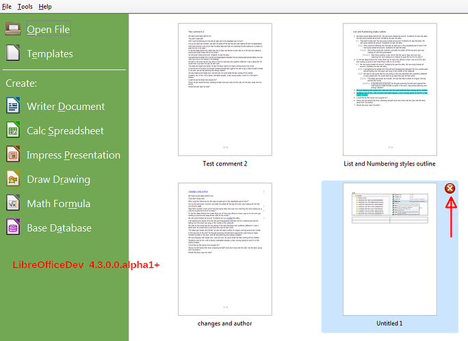
The new start screen shows legible images of recent documents. This has privacy implications. Is there any way to suppress the presentation of images so that casual viewers cant see things they shouldn’t?

So far the only solution I’ve come up with is to open individual components of LO separately, rather than use the main ‘soffice’ executable.

Patch /usr/lib64/libreoffice/share/config/soffice.cfg/sfx/ui/startcenter.ui
Search for class=“sfxlo-RecentDocsView” and change the value for the
properties “visible”, “can_focus”, “hexpand” and “vexpand” from “True”
to “False”.

You will have to re-do this for any version update, though :frowning:

No, there isn’t any option for suppressing the view of the recently-opened documents on the start screen.

See also: Can the new Start Screen in v4.2 be reverted to that in v4.1?

A request for enhancement on Bugzilla:

Bug 74834 - CONFIGURATION: Option to disable documents thumbnails on the New Start Screen

Status: FIXED

Update 2017-01-16

In LibreOffice 5.2 or later you can use Tools|Options → LibreOffice → Advanced → Open Expert Configuration to switch thumbnail mode. Search for RecentDocsThumbnail property and toggle the value to false.

See below for the initial answer with alternative ways and workaround for older versions of LibreOffice.


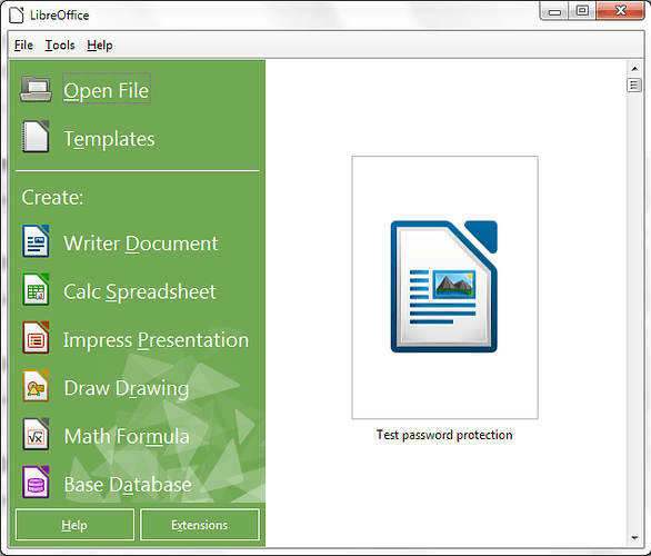
A workaround with password protection (see fdo#74844, comment #1):

…if you add a password to the file you want to protect your data, only the icon of the file will appear and no data will be shown.

[2014-07-29] Doesn’t work with LibO 4.3.0, see Bug 80755 - Startcenter showing password protected file.


If you do not need the list of the Recent Documents:

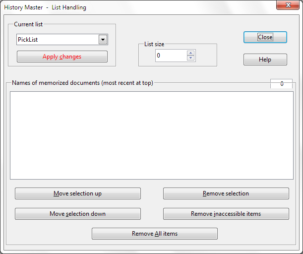
You may install the extension History Master.
There you can set the list size
of the Recent Documents (PickList) to zero:

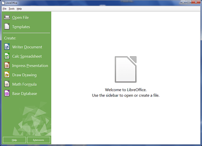
Then the start screen will be shown as follows:


Update 2014-05-20

A new feature in LibreOffice 4.3.0: Selectively delete Recent Documents.

See also: Removing files from the recent documents list.


Update 2014-07-09

@Nars has provided a workaround that doesn’t affect the list of the Recent Documents:

You can customize the background color via menu

Tools → Options… → LibreOffice → Appearance → General → Application background.

@ manj_k Thanks for the link to the bug report.

See also: Is there a way to change the initial screen in LO 4.2.1.1?

fdo#80755 - StartCenter displays thumbnails of password-protected files, seems fixed at least for 4.4

fdo#80755 – The bugfix will be available in LibreOffice 4.3.2.

The privacy implications @kiwi_writer mentioned is indeed an important one.

The solution @manj_k kindly explained can only be a temporary workaround. Setting the PickList to 0, also the list of Recent Documents in the File menu shrinks to 0. To have a longer list there, I installed the History Master.

When I meet with a customer I would need to switch the thumbnails off, but when I work alone the thumbnails could be a nice feature I like to try.

Is something known about a solution to the privacy implications which allows a quick switch on/off of the thumbnails while keeping the long Recently Documents list in File menu?

I’ve posted a detailed answer here: Can the new Start Screen in v4.2 be reverted to that in v4.1?.

I dislike the new start screen about as much as I have disliked anything in any software I have ever used! What on earth are you thinking! I echo the comments of others including:

  1. icons and text just too big
  2. I give common names to versions and with different extensions so have lost the ability to distinguish them which makes it essentially useless as a production tool. I’ve reverted to an older version (I’m glad I ignored advice to remove earlier versions!)
  3. It just looks so bad! Icky colour combo – white text?

OK, now solutions:

  1. lose the white text on green (bad visibility–Google VEAPs visual environmental adaptation problems)
  2. make the history list editable, but the current form is useless though perhaps faddy, but us fuddy duddies who use LO for work have no patience for juvenile visual fads – do your homework on user experience and functionality. The workaround (zero) is silly and defeats the purpose of history.
  3. shrink icon size, or give option of just listing files-- icons are so dependent on individual installations and invariably aren’t useful. Add ability to list files by folders so all that screen space is our documents folder – that might be more useful and highlight folder documents.
  4. don’t limit how much of a file name gets shown, e.g. document name might be: project with a long name version 2 date some other info extension (please keep)

@oxide I strongly dislike your manners, or lack of. Also I don’t agree with a lot of your arguments. But that said, I think design team is the easiest place to make your voice heard about such things.