As I was interested by the challenge, I made experiments. I followed two tracks:
- page background for simple “stuffing”
- background frame for more versatile effects, such as “no intentional text here” watermark in blank spaces
This idea is to simulate pre-printed stationery. You are no longer limited to monospaced text. You can also use all highlighting Writer facilities such as font change, colour, alignment, …
My experiment was conducted with three paragraph styles:
-
Justified Body displaying a serif font, paragraph background set to white, justified so that text will extend from margin to margin, completely hiding the background
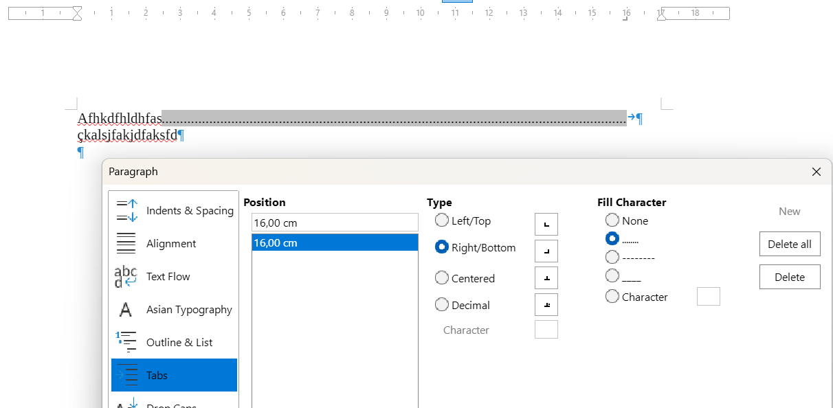
However, the background is defined for the paragraph bounding rectangle. Therefore, end of the last line remains white. To cope with this, a tab at right margin with a dashed leader line is created. You just hit Tab after the last character in the last line to cross out it.
-
Jagged Body left-aligned with character highlighting (instead of paragraph background)
-
Preformatted Text, similar to Jagged Body, except it displays a monospaced font
But, IMHO, this does not prevent a very meticulous fraud to glue extra text over background and photocopy the forged page.
Page background
I created a Checkered Page page style with a pattern covering only text area. This pattern can be extended to cover the whole page but most printers have a “mechanical feeding margin” which cannot be printed so that gears and other pressure rollers are not clogged by ink or toner. This will however result in a rather ugly look.
-
Justified Text is quite satisfactory.
-
Jagged Text exhibit a throbbing effect between the vertical pattern frequency and line spacing because character highlighting does not cover the leading between lines of text. It could be compensated by reducing the leading in the paragraph style configuration but this makes text hard to read.
-
Preformatted Text is vulnerable to the same “Moiré” effect but the monospace font used here (Liberation Mono) seems to define a higher glyph rectangle than the serif font, seemingly preventing the effect. It is shown for comparison with what you do presently.
Background frame
To provide more possibilities, I created a Watermarked Page with a very tiny header enabled. This header is forced to fixed minimal height, i.e. 0.1 cm with no spacing. Of course, if you have a need for a header, you can use it in the usual way for its intended purpose. The header paragraph is styled Invisible where font size is set to 2pt (the absolute minimum in Writer) and spacing above and below at 0 cm.
A text frame is anchored to the header paragraph. Size is page size minus the margins, centred inside page text area. The frame contains some text (in this example “The Document Foundation”, but can be “The Acme Company, unincorporated” or “Ministry of Fancy Documentation - form 0000”) styled Watermark Text. This paragraph style allows for adjustments such as line spacing and font colour.
Frame style Watermark hosts all properties of the frame: its position and, most important, its Wrap properties: Through, In background and Allow overlap. Be aware that, should you edit frame contents, you must remove temporarily background or overlap to be able to click and select the frame.
The results are the same as above, except use of the frame reveals an undocumented behaviour relative to “background”. It looks like a frame wrapped In background is in fact z-sorted between paragraph background and character layer. Thus, paragraph background is made invisible and replaced by frame background which is not “transparent” as would be expected. To compensate, I had to modify Justified Text to add white highlighting.
See AskLOStuffedText.odt (62.8 KB)
EDIT: Working more on the challenge, I discovered an horrible bug: tdf#168410
See this document: LOBug-BackgroundOrder.odt (32.7 KB)